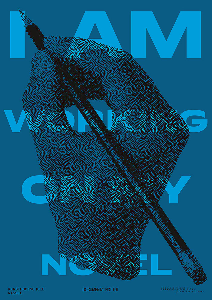
I Am Working on My Novel conference poster
Book Book. License: All Rights Reserved.

For the I Am Working on My Novel conference poster, Book Book Studio and Jan Blessing (Expanded Printmaking) took Pierre Pané-Farré’s Klub back to the press. The studio had used Klub before, including in its design for Bani Abidi: The Artist Who, published in 2022 by Hatje Cantz. For the Kassel poster, the studio chose Klub 11 SemiBold. The letters were laser-cut and printed by letterpress in two colours, then the illustration was screenprinted over the type.
Held at the Kunsthochschule Kassel in October 2026, the two-day conference brought artists, writers and researchers together to explore writing as an artistic practice. Chris Kraus discussed conceptual writing and literary fiction. Blessing and artist Sarah Lehnerer approached the subject from another angle in a conversation about the materiality of text.
Klub’s letterforms grew out of a series of experiments in 2012 that used laser-cut wood type to explore new possibilities for contemporary display type. The result was a large sans serif family spanning eleven widths, each drawn in six weights. This range gives designers the flexibility to define levels of typographic hierarchy through changes in proportion as well as weight. Sharp contours and pronounced contrast between thick and thin strokes in the lowercase letters give the letterforms their distinctive character. Since Klub’s public debut in the 2014 exhibition catalogue Vom Buch auf die Straße, these forms have proven influential in contemporary display type design.
For Klub, the Kassel poster is a homecoming. Here the process ran the other way, with Klub 11 SemiBold providing the outlines for a new set of letters cut for the press.
The full family is available to license from Type By.

Book Book. License: All Rights Reserved.
Printing the I Am Working on My Novel poster: Book Book Studio and Jan Blessing print the laser-cut Klub 11 SemiBold letters in two colours on the letterpress, then screenprint the illustration over the type.
This post was originally published at Fonts In Use