Medido
License: All Rights Reserved.


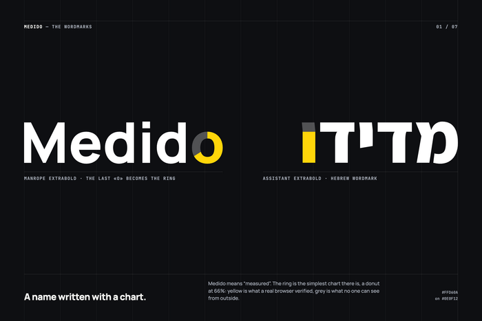
Medido started with a question, not a logo: how do you show what was really checked, and what wasn’t? The answer was a ring, the simplest chart there is. Medido means “measured”, so the name is written with one.
What Medido reads is a website’s marketing measurement, and the last o of the wordmark shows the result: a donut filled to 66%. Yellow is what a real browser saw on the site. Grey is what no one can see from outside.
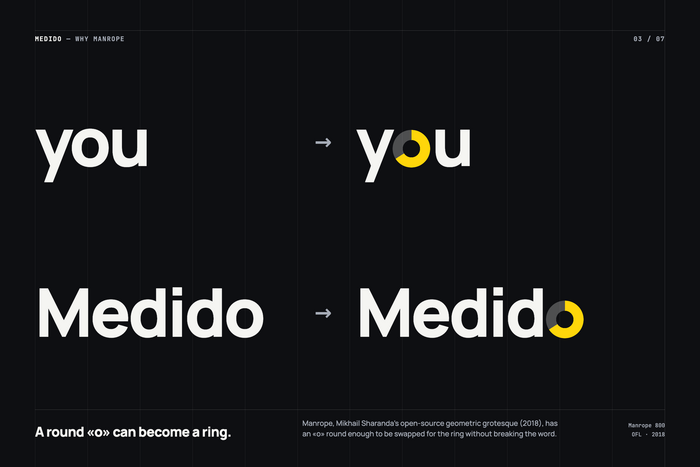
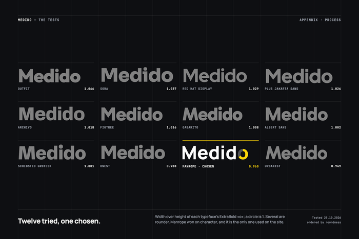
That only works because of the typeface. Twelve were tested; several have rounder o’s. Manrope, Mikhail Sharanda's open-source grotesque from 2018, won on character.
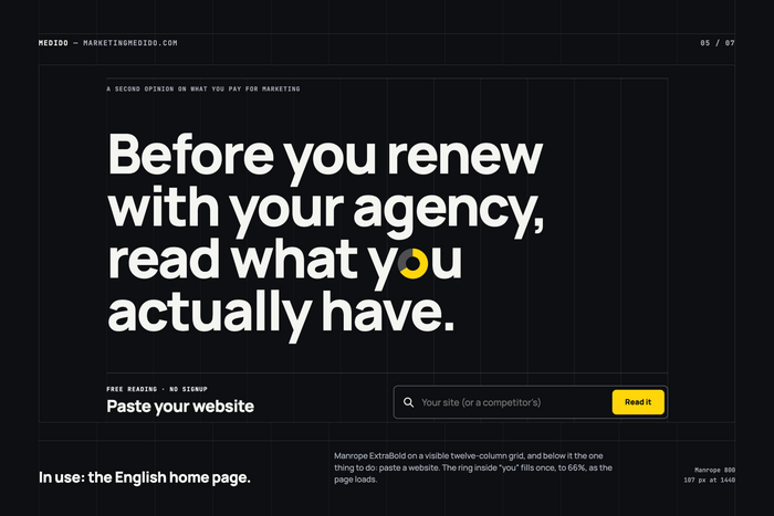
I measured it, as Medido would: its ExtraBold o is 1,094 units wide and 1,140 tall, a ratio of 0.96, where a circle is 1. The ring’s hole is the d’s counter, so it reads as a letter, not a symbol.
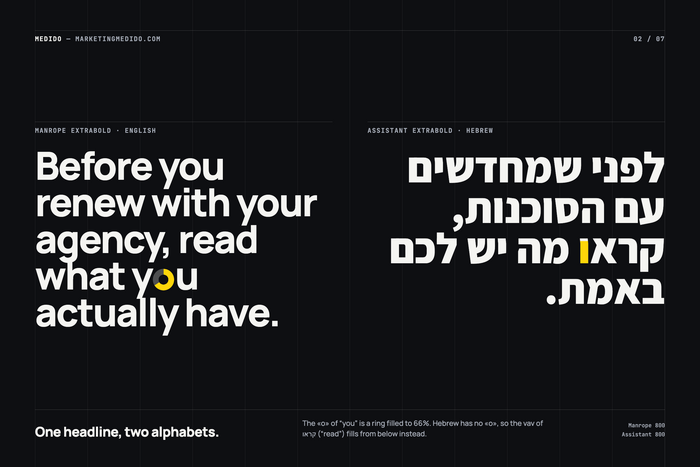
On the home page the ring sits inside “you”, in a headline that fills the first screen. It fills once as the page loads, and again, much larger, during a live reading. It only moves when a step is done.
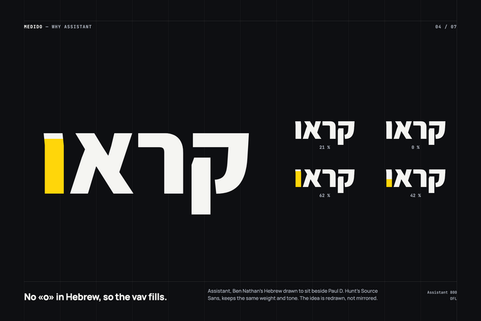
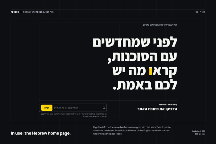
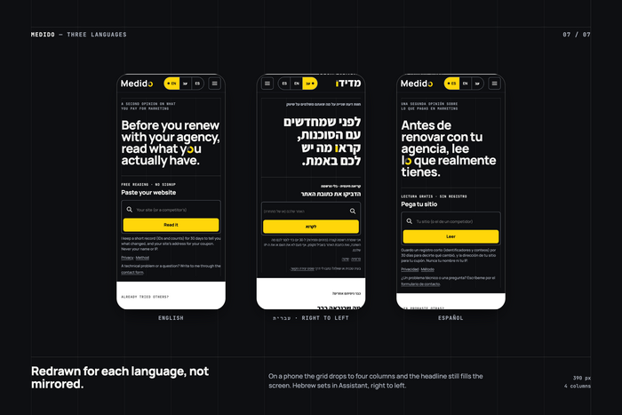
Hebrew has no o. In Assistant, Ben Nathan’s companion to Paul D. Hunt’s Source Sans, the vav of קראו (“read”) fills from below instead, like a bar chart. A donut in Latin, a bar in Hebrew: redrawn, not mirrored.
JetBrains Mono writes the browser’s log and stamps the seals. One accent: yellow, always paired with black.
Medido doesn’t decorate with type. It measures with it.
License: All Rights Reserved.
License: All Rights Reserved.
License: All Rights Reserved.
License: All Rights Reserved.
License: All Rights Reserved.
License: All Rights Reserved.
License: All Rights Reserved.
This post was originally published at Fonts In Use