Wiener Hitze. Architecture and Storytelling in Times of Heat
Alexandra Möllner. License: All Rights Reserved.


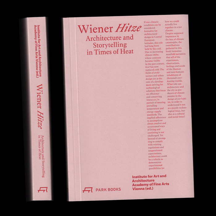
Wiener Hitze. Architecture and Storytelling in Times of Heat explores how climate change reshapes urban and architectural narratives, with a particular focus on Vienna and its shifting role in a warmer world.
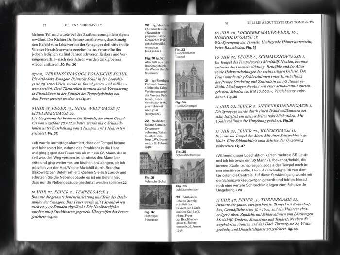
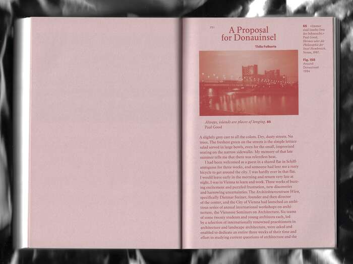
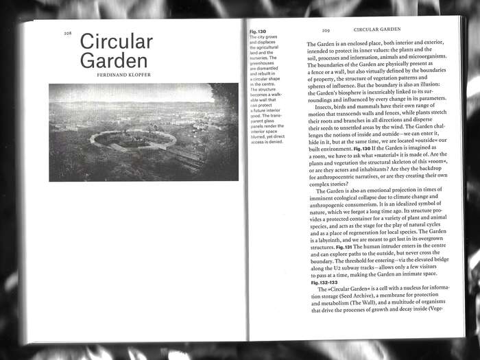
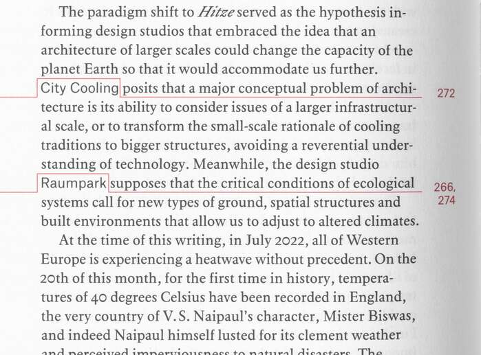
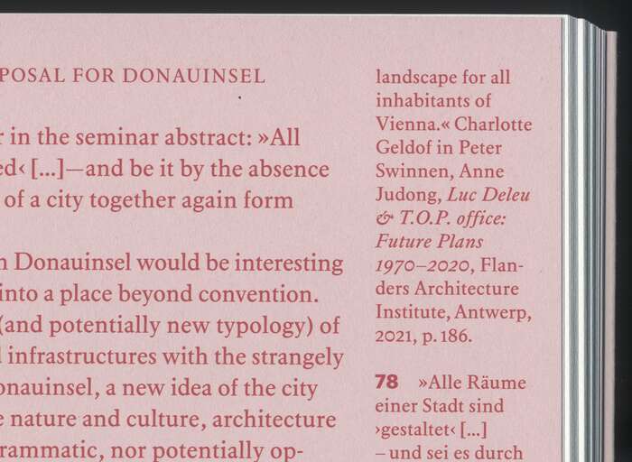
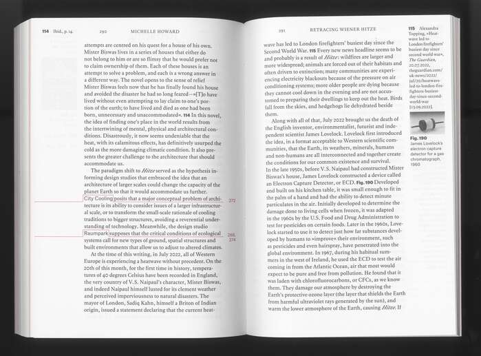
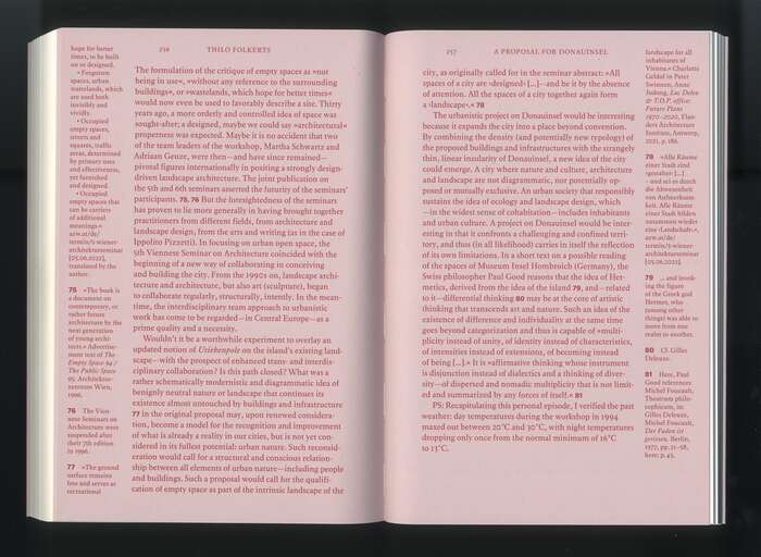
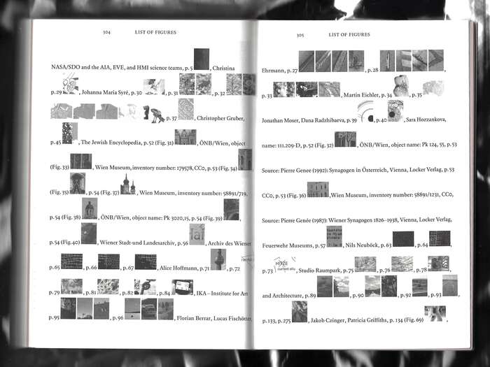
Typography plays a key role in the book’s design. The serif text face Elaphus is used for the main body copy, providing a calm, readable texture that supports long‑form essays and reflections. Occasional shifts in tone are marked with Atlas Grotesk, which appears in headings, numbered sections, or short breakout texts, offering a sharp contrast through its sans‑serif, robust forms.
A distinctive feature of the layout is the use of narrow marginal columns for references and commentary. These are set in smaller sizes, adding a secondary layer of information while maintaining typographic coherence with the main text.
Alexandra Möllner. License: All Rights Reserved.
Alexandra Möllner. License: All Rights Reserved.
Alexandra Möllner. License: All Rights Reserved.
Alexandra Möllner. License: All Rights Reserved.
Alexandra Möllner. License: All Rights Reserved.
Alexandra Möllner. License: All Rights Reserved.
Alexandra Möllner. License: All Rights Reserved.
Alexandra Möllner. License: All Rights Reserved.
This post was originally published at Fonts In Use