WEWEHOME

Source: www.instagram.com License: All Rights Reserved.


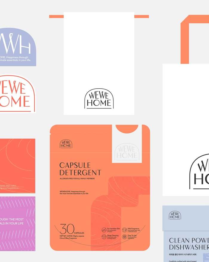
WEWEHOME is a brand that proposes essential items for the home, the most intimate and comfortable space in our lives.
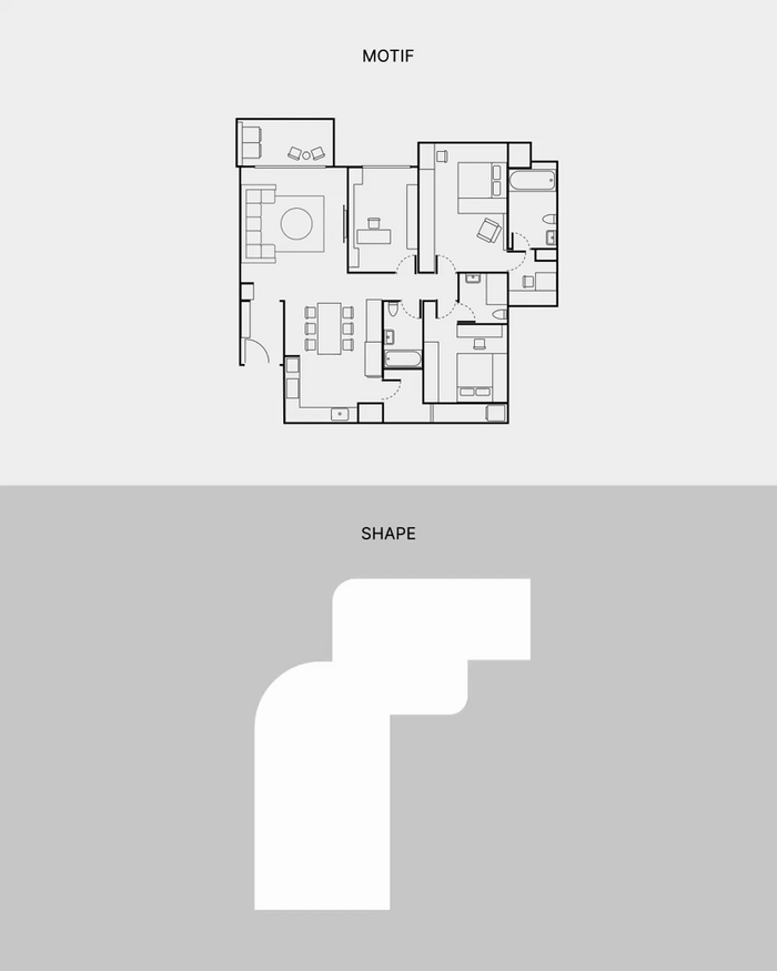
The arch-shaped WEWEHOME logo symbolizes the concept of home while reflecting the brand’s value of offering essential items for our living space. The wordmark logo is also designed with soft curves to harmonize with the arch shape.
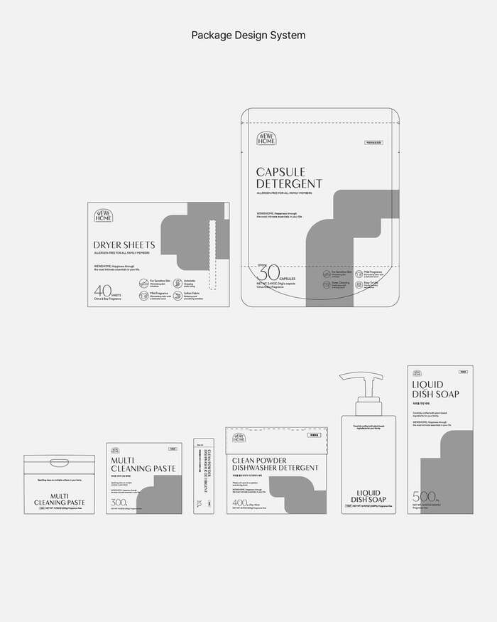
WEWEHOME’s visual elements consist of typography, a color palette, and pattern graphics. The main typeface, Layfort, conveys a modern yet soft image, while the secondary one, F37 Ginger, was chosen for its simple and contemporary style. The color palette and pattern graphics intuitively represent various activities that take place in the kitchen, laundry, bath, and living room, reinforcing the brand’s identity.
Source: www.instagram.com License: All Rights Reserved.

Source: www.instagram.com License: All Rights Reserved.

Source: www.instagram.com License: All Rights Reserved.

Source: www.instagram.com License: All Rights Reserved.

Source: www.instagram.com License: All Rights Reserved.
Source: www.instagram.com License: All Rights Reserved.
Source: www.instagram.com License: All Rights Reserved.
This post was originally published at Fonts In Use