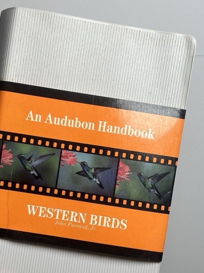
Western Birds. An Audubon Handbook by John Farrand Jr.
Source: www.ebay.com shopskythrift (cropped). License: All Rights Reserved.

Western Birds. An Audubon Handbook by John Farrand Jr. helps readers identify “the over 460 species of birds regularly found east of the Rockies.” It is a lengthy yet compact softcover of 416 pages, 1,314 photographs, and 100,000 words. Published in 1988 by McGraw-Hill, Western Birds is one of several books Massimo Vignelli designed for the National Audubon Society.
The book’s page layouts are built upon a simple two column grid subdivided into ten modules. All text is flush left. Paragraphs are not indented nor are they separated by an empty line. This creates a sharp, mostly uniform line on the left edge of text columns. Their right edge, in contrast, is particularly ragged due to hyphenation being dispensed with all together. Although the lack of paragraph indents and spacing and of hyphenation is somewhat unusual for such a text-heavy book, it is a hallmark of books designed by Vignelli and many of his modernist peers.
The book was typeset by Dix Type in Century Expanded, one of Vignelli’s preferred typefaces. As Vignelli was wont to do, the italic is used liberally throughout. The title on the title page is kerned in Vignelli’s signature tight-not-touching style. Two subsequent section headings are kerned in the same way but the kerning (or, rather, lack thereof) of the rest of text leaves much to be desired. The spacing between the characters of the body text is much more open than the tight headings – just as one would hope and expect. The problem, however, is that for the rest of the book, in both the body and in headings, many letters have awkward gaps yawning between them.
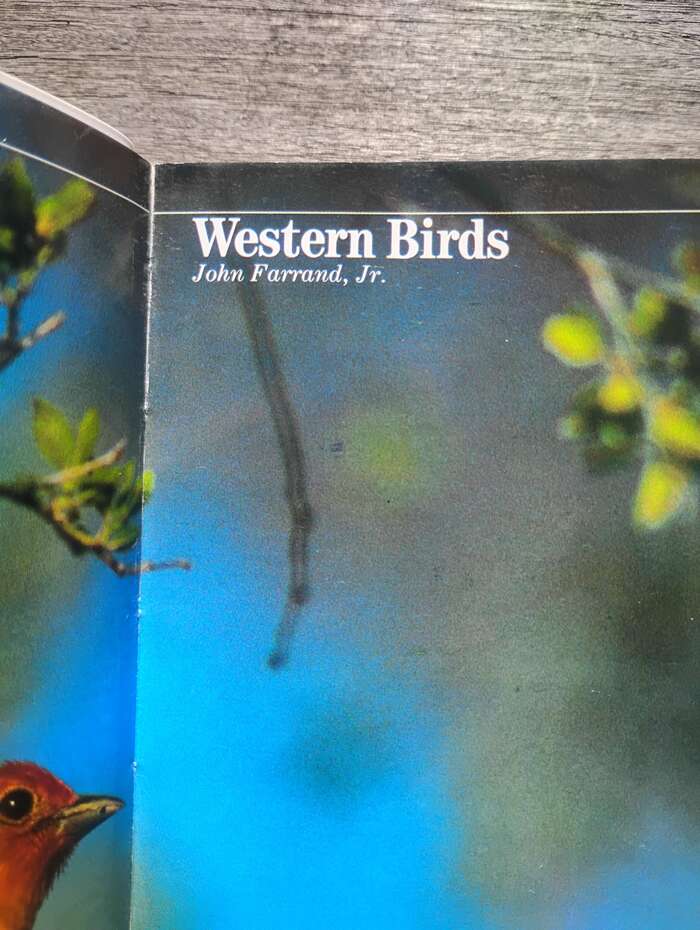
Photo: Spencer Lachmanec. License: All Rights Reserved.
The tightly kerned title with the author’s unkerned name below.
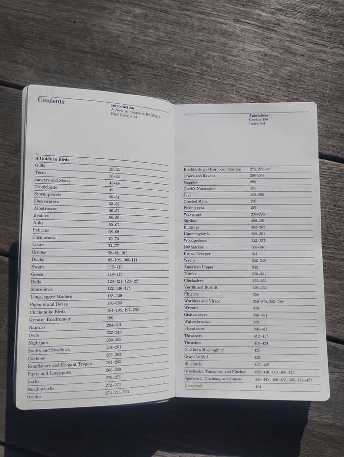
Photo: Spencer Lachmanec. License: All Rights Reserved.
A rare case in Vignelli’s work where text appears to be evenly spaced between rules. Usually when using rules, Vignelli would set the text closer to the rule above than to the one below, creating the impression that text is hung from the rule above. In his Canon, he mentions this as a “small but important detail.”
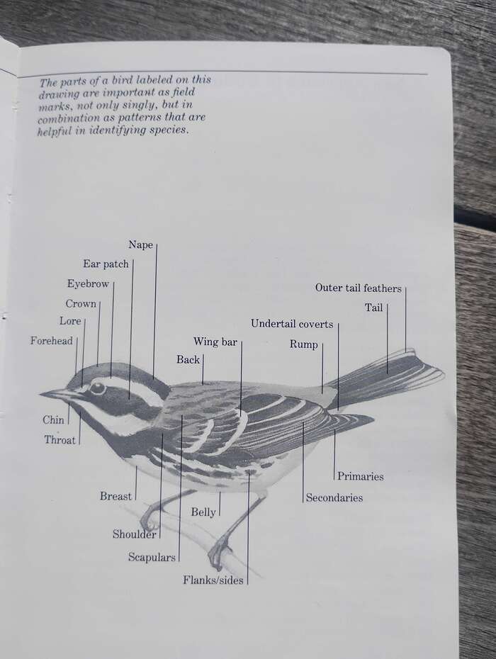
Photo: Spencer Lachmanec. License: All Rights Reserved.
One of 168 black-and-white drawings
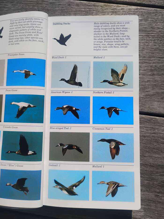
Photo: Spencer Lachmanec. License: All Rights Reserved.
On pages where rules are separated by images or multiple lines of text, the text does look as if it is hung from the rule above.
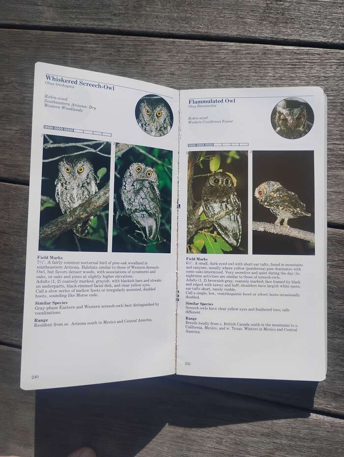
Photo: Spencer Lachmanec. License: All Rights Reserved.
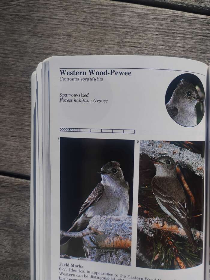
No elements of the layouts for recto and verso pages are mirrored. Instead, each page is uniformly designed as if it was a verso page with the page number always placed on a page’s bottom left.
License: All Rights Reserved.
A quite obvious example of the book’s kerning issues
Photo: Spencer Lachmanec. License: All Rights Reserved.
One of three headings where text is kerned in a manner one would expect from a Vignelli-designed book.
License: All Rights Reserved.
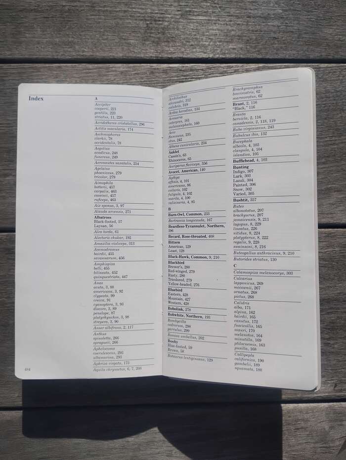
The first page of the Index is numbered but all subsequent pages are not.
Source: www.ebay.com shopskythrift (cropped). License: All Rights Reserved.
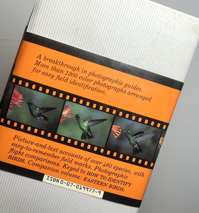
Back cover with description in italic. The ISBN is added in OCR-A.
This post was originally published at Fonts In Use