Webkikker

Source: www.webkikker.com Photo: Jasper Bosman. License: All Rights Reserved.


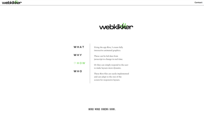
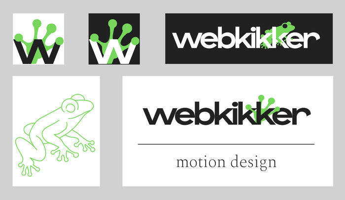
Webkikker was created to be used as my professional design identity. I work with Rive, a platform for creating interactive motion graphics (a famous example of Rive In Use is Duolingo). “Kikker” is Dutch for frog, and “opkikker” is Dutch for “boost”, so the name was created to suggest a positive effect/refresher for potential clients’ branding.
As the name contains no fewer than three k’s and two e’s, it has a tendency to look quite bland when set in many popular typefaces. That’s why Zoom – designed by Florian Paizs and available from The Designers Foundry felt like a great choice for the logotype. The extended r adds character at the end of a word that’s unremarkable in terms of shapes, and the wide letter shapes feel warm yet trendy. The typeface reminds me of Agrandir’s playfulness, without feeling disjointed. Zoom, a variable font, is used here in just its normal width and medium weight.
Zoom comes with many alternates to increase or decrease its innate quirkiness, depending on the vibe the designer is going for. For now, all I have used is its alternate t to save space on the mobile version of the website. On the animated main page, Production Type’s Spectral, designed by Jean-Baptiste Levée, is used for the short paragraphs of text. Kilotype’s Snapshot designed by Selma Losch, is used to announce upcoming examples of motion design projects.
Source: www.webkikker.com Photo: Jasper Bosman. License: All Rights Reserved.
Source: www.webkikker.com Photo: Jasper Bosman. License: All Rights Reserved.
This post was originally published at Fonts In Use