Industrie Africa
Source: www.instagram.com Industrie Africa. License: All Rights Reserved.


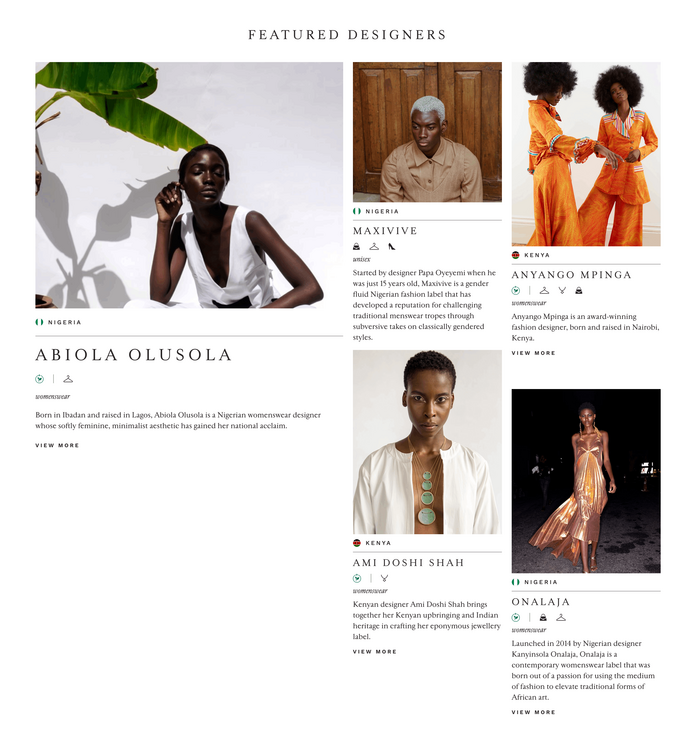
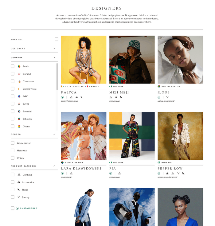
Industrie Africa started in 2018 as a platform to introduce the world to top-class fashion designers from the African continent. Developed further into an online marketplace in 2020, the website today includes the editorial blog section “Imprint” and allows to research for countries and designers’ profiles. In 2025 the first analogue concept store was opened inside the tourist resort of Bawe Island located in the Zanzibar Channel.
What developed so well is the work of founder Nisha Kanabar who was born in Tanzania to parents of Indian descent. After her Bachelor in Business Administration at New York’s Parsons School of Design in 2013, she pursued a career in communication and public relations in the field of fashion and luxury goods. Her path took her around half the globe to such prestigious workplaces as Vogue New York and Vogue Mumbai.
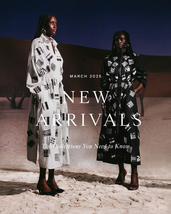
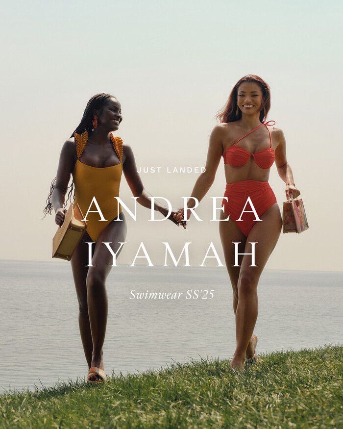
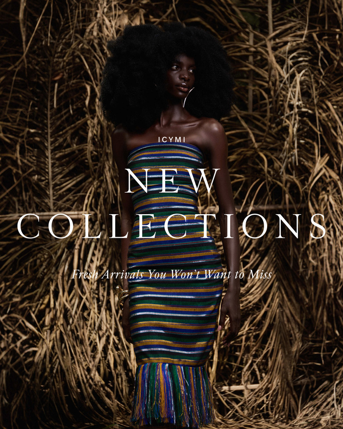
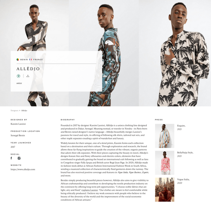
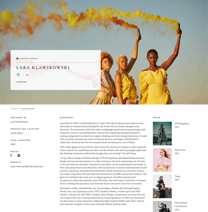
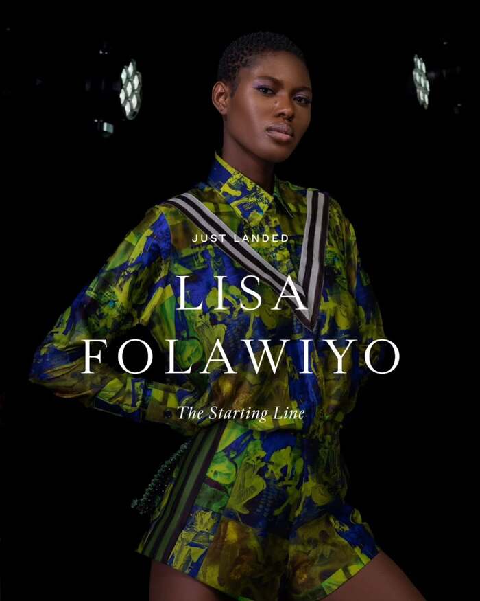
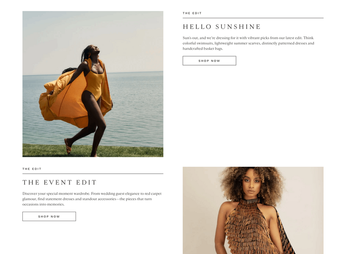
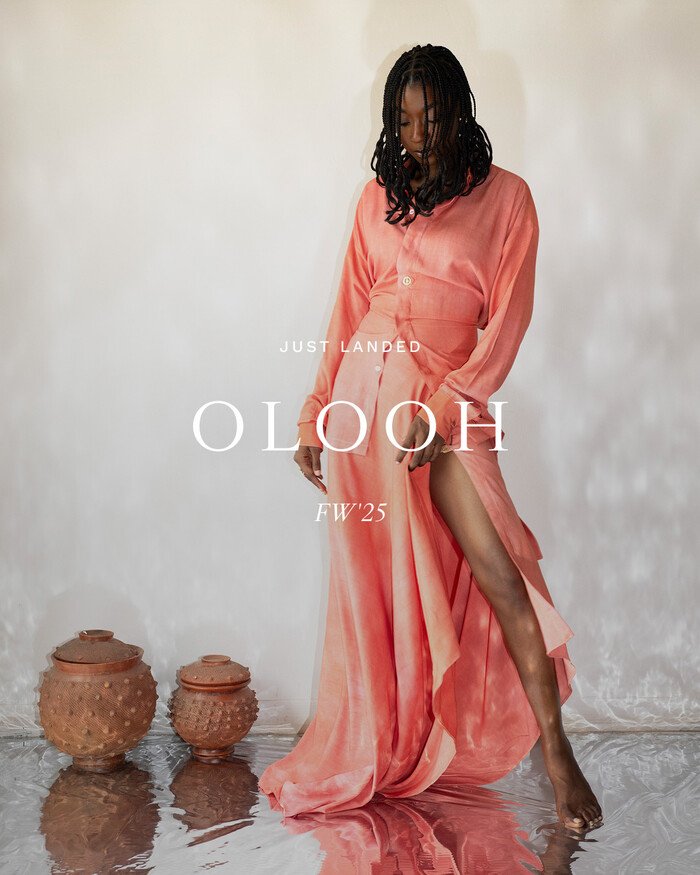
Industrie Africa’s website focuses on white as the main color. Apart from a few spots where earthy tones are used for emphasis, the colorful impact stems from the gorgeous fashion photography showcased. The typography follows two major lines: the use of generously tracked all-caps typesetting for headlines and straight-forward left-aligned typesetting for the reading text.
The font that coins the style of Industrie Africa is the seriffed roman Cardinal, designed by the team at Production Type under the guidance of Jean-Baptiste Levée. Cardinal is a complex design system encompassing the three basic variants Classic, Fruit, and Photo. While Fruit and Photo can be seen as two different display variants that share tight spacing, the Classic variant is a roman suitable for extended reading. Cardinal Classic takes references in the Garamont and Granjon styles without following the Renaissance pattern too strictly. As an extra, it offers ascenders and descenders in three different lengths, Short, Mid and Long, that enable graphic designers to pick the perfect style for a given purpose.
In use on the website presented here is Cardinal Classic Short, in Regular and Italic. For the running titles and functional elements it is complemented with Work Sans by Wei Huang, a rationalist (not geometric) sans serif inspired by the early Grotesque genre.

Source: industrieafrica.com Industrie Africa. License: All Rights Reserved.
Source: www.instagram.com Industrie Africa. License: All Rights Reserved.
Source: industrieafrica.com Industrie Africa. License: All Rights Reserved.
Source: www.instagram.com Industrie Africa. License: All Rights Reserved.
Source: industrieafrica.com Industrie Africa. License: All Rights Reserved.
Source: industrieafrica.com Industrie Africa. License: All Rights Reserved.
Source: www.instagram.com Industrie Africa. License: All Rights Reserved.
Source: industrieafrica.com Industrie Africa. License: All Rights Reserved.

Source: www.instagram.com Industrie Africa. License: All Rights Reserved.
Source: industrieafrica.com Industrie Africa. License: All Rights Reserved.
Source: www.instagram.com Industrie Africa. License: All Rights Reserved.

Source: industrieafrica.com Industrie Africa. License: All Rights Reserved.

Source: www.instagram.com Industrie Africa. License: All Rights Reserved.
This post was originally published at Fonts In Use