Viridian
Source: studyhall.design ©2025 Study Hall. License: All Rights Reserved.

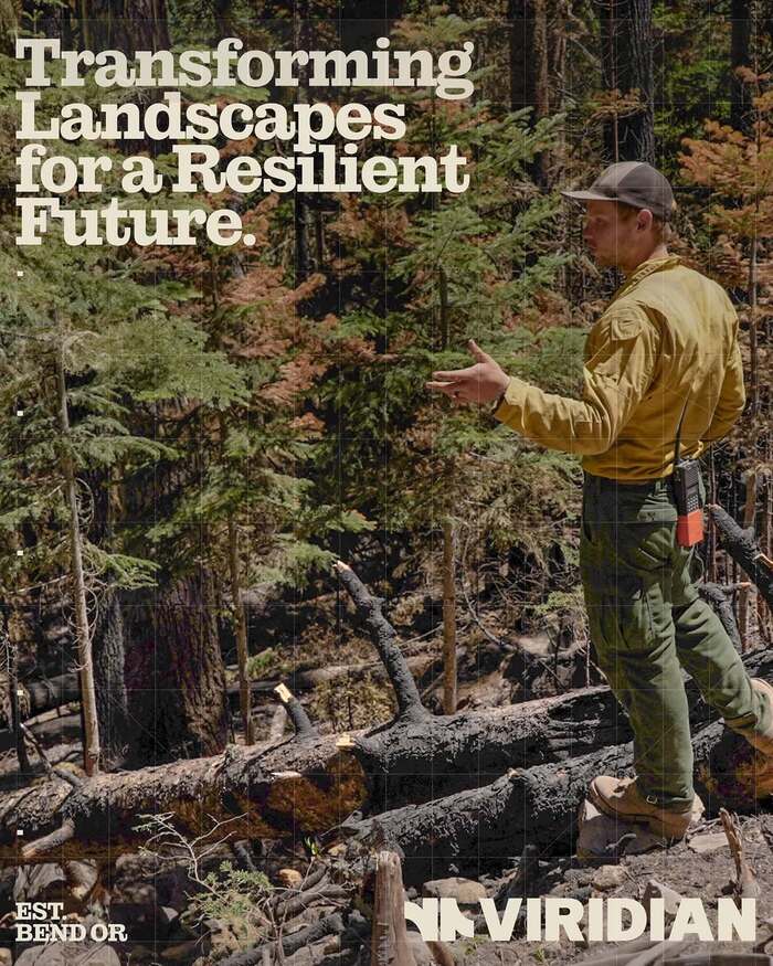
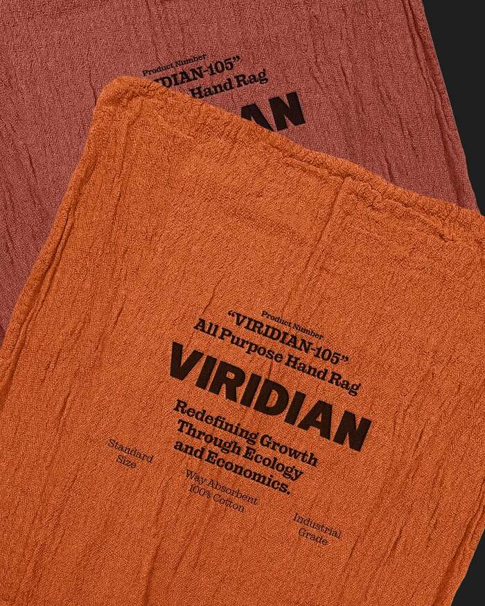
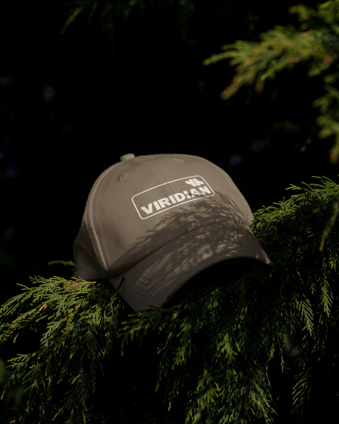
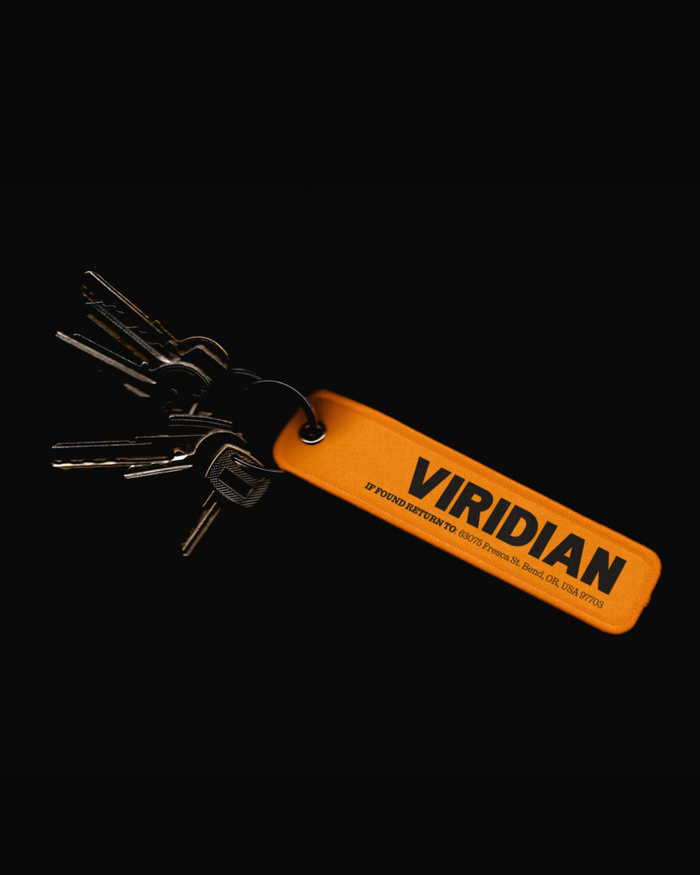
Viridian Ecosystems is an Oakland-based environmental services outfit specializing in data-driven land restoration and natural capital strategies.
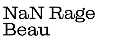
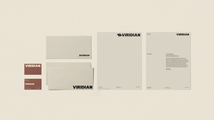
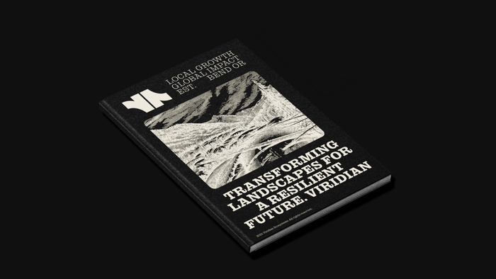
The logo features a monochrome abstract sign figuring a kind of crossroads but also a zoomed-in typographic detail, where the bowl of a p and q meets the stem. The all-caps wordmark is set in a slightly modified American Grotesk Black, noticeable with its high-waist R and narrower N.
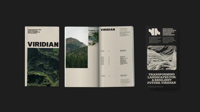
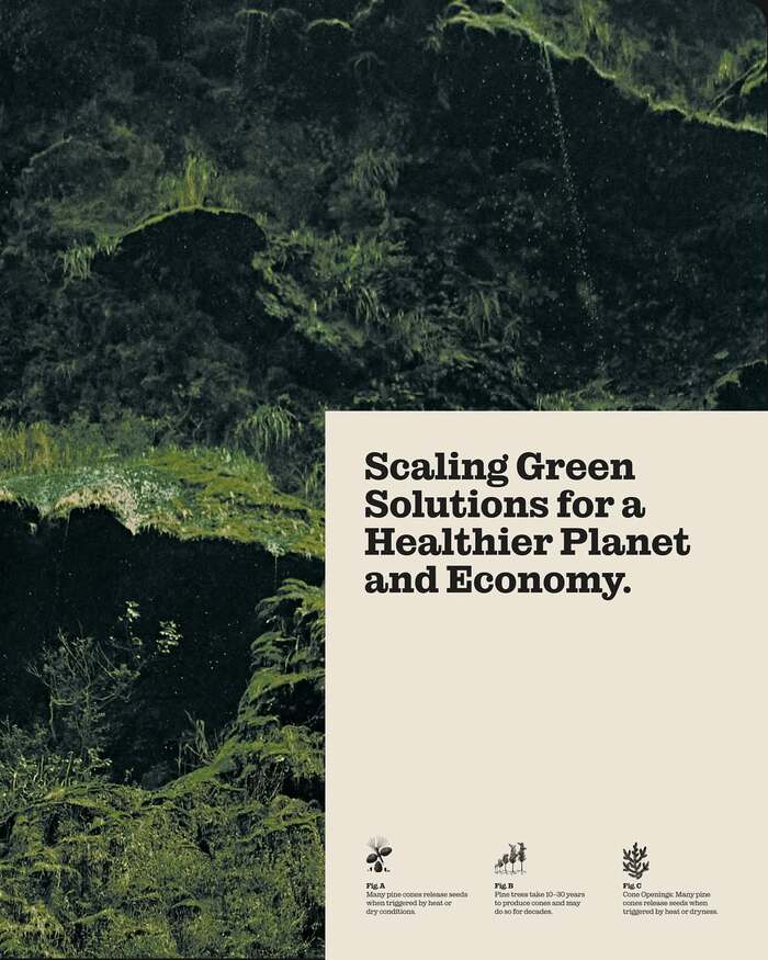
Study Hall chose the recently-released NaN Rage Beau as the main typeface for the identity, in two weights. The choice of a slab serif from titles to running text is a refreshing one in today’s landscape dominated by sleek sans serifs for corporate text fonts. Beau’s rounded terminal bring some warmth to the identity. Coupled with the beige and almost-black colours and the grain in the photos, it gives a nostalgic kodachrome-technicolour-era to the whole.
See the full case study.
Source: studyhall.design ©2025 Study Hall. License: All Rights Reserved.
Source: studyhall.design ©2025 Study Hall. License: All Rights Reserved.
Source: studyhall.design ©2025 Study Hall. License: All Rights Reserved.
Source: studyhall.design ©2025 Study Hall. License: All Rights Reserved.

Source: studyhall.design ©2025 Study Hall. License: All Rights Reserved.

Source: studyhall.design ©2025 Study Hall. License: All Rights Reserved.

Source: studyhall.design ©2025 Study Hall. License: All Rights Reserved.

Source: studyhall.design ©2025 Study Hall. License: All Rights Reserved.
Source: studyhall.design ©2025 Study Hall. License: All Rights Reserved.
Source: studyhall.design ©2025 Study Hall. License: All Rights Reserved.
Source: studyhall.design ©2025 Study Hall. License: All Rights Reserved.
This post was originally published at Fonts In Use