Omidyar Network

Source: www.20-something.com License: All Rights Reserved.


From design studio 20(Something):
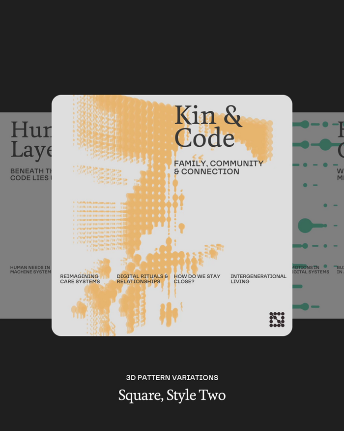
How can we ensure technology serves humanity, rather than undermines it? Omidyar Network (ON), the US philanthropic organisation founded by Pierre and Pam Omidyar, challenged us to create a brand identity reflecting their commitment to embedding humanity into our digital future. With nearly $2 billion invested, ON is one of the largest philanthropic funds dedicated to guiding technological advancement towards collective power, prosperity and possibility.
Our brief was to develop an identity centred on collaboration, collective achievement and responsible innovation. We crafted a distinctive wordmark and emblem symbolising unity and strength. Rejecting typical philanthropic aesthetics, our dynamic design system was inspired by authentic human interactions, visually highlighting the vital link between people and technology. Typography was chosen to embody ON’s vision, pairing the warmth of Feijoa Medium with the future-oriented precision of F37 Lineca.

Source: www.20-something.com License: All Rights Reserved.

Source: www.20-something.com License: All Rights Reserved.

Source: www.20-something.com License: All Rights Reserved.

Source: www.20-something.com License: All Rights Reserved.
This post was originally published at Fonts In Use