VIMU
Source: www.itsnicethat.com Try Design. License: All Rights Reserved.


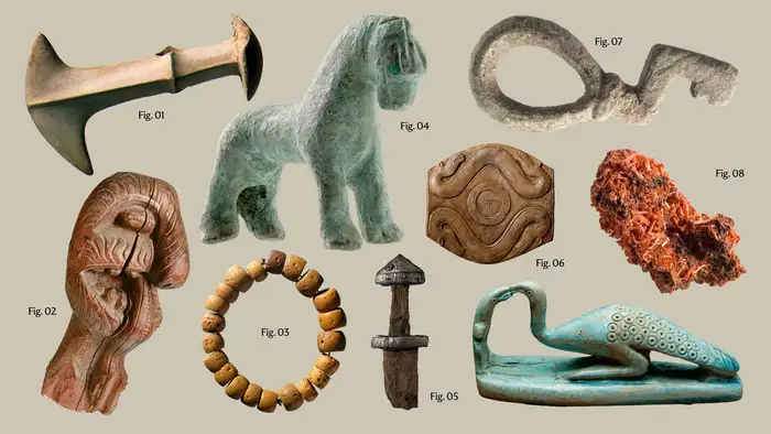
The Vitenskapsmuseet (VIMU), one of Norway’s oldest museums and home to one of the largest collections of artefacts of Norway’s environmental and cultural history, needed a more distinct identity to attract a new audience. The team of Try Design studio worked hard to design a clear and functional image of the museum while preserving history.
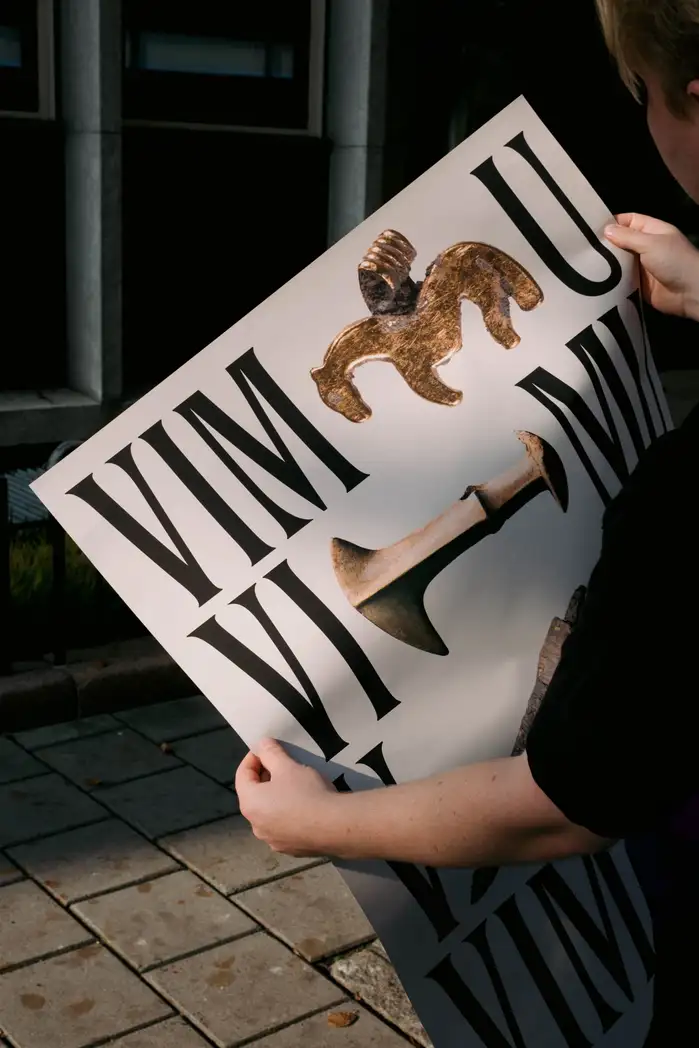
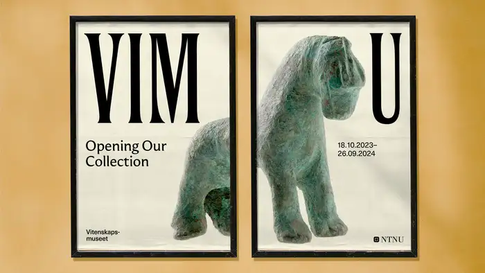
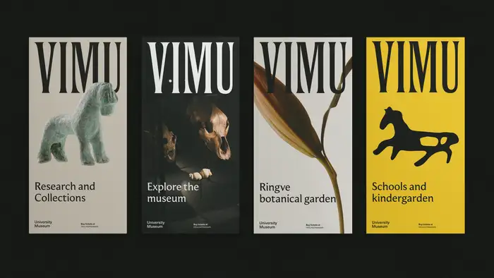
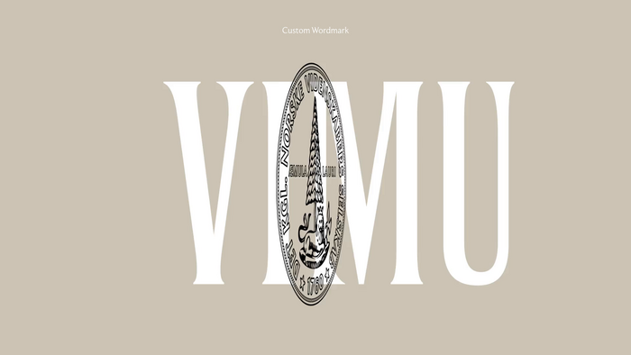
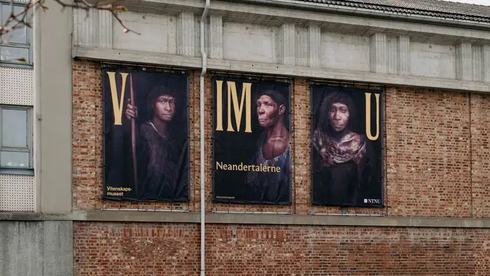
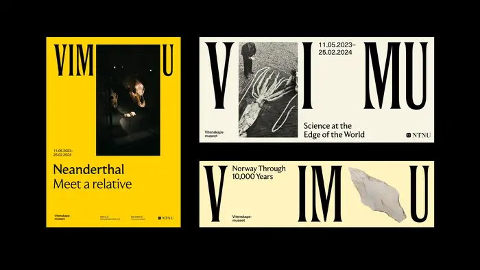
They realized it was necessary to modify and shorten the name of the museum (with keeping only four letters). They collaborated with Good Type Foundry to create a custom wordmark of the institution. The ultra-condensed lettering is paired with typography set in Moulin from Commercial Type, and a yet unidentified grotesk (Neue Haas Unica and Untitled Sans are similar).
Throughout the identity, the concept of ‘opening up’ is translated through sliding typography. Artefacts emerge from the sliding type, populating posters, banners and the website, creating a sense of curiosity and calling for further inspection.
Find more images and animations on It’s Nice That.

Source: www.itsnicethat.com Try Design. License: All Rights Reserved.
Source: www.itsnicethat.com Try Design. License: All Rights Reserved.
Source: www.itsnicethat.com Try Design. License: All Rights Reserved.
Source: www.itsnicethat.com Try Design. License: All Rights Reserved.
Source: www.itsnicethat.com Try Design. License: All Rights Reserved.
Source: www.itsnicethat.com Try Design. License: All Rights Reserved.
Source: www.itsnicethat.com Try Design. License: All Rights Reserved.
This post was originally published at Fonts In Use