Vermilion
Published April 11, 2024
By FontsInUse
Contributed by Katie Bevan
License: All Rights Reserved.


License: All Rights Reserved.
License: All Rights Reserved.
This post was originally published at Fonts In Use
License: All Rights Reserved.
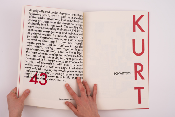
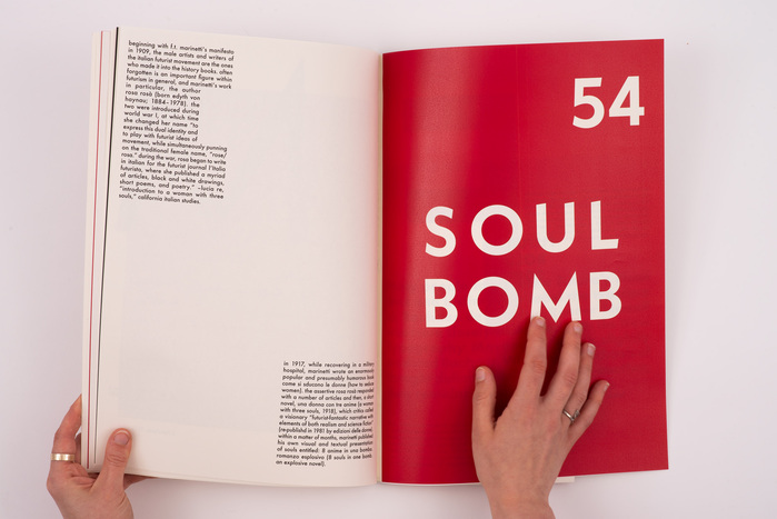
Vermilion is a self-published zine conducting a debate between the creators of hierarchy within graphic design.
The two typefaces used represent the two sides of the argument: early Western books before the year 1500: incunabula. In this publication, they are represented by Adobe Jenson, designed in 1995 by Robert Slimbach, referencing the type used by Nicolas Jenson.
On the other hand, Jan Tshichold’s New typography is represented by Paul Renner’s Futura. Jan Tschichold created “Die Neue Typografie” and arguing for new guidelines establishing typographic hierarchy. The use of vermillion is a reference to the incunabula, which was often illuminated using colour, manually creating hierarchy on the page.
License: All Rights Reserved.
License: All Rights Reserved.
This post was originally published at Fonts In Use
Read full story.
WRITTEN BY
FontsInUse
An independent archive of typography.
More from FontsInUse