School and Society through Science Fiction
Source: archive.org Internet Archive. License: All Rights Reserved.


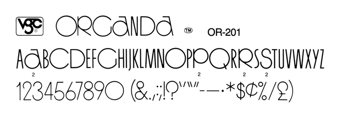
In the late 1960s and early 1970s, the renewed interest in Art Deco spawned a number of typefaces with perfectly circular rounds. Since other letters are kept much narrower, those designs yield an interesting (but agitated) look. Among monolinear sans serifs, this includes Epic (1968), Queen (1969), Herculoid (1970), and ITC Busorama (1970). In 1972, VGC released their addition to the genre: Organda, designed by Franz Heigemeir.
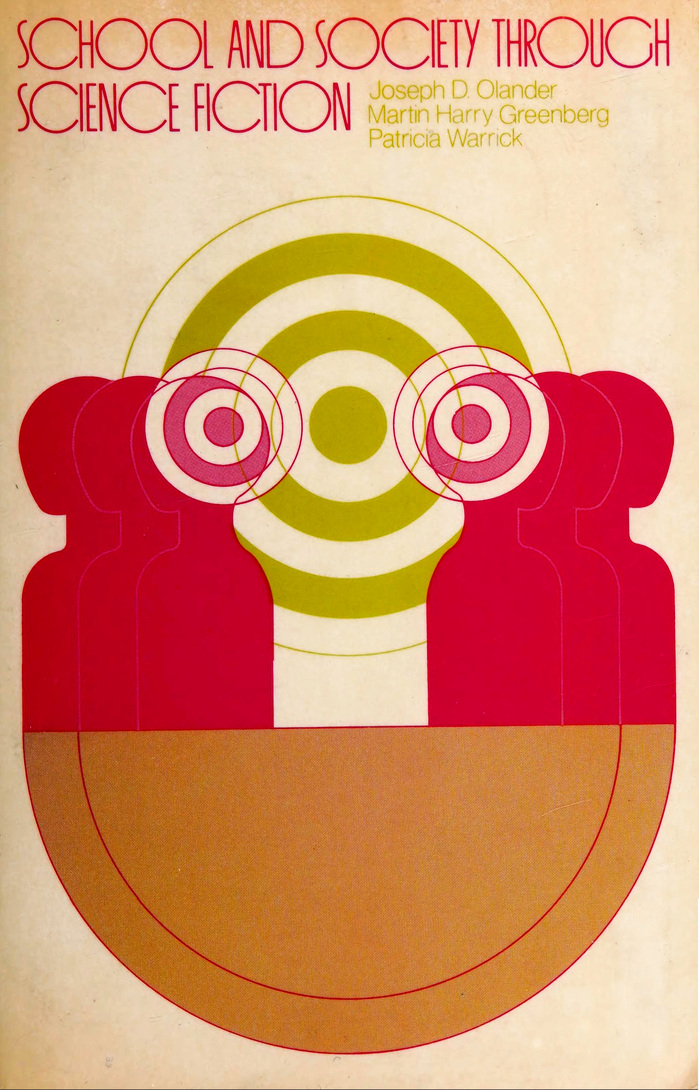
In 1974, Organda was used on the cover of an anthology titled School and Society Through Science Fiction, compiled by Joseph D. Olander, Martin Harry Greenberg, and Patricia Warrick. The design is uncredited. Chances are it’s by Todd Sanders, who designed a related cover for a book by the same authors, also published by Rand McNally in 1974.
Source: www.flickr.com Stephen Coles (detail). License: CC BY-NC-SA.
The medium weight of Organda, with alternates, as shown in VGC Alphabet Library, 14th ed., 1988.
This post was originally published at Fonts In Use