Ver Sacrum wines
Published April 15, 2024
By FontsInUse
Contributed by Florian Hardwig

Source: diegoballester.blogspot.com License: All Rights Reserved.


Source: diegoballester.blogspot.com License: All Rights Reserved.
Source: www.pngitem.com License: All Rights Reserved.
This post was originally published at Fonts In Use
Source: diegoballester.blogspot.com License: All Rights Reserved.
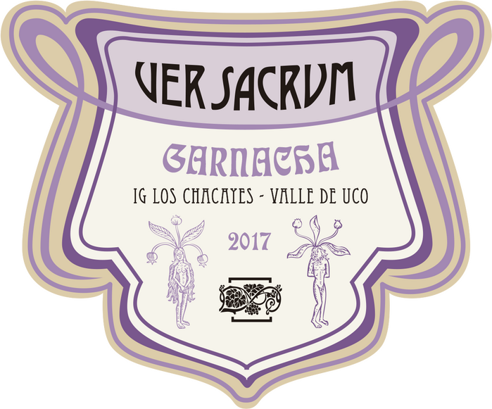
Diego Ballester is an Argentine designer specialized on wine labels. When vintner Eduardo Soler and friends launched a new series of wines made from Mediterranean grape varieties, he let the name determine the design direction. Ver Sacrum is Latin for “sacred spring”, but better known as the title of the magazine published by the Vienna Secession. The three typefaces Ballester selected were all popular in the Art Nouveau era: Desdemona is a version of Quaint Roman from 1886, Eccentric was first cast in 1881, and Eckmann is the quintessential German Jugendstil typeface, issued in 1900.
Source: diegoballester.blogspot.com License: All Rights Reserved.
Source: www.pngitem.com License: All Rights Reserved.
This post was originally published at Fonts In Use
Read full story.
WRITTEN BY
FontsInUse
An independent archive of typography.