Vanzzz visual identity
Source: www.thedistrict.co.uk The District. License: All Rights Reserved.


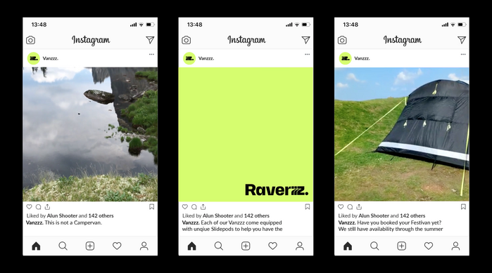
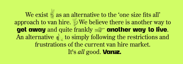
Vanzzz are a new concept in camper van hire which aims to represent ‘the antidote to the current one size fits all approach’.
From design studio The District:
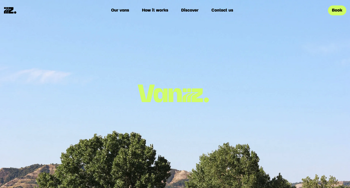
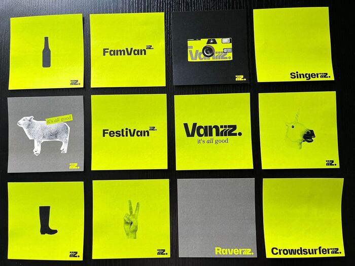
We were appointed to brand them from the ground up. Our role was to ensure they launched with impact and to ensure people 'got' this innovative new concept. Focusing first on the verbal we named the vans based on their place in the world, and anchored everything in the joyous and reassuring strapline “it's all good”.
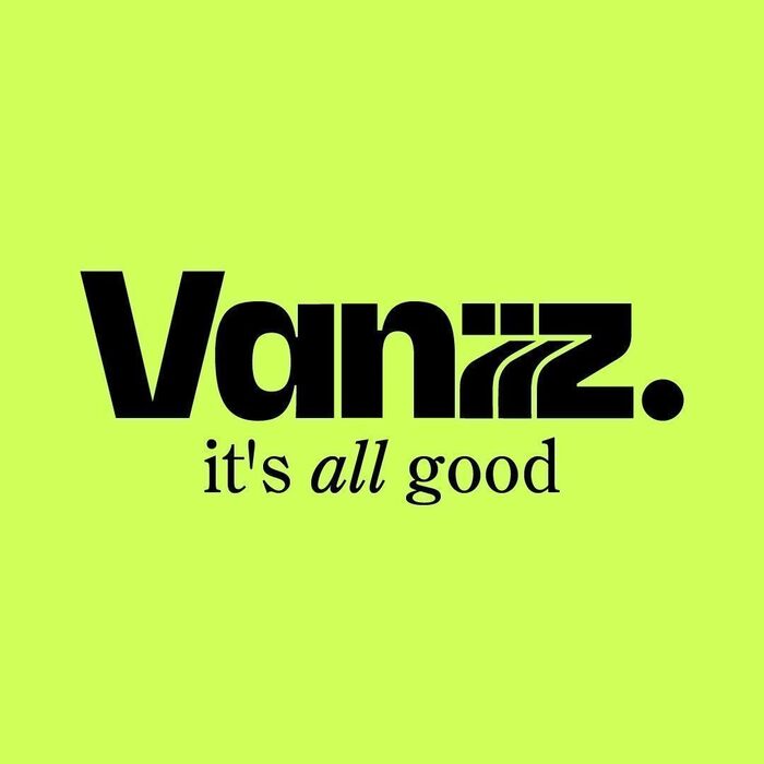
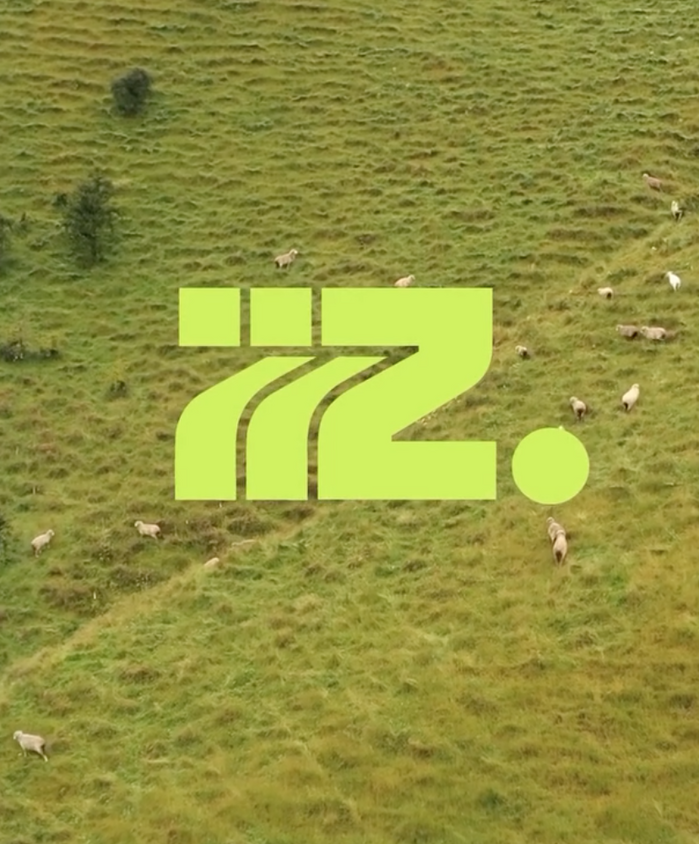
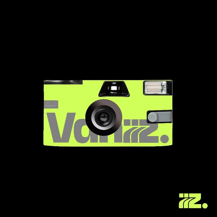
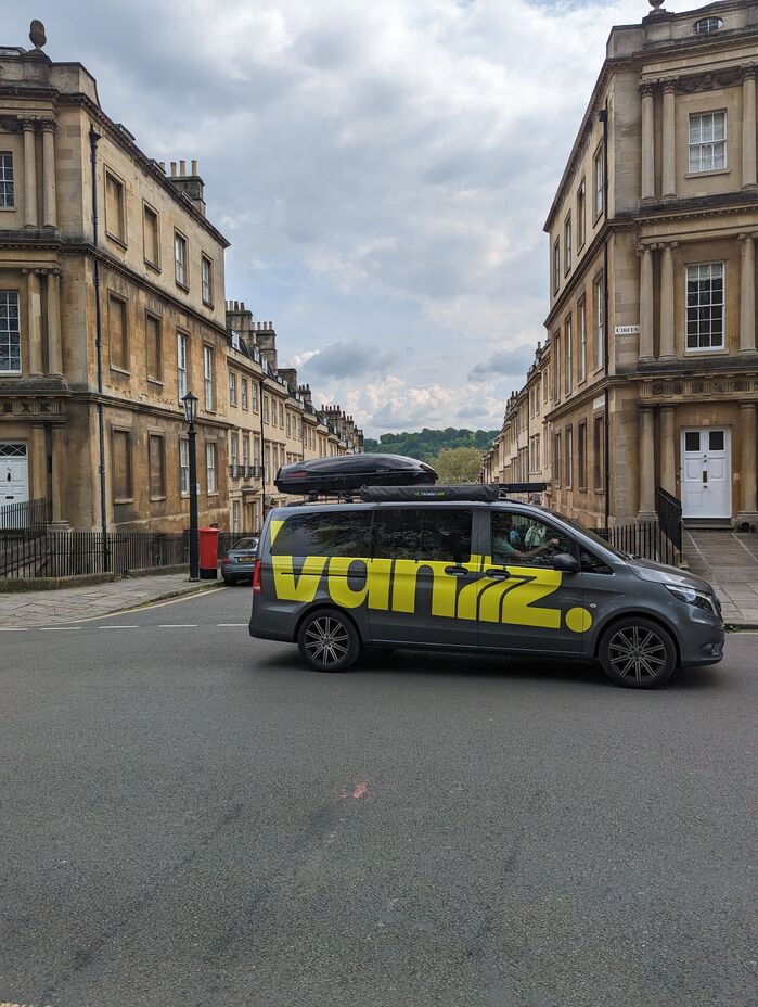
The identity was created around a wordmark, set in Margo+Beuys, ending in three stacked z’s to emphasise the flexible nature of the vans. The concept is boldly and brightly applied on vehicle livery and in off- and online communications. The supporting typeface is Times New Roman.
Source: www.thedistrict.co.uk License: All Rights Reserved.

Source: www.thedistrict.co.uk License: All Rights Reserved.
Source: www.thedistrict.co.uk License: All Rights Reserved.
Source: www.thedistrict.co.uk License: All Rights Reserved.
Source: www.thedistrict.co.uk License: All Rights Reserved.
Source: www.thedistrict.co.uk License: All Rights Reserved.
Source: www.thedistrict.co.uk License: All Rights Reserved.
Source: www.thedistrict.co.uk License: All Rights Reserved.
This post was originally published at Fonts In Use