Underdays visual identity
Published May 9, 2023
By FontsInUse
Contributed by Caramba Agency

License: All Rights Reserved.


License: All Rights Reserved.
License: All Rights Reserved.
License: All Rights Reserved.
License: All Rights Reserved.
License: All Rights Reserved.
This post was originally published at Fonts In Use
License: All Rights Reserved.
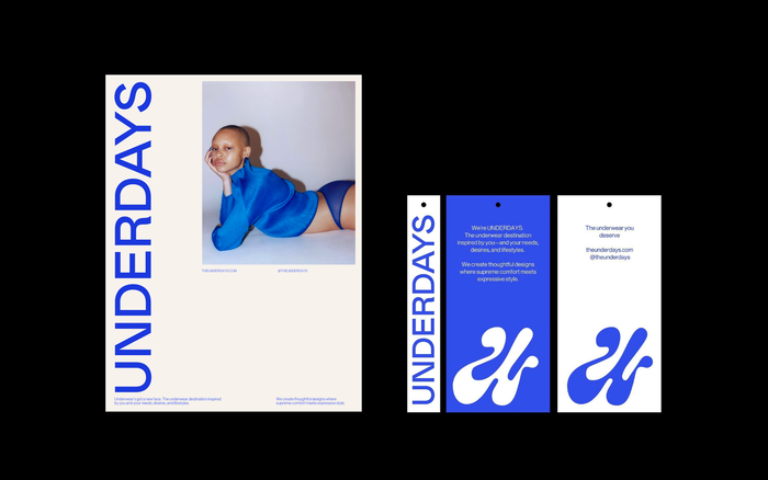
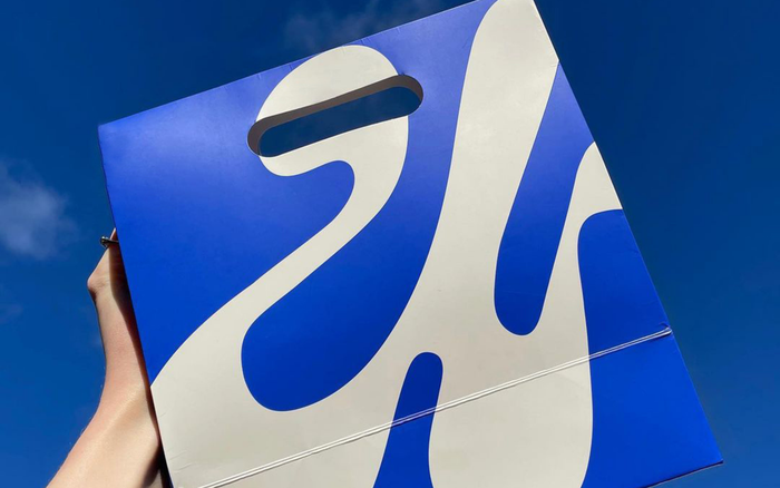
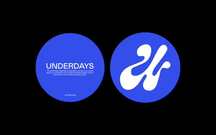
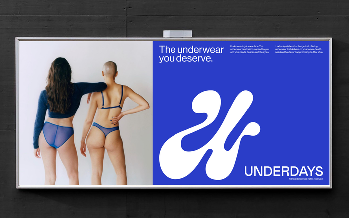
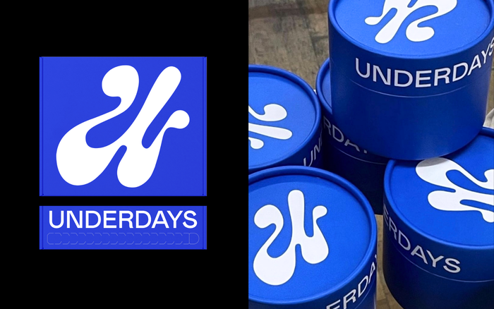
Underdays is a London based underwear brand for all women of all shapes and sizes. For their branding, we created a minimalist and colorful visual identity. The fun side of the brand is reflected via the U monogram, representing a unique and strong symbol that provides a real personality to the brand. The branding reflects this through a modern and sleek design, with vibrant colors and organic shapes to represent the diversity and uniqueness of everyone. The branding of Underdays was created to visually reflect inclusivity and diversity.
The logo typeface is Mabry, with information set in Neue Haas Grotesk.
Photography by Charlie Gates.
License: All Rights Reserved.
License: All Rights Reserved.
License: All Rights Reserved.
License: All Rights Reserved.
License: All Rights Reserved.
This post was originally published at Fonts In Use
Read full story.
WRITTEN BY
FontsInUse
An independent archive of typography.