Überbrückungsfonds
Source: christophrauscher.de Christoph Rauscher. License: All Rights Reserved.


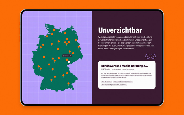
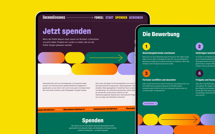
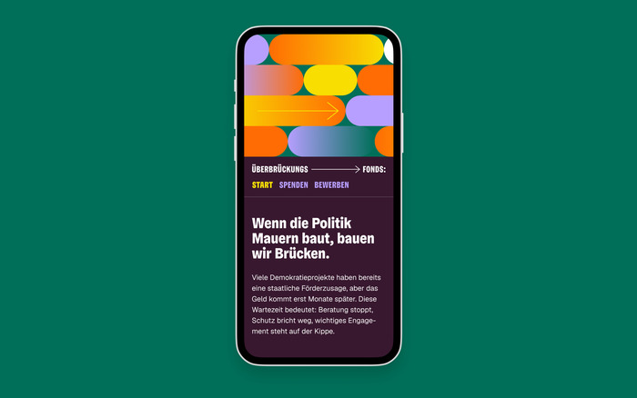
The Überbrückungsfonds (“Bridging Fund”) was established by the German NGO FragDenStaat to ensure that delayed government payments do not threaten the existence of small organizations and projects. Christoph Rauscher collaborated with the team to develop the brand identity, website, and social media assets. For the typographic system, he selected Geist Sans by Vercel for body text and Gregory Grotesk Condensed for headlines. Rauscher explains his approach:
For the bridging fund, I was looking for a serious yet friendly sans serif font to complement the clear geometric shapes and movements. It was to be used for the logo and headline and an addition to the very quiet body font (Geist by Vercel). I specifically chose the condensed style because the project primarily communicates in German and the word “Überbrückungsfonds” is long and somewhat cumbersome. Gregory Condensed has character, but is still serious and, thanks to the round dots on the i’s, also super positive – a perfect fit for the project!
Source: christophrauscher.de Christoph Rauscher. License: All Rights Reserved.

Source: christophrauscher.de Christoph Rauscher. License: All Rights Reserved.

Source: christophrauscher.de Christoph Rauscher. License: All Rights Reserved.

Source: christophrauscher.de Christoph Rauscher. License: All Rights Reserved.
Source: christophrauscher.de Christoph Rauscher. License: All Rights Reserved.
This post was originally published at Fonts In Use