Type Directors Club website (2025)

Source: tdc.org License: All Rights Reserved.

The latest incarnation of the TDC website uses Gamay.
Gamay is the most recent release by Darden Studio. The dashing sans comes in a family of six widths, all in weights from Thin to Black, in upright and italic. The easiest way to use this wide palette to full capacity is with the variable version. That’s exactly what KUDOS did. The studio responsible for the redesign employed the font’s axes for weight and width and dialed in those styles that are the best match for the respective text elements: headings are shown in caps from a bold expanded style, while body copy is spec’d in a lighter weight of regular proportions. On some pages, intro texts feature Gamay’s handsome italic.
We’re honored to see Gamay in use as the new visual voice of one of the design world’s most respected institutions.
Gamay was designed by Viktoriya Grabowska, a talented type designer based in Poland who also teaches at the University of Arts in Poznań. Vika has been a member of Darden Studio since 2017. In 2020, her addition to the Birra Flight, Birra Saison, was awarded a Certificate of Typographic Excellence by the Type Directors Club.
Source: tdc.org License: All Rights Reserved.
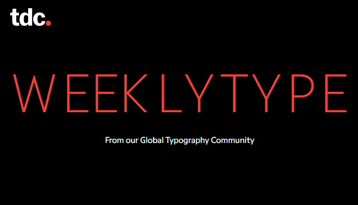
The Weekly Type header shows an animated type weight gradient hinting at Gamay’s range of styles.

Source: tdc.org License: All Rights Reserved.
Selecting the red dot brings up the menu, with items presented in expanded caps from Gamay Medium. On hover, the font weight increases.

Source: tdc.org License: All Rights Reserved.
The section about the TDC’s traveling exhibition presents dates and locations in contrasting weights.

Source: tdc.org License: All Rights Reserved.
Key figures from the lastest competition are brought to life by Gamay’s clear-cut numerals – here used in both tabular and proportional varieties.

Source: tdc.org License: All Rights Reserved.
The section about TDC Ascenders and Medalists reverses the color scheme, featuring white text against red.

Source: tdc.org License: All Rights Reserved.
Detail from the page about TDC medalist Margaret Calvert, in bold italic and upright styles

Source: tdc.org License: All Rights Reserved.
The page about the Beatrice Warde Scholarship highlights the most important bits in bold, with italic used for book titles.
Source: tdc.org License: All Rights Reserved.

Source: tdc.org License: All Rights Reserved.
Detail from an interview with Jess Goldsmith, using bold caps for the questions and italic for the pull quote

Source: tdc.org License: All Rights Reserved.
This post was originally published at Fonts In Use