Twin Cities Marathon poster
Source: www.slade.studio License: All Rights Reserved.

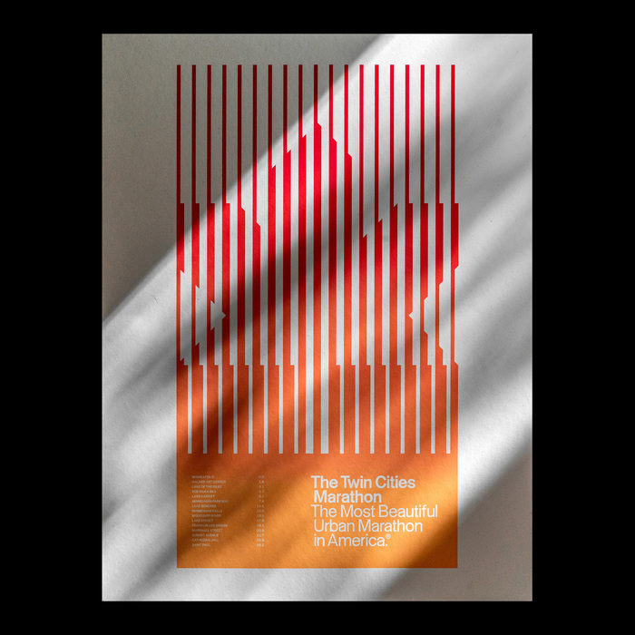
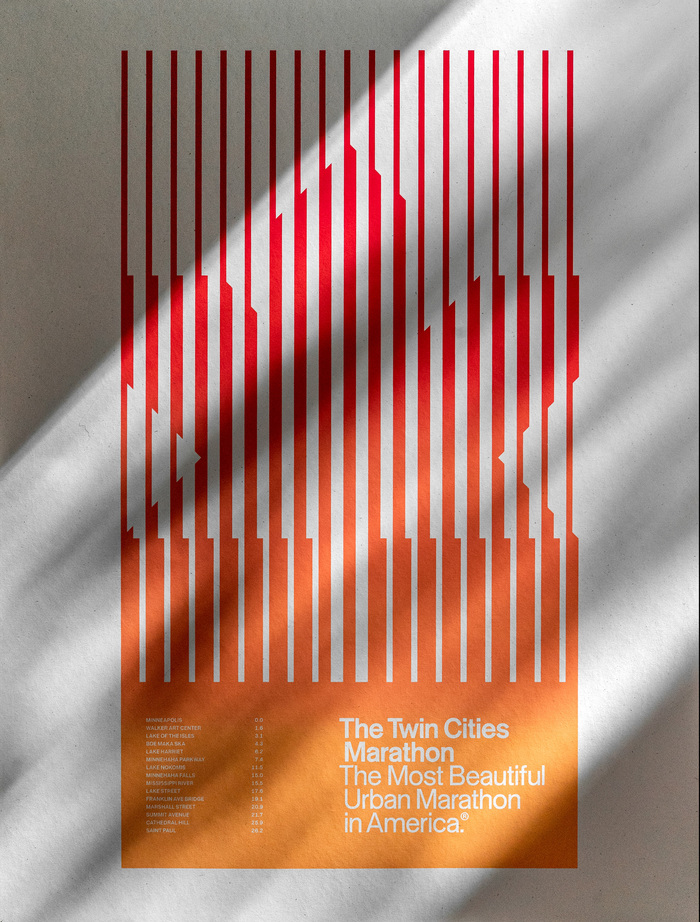
This poster was made for the Twin Cities Marathon Poster Show, which invited local artists/designers to create “a piece inspired by the beauty and energy of the marathon: the sights, sounds, highlights, and landmarks that capture the spirit of the marathon and the Twin Cities community.”
The maple leaf is widely used in TCM promotions (the leaves are often changing color on the course around the event), but I wanted to abstract it a bit and skew more mid-century. As a runner myself, most event posters aren’t terribly interesting; I wanted to make something that felt like it could have been rolled up in my dad’s attic after he ran the marathon in some waffle iron Nikes.
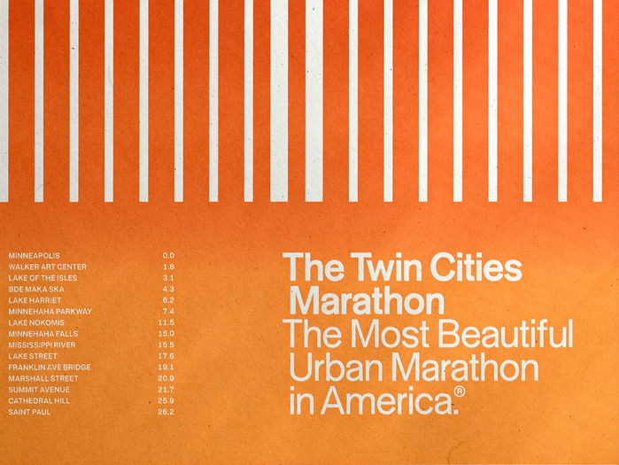
Tausend Plakat was a great choice for the supporting typography – more personable than a strict Helvetica, even if less “period-accurate.” While not required, the ® symbol made it feel more contemporary. To round out the poster, I included fifteen waypoints along the course between Minneapolis and St. Paul in small type.
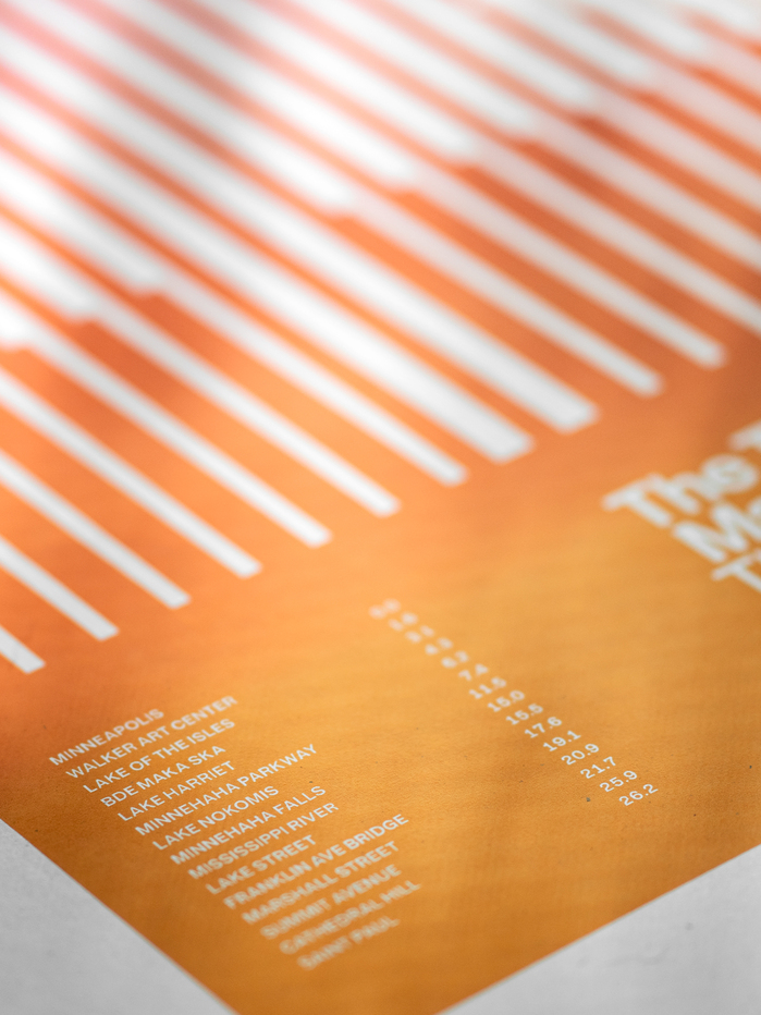
Screenprinted with a split fountain by Night Swim Project on a thick, flecked 19″×25″ French Paper Co. stock.
Source: www.slade.studio License: All Rights Reserved.
Source: www.slade.studio License: All Rights Reserved.
Source: www.slade.studio License: All Rights Reserved.
This post was originally published at Fonts In Use