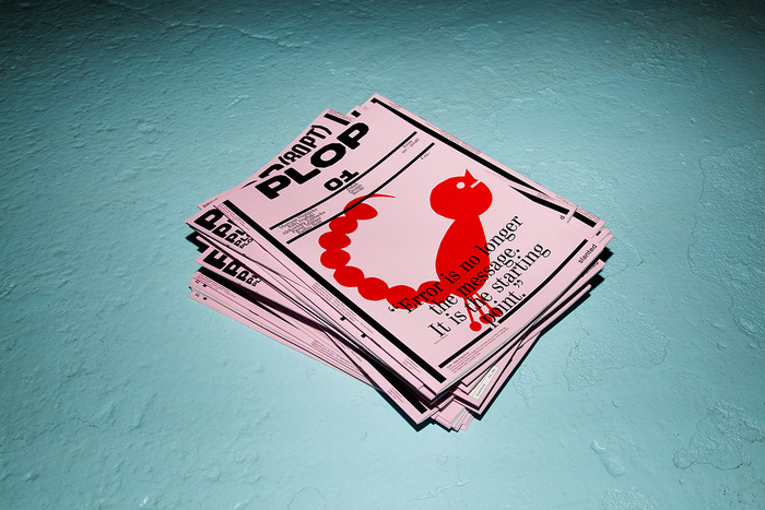
PLOP #01—Polish Design Revue
Source: www.slanted.de Photo: Slanted Publishers. License: All Rights Reserved.


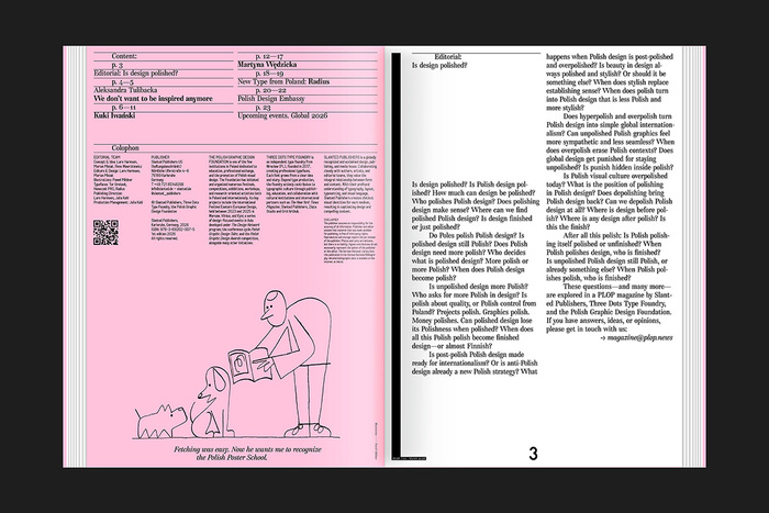
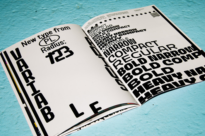
Is Polish design polished—or is polish the design? PLOP #01—Polish Design Revue
explores the tension between Polish identity, global aesthetics, and the endless act of polishing. Through sharp questions and critical perspectives, this quarterly revue investigates what happens when Polish design becomes polished, overpolished, depolished—or something entirely new.
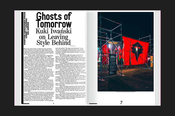
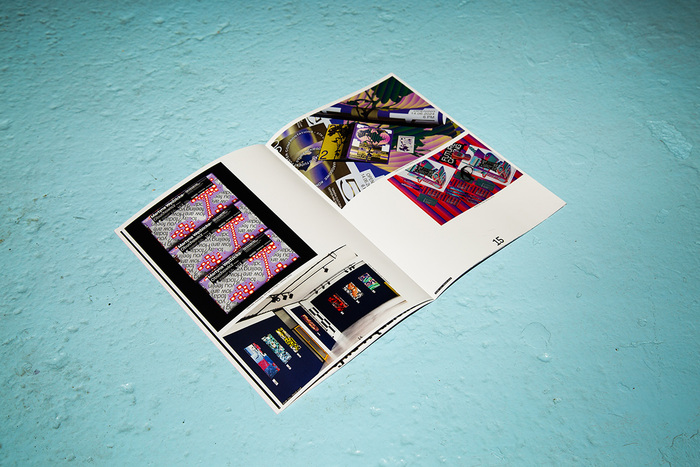
Published by Slanted Publishers in collaboration with Threedotstype and the Polish Graphic Design Foundation, PLOP invites readers to rethink authorship, style, quality, and cultural context in contemporary Polish graphic design. The first issue features works by Martyna Wędzicka, Kuki Iwański, and Paweł Mildner, an essay by Aleksandra Tulibacka, and edgy forms of the Radius typeface.
PLOP is a thought-provoking snapshot of current debates in Polish visual culture—questioning whether polish enhances identity or erases it.
The English-language magazine was edited by Rene Wawrzkiewicz together with Lars Harmsen and Marian Misiak who took care of the design. The saddle-stitched brochure was offset printed and has 24 pages measuring 21×29.7 cm. ISBN 978-3-69202–007-5
Source: www.slanted.de Photo: Slanted Publishers. License: All Rights Reserved.
Source: www.slanted.de Photo: Slanted Publishers. License: All Rights Reserved.
Source: www.slanted.de Photo: Slanted Publishers. License: All Rights Reserved.
Source: www.slanted.de Photo: Slanted Publishers. License: All Rights Reserved.
Source: www.slanted.de Photo: Slanted Publishers. License: All Rights Reserved.
This post was originally published at Fonts In Use