Tre Mari

Source: blokdesign.com Blok Design. License: All Rights Reserved.


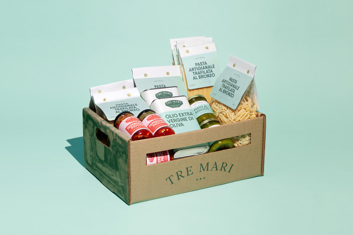
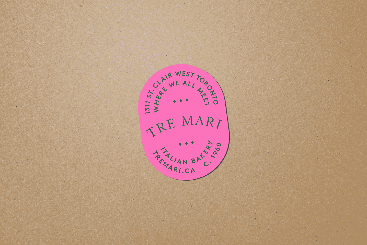
Tre Mari is an Italian bakery and deli in Toronto’s St. Clair West neighborhood that has been open since 1960. Now in its third generation, they worked with Blok Design to reimagine their identity, packaging, and visual system.
The new identity features my typeface Condor in Compressed and Condensed widths, Displaay’s Avantt and Lineto’s LL Brown, punctuated by moments of Dinamo’s ABC Honeymoon. The logo is typeset in Ivar Headline from Letters from Sweden, with a custom head serif on the A, a featured carried forward from the bakery’s previous logo.
The folks at Blok Design were kind enough to share their motivations:
With this identity our goal was to bring a staple of the community forward without losing who they are. Tre Mari is very much a family business with many different characters all coming together. To express this we knew we would like a diverse typographic language and colour palette that evoked their bold, playful side while still holding their Italian heritage and strong family roots. We felt that the final identity evokes these classic elements of Italian/ European design while still feeling contemporary, fresh and bold.

Source: blokdesign.com Blok Design. License: All Rights Reserved.

Source: blokdesign.com Blok Design. License: All Rights Reserved.

Source: blokdesign.com Blok Design. License: All Rights Reserved.
Source: blokdesign.com Blok Design. License: All Rights Reserved.
Source: blokdesign.com Blok Design. License: All Rights Reserved.

Source: blokdesign.com Blok Design. License: All Rights Reserved.

Source: blokdesign.com Blok Design. License: All Rights Reserved.

Source: blokdesign.com Blok Design. License: All Rights Reserved.

Source: blokdesign.com Blok Design. License: All Rights Reserved.

Source: blokdesign.com Blok Design. License: All Rights Reserved.

Source: blokdesign.com Blok Design. License: All Rights Reserved.

Source: blokdesign.com Blok Design. License: All Rights Reserved.

Source: blokdesign.com Blok Design. License: All Rights Reserved.

Source: blokdesign.com Blok Design. License: All Rights Reserved.

Source: blokdesign.com Blok Design. License: All Rights Reserved.
This post was originally published at Fonts In Use