Tour d’Argent
Typofonderie. License: All Rights Reserved.

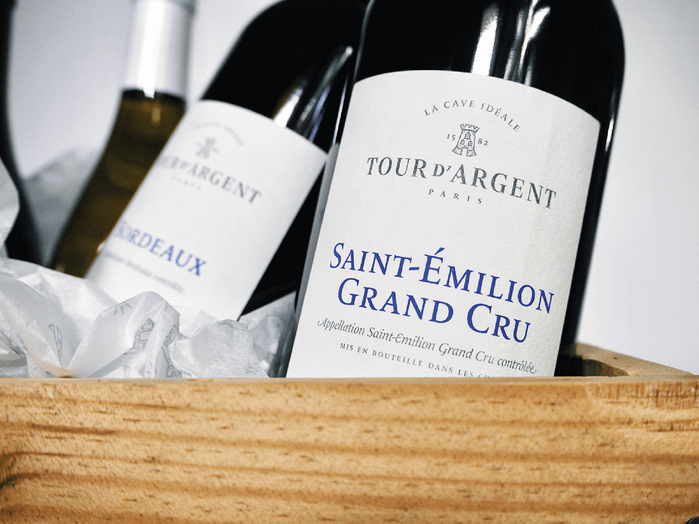
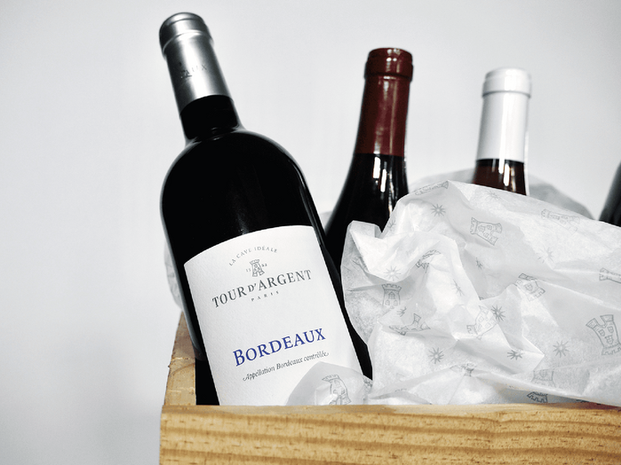
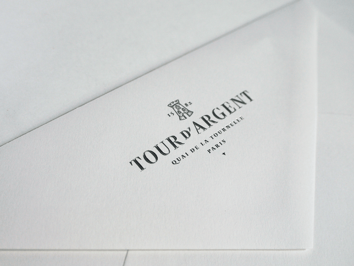
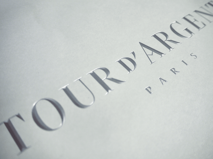
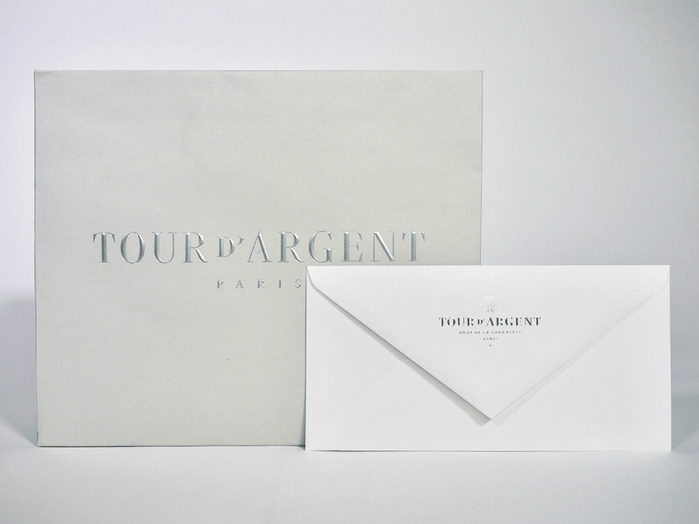
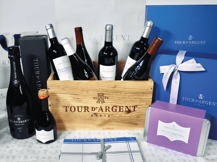
Various typographic proposals have been made in order to find the best solution to convey the Tour d’Argent heritage. The result is inspired by the archives of the famous Parisian restaurant, taking its roots from the 1950s typographic style with a contemporary twist. The Tour d’Argent logotype made by ZeCraft (our sister company) paid homage to Vendôme, the typeface used by the restaurant for years. As the sign on the building – which is still in place – proved it too, sharp serifs have been in vogue during the fifties in France. That’s why Jean François Porchez added sharp details to the new logotype such the angle on the R and specific serifs on certains positions of the letters that build the logotype.
Creative director Aaron Levin recommended the use of two typefaces in association: Le Monde Livre Classic by Typofonderie and Darby Sans (not show on products presented, but you can see it on the website) by Commercial Type. Le Monde Livre Classic works beautifully on text and titling settings. This typeface is used for packaging, menus, and other items at the Tour d’Argent. Designed as an extension of Le Monde Livre, this family distinguishes itself by its historical forms and by its numerous stylistic effects. Le Monde Livre Classic’s italics follow the models of the Renaissance and feature swashes for capitals and lowercase letters.
Typofonderie. License: All Rights Reserved.
Typofonderie. License: All Rights Reserved.
Typofonderie. License: All Rights Reserved.
Typofonderie. License: All Rights Reserved.
Source: typofonderie.com Photo: Team Typofonderie. Typofonderie. License: All Rights Reserved.
This post was originally published at Fonts In Use