Thin Man Brewery
Published May 24, 2023
By FontsInUse
Contributed by Bailey Hummel
Source: thinmanbrewery.com License: All Rights Reserved.


Source: thinmanbrewery.com License: All Rights Reserved.
Source: thinmanbrewery.com License: All Rights Reserved.
Source: thinmanbrewery.com License: All Rights Reserved.
Source: thinmanbrewery.com License: All Rights Reserved.

Source: thinmanbrewery.com License: All Rights Reserved.

Source: thinmanbrewery.com License: All Rights Reserved.
Source: customtshirtsny.com License: All Rights Reserved.
Source: thinmanbrewery.com License: All Rights Reserved.
This post was originally published at Fonts In Use

Source: thinmanbrewery.com License: All Rights Reserved.


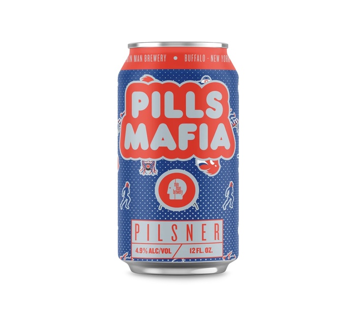
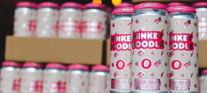
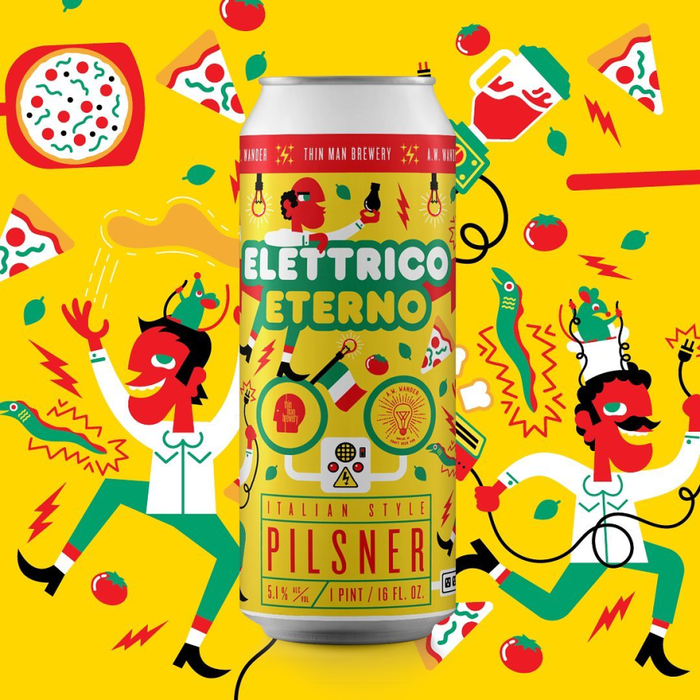
Can label, packaging and branding for Thin Man Brewery in Buffalo, New York, designed in house by Peter Cahlstadt. Irreverent illustrations and bold colors are supported by and highlight Frankfurter’s easygoing curves. Knockout is used for the logo as well as for additional text on the cans.

Source: thinmanbrewery.com License: All Rights Reserved.

Source: thinmanbrewery.com License: All Rights Reserved.
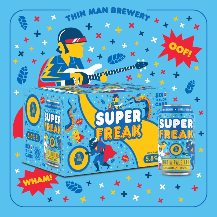
The Superfreak packaging adds Frankfurter Highlight to the mix.

Source: thinmanbrewery.com License: All Rights Reserved.

Source: thinmanbrewery.com License: All Rights Reserved.

Source: thinmanbrewery.com License: All Rights Reserved.
The graphics for the Weirdly Wonderful Beer Fest feature Ed Interlock.

Source: thinmanbrewery.com License: All Rights Reserved.
Homepage detail with the logo in all-caps Knockout

Source: customtshirtsny.com License: All Rights Reserved.
Logo as used on the shop website, with Frankfurter on a circle

Source: thinmanbrewery.com License: All Rights Reserved.
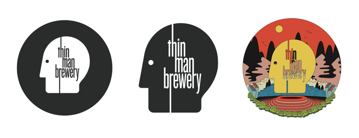
Logo variants using all-lowercase Knockout No. 26 Junior Flyweight with modifications
This post was originally published at Fonts In Use
Read full story.
WRITTEN BY
FontsInUse
An independent archive of typography.