Generation Cana brand concept
Source: studiochenchen.com Studio Chenchen. License: All Rights Reserved.
Logo variants


Launched by the CANA Foundation, Generation Cana is —
a concept by an established conservationist who wants to popularise and inspire a new and diverse generation of Americans to fall in love with their natural landscapes and support rewilding – of their own worldviews, and of the lands they live on.
The Cana Foundation (CF) supports research, policy and action to support the wellbeing of horses and burros in North America, and the role they play in America’s iconic prairie and grassland ecosystems. With strong connections to first nations communities and the nexus of social justice and environmental issues, CF’s founder wanted to reach more people and inspire a new audience to take action in ways that went beyond specific policy solutions.
The graphic identity was designed by Studio Chenchen with a range of new logos to promote the foundation through various printed and digital media. Studio Chenchen comments:
The brand concept, Love Songs to America, is based on revitalising North American Romanticism.
Its visual language draws on iconic precedents in North American naturalism that we updated to reach modern, urban audiences. An internal brand manifesto was established to crystalise the brand’s purpose, tone of voice and personality, along with a set of illustrative templates, design applications, and targeted messaging to demonstrate how the brand can be applied to achieve the clients goals.
Source: studiochenchen.com Studio Chenchen. License: All Rights Reserved.
Logo version ft. Kerozene, Swear, and Copperplate Gothic
Source: studiochenchen.com Studio Chenchen. License: All Rights Reserved.
Logo version in Swear and Copperplate Gothic
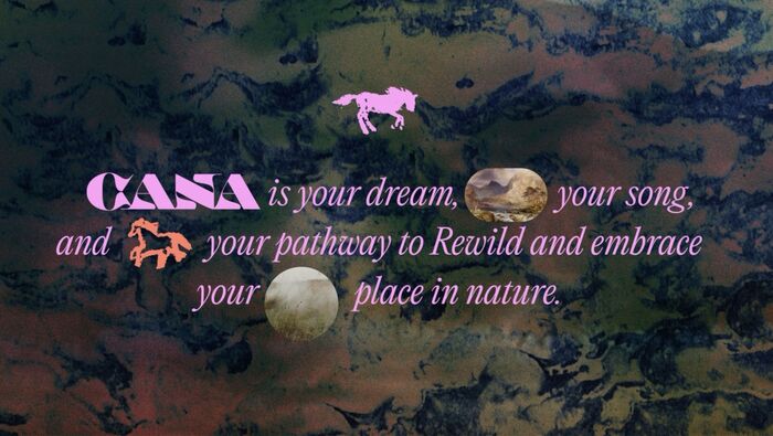
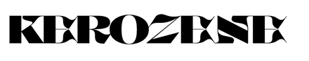
Source: studiochenchen.com Studio Chenchen. License: All Rights Reserved.
Kerozene and Editorial New Italic
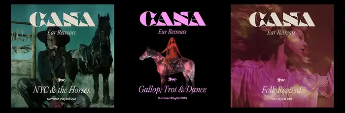
Source: studiochenchen.com Studio Chenchen. License: All Rights Reserved.
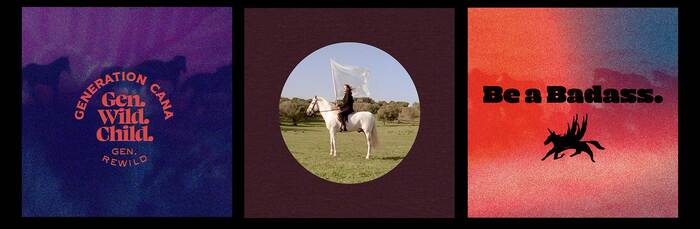
Playlist covers ft. Kerozene and Editorial New Italic
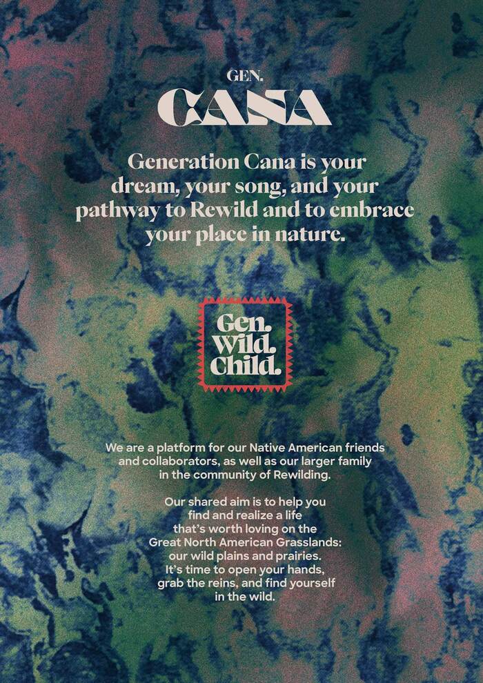
Source: studiochenchen.com Studio Chenchen. License: All Rights Reserved.
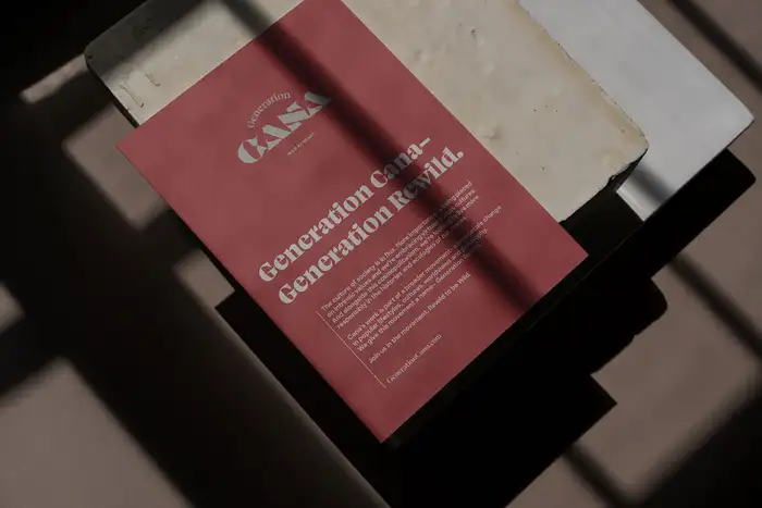
Manifesto featuring Swear, Sharp Sans, and an unidentified serif (top).
Source: studiochenchen.com Studio Chenchen. License: All Rights Reserved.
Instagram template ft. Swear, Copperplate Gothic, and Mighty Slab
Source: studiochenchen.com Studio Chenchen. License: All Rights Reserved.
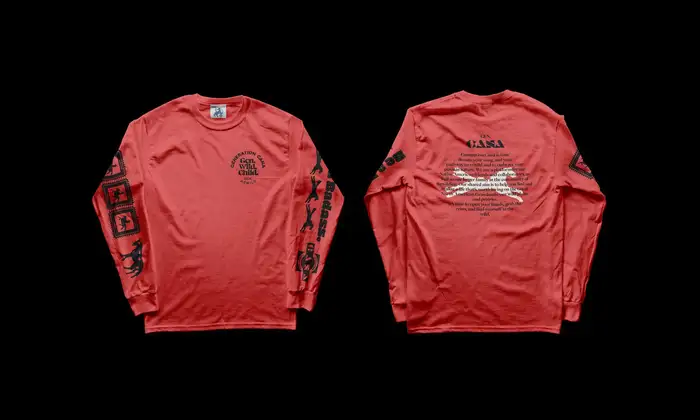
Longsleeves
Source: studiochenchen.com Studio Chenchen. License: All Rights Reserved.
Source: studiochenchen.com Studio Chenchen. License: All Rights Reserved.
Source: studiochenchen.com Studio Chenchen. License: All Rights Reserved.
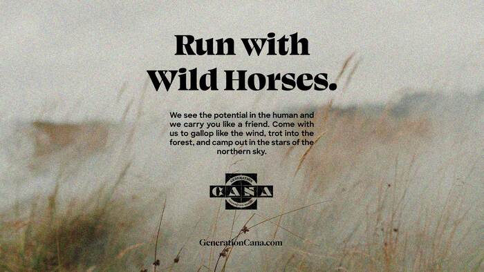
Swear and Sharp Sans, with an unidentified serif for the URL
This post was originally published at Fonts In Use