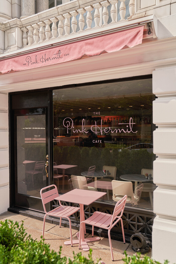
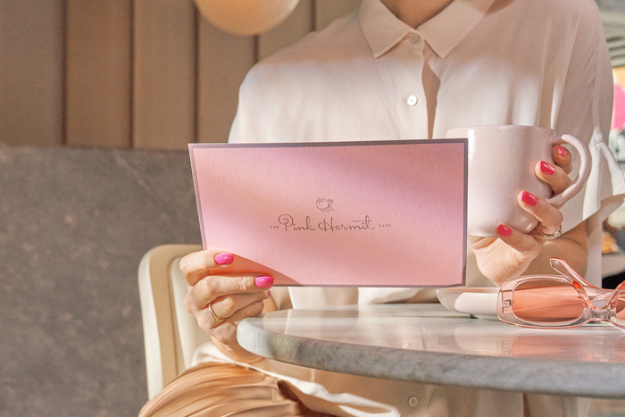
The Pink Hermit

Source: www.mucca.com Mucca. License: All Rights Reserved.

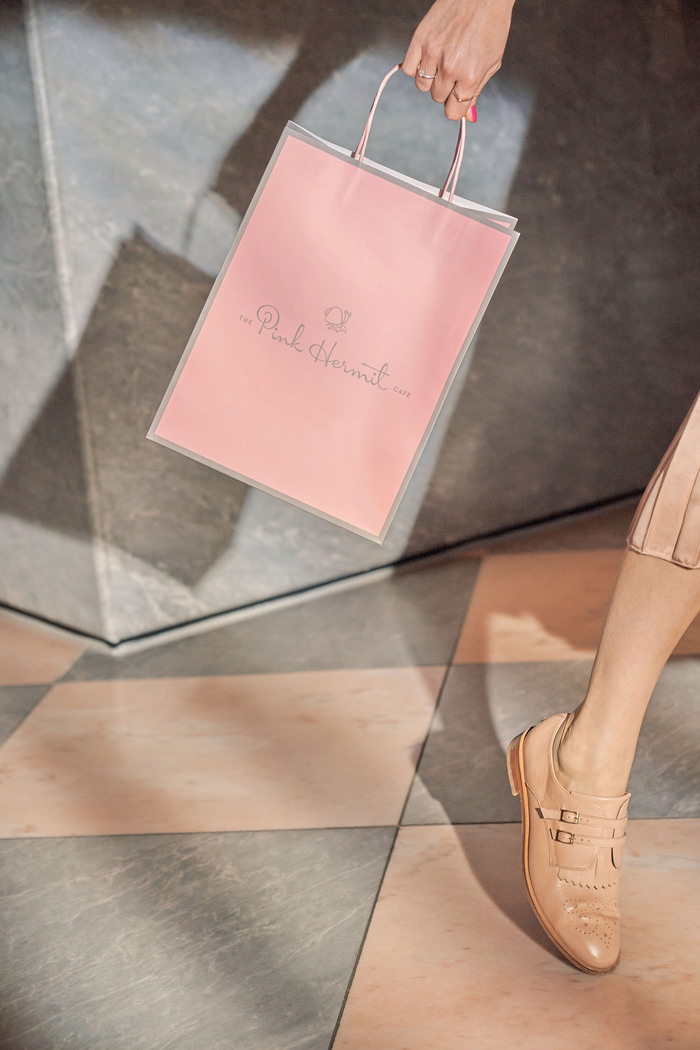
An all-day café by Jean-Georges Vongerichten in Nashville’s Hermitage Hotel, The Pink Hermit offers a playful retro-modern vibe that complements the hotel’s classic elegance. Our branding takes inspiration from the past to build a connection with the historic hotel, while establishing an independent identity for the café.
We embraced the interior color palette and the quirky charm of the name, creating a bespoke script logotype that reveals a spiraling hermit crab shell. It’s joined by an elusive crab icon that adapts to its surroundings, finding a new home wherever it goes.
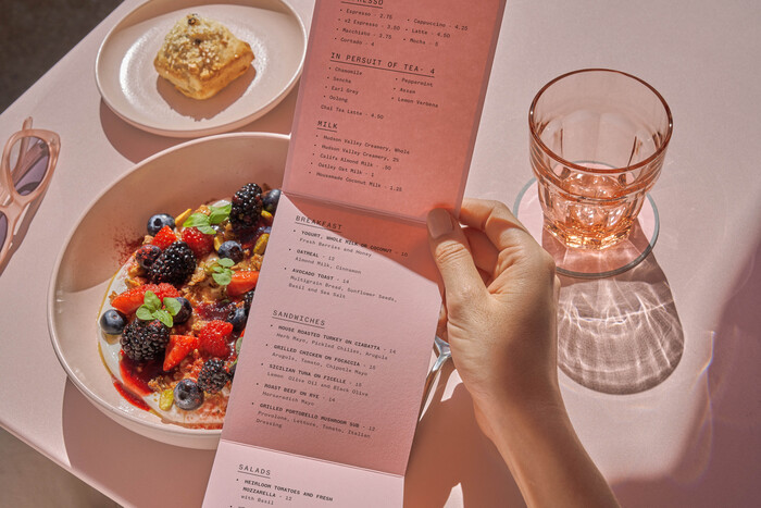
The rest of the typographic system is anchored by TT Chocolates, which lends a similar mid-century flare to that of the logotype, and Founders Grotesk Mono, which offers a nice juxtaposition of structure and legibility.
Source: www.mucca.com Mucca. License: All Rights Reserved.
Source: www.mucca.com Mucca. License: All Rights Reserved.

Source: www.mucca.com Mucca. License: All Rights Reserved.
Source: www.mucca.com Mucca. License: All Rights Reserved.
Source: www.mucca.com Mucca. License: All Rights Reserved.

Source: www.mucca.com Mucca. License: All Rights Reserved.
This post was originally published at Fonts In Use