Heartbeats brand identity and website

Source: e-types.com Rita Kuhlmann. License: All Rights Reserved.
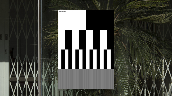
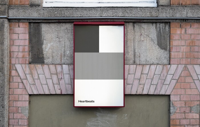
Going from being a radio station towards being an online culture site and content agency, Heartbeats needed a new brand identity. e-Types created a new visual identity and a digital design concept for the media based company. The main goal was to secure a recognizable and strong identity across all platforms going from physical products towards online platforms such as presence in iTunes, web and SoMe.
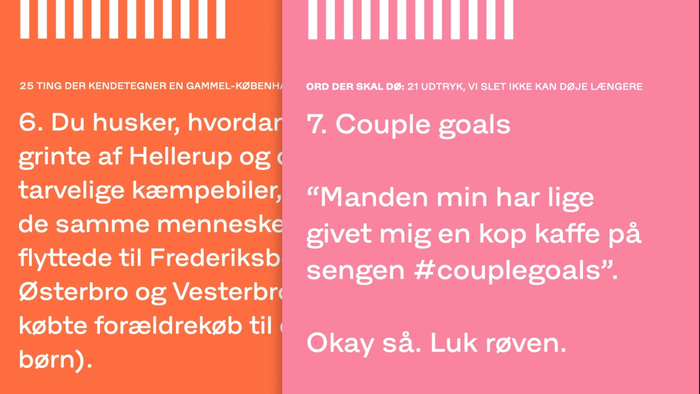
Heartbeats is deeply connected to its roots within the music industry. e-Types therefore worked with integrating the love of music and beats into the identity. The result is a dynamic and bold identity with a 5th element that can work as an integrated part of Heartbeats’ visual expression across all platforms. In addition to this the logo was formed as a solid recognizable mark in order to support the rest of the identity. While working with bold graphic elements throughout the identity, e-Types created a complimentary downplayed color palette and a simple, abstract image style. The full identity is carried out in Hansen Grotesque by Playtype.
Source: e-types.com Rita Kuhlmann. License: All Rights Reserved.
Source: e-types.com Rita Kuhlmann. License: All Rights Reserved.

Source: heartbeats.dk License: All Rights Reserved.
Source: e-types.com License: All Rights Reserved.

Source: heartbeats.dk License: All Rights Reserved.

Source: heartbeats.dk License: All Rights Reserved.
This post was originally published at Fonts In Use