The Mystery of the Dune Font


In the six decades since the publication of the original Dune novel in 1965, the science fiction franchise has gone through many different typographic identities. Notable examples include the use of Giorgio for the British paperbacks by NEL (c. 1968) and Albertus for David Lynch’s movie adaptation (1984). But another typeface has even stronger ties to Dune and its author. It appeared on the covers of dozens of books, including the classic Dune trilogy and its sequels, and also on other titles by – or about – Frank Herbert, from various imprints. Strangely enough, the name of this typeface is barely known even among die-hard fans.
License: All Rights Reserved.
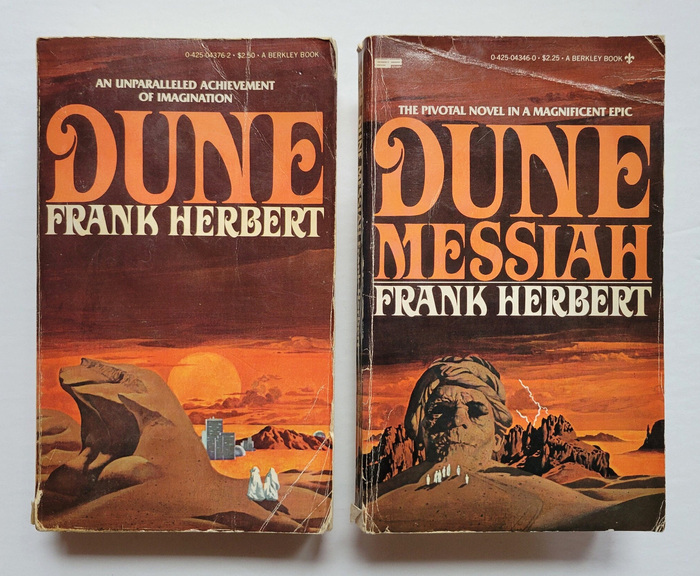
Dune (1965) and Dune Messiah (1969) as published by Berkley Medallion in September 1975. Cover art by Vincent Di Fate. [More info on ISFDB about Dune and Dune Messiah]
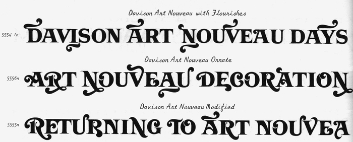
Davison Art Nouveau was drawn by lettering artist Meyer M. “Dave” Davison for Photo-Lettering (PLINC), a typesetting company in New York City. It was first shown in PLINC’s 1967 Alphabet Yearbook. Basically a bold all-caps roman with long bracketed serifs, Davison Art Nouveau comes in three variants of increasing ornamentation: Art Nouveau with Flourishes, Modified, and Ornate.
Scan courtesy of Michael Babcock. License: All Rights Reserved.
One-line samples for the three variants of Davison Art Nouveau, compiled from a page in PLINC’s Alphabet Yearbook 1967
Each variant includes additional alternates, some of which sport swashes, fox tail extensions, and curlicues that reach above and below the line. Depending on which glyphs are selected, the look of words set in Davison Art Nouveau ranges from sober to discreetly flowery to full-blown carnivalesque. That’s one reason this face isn’t easy to track down – it can take on so many different appearances. The other reason is that it was exclusive to PLINC. And PLINC was a service provider, not a font retailer. You couldn’t buy or license a copy of Art Nouveau. If you wanted to have some text set in this font, you had to place an order at their Manhattan office at 216 East 45th Street, in person or by phone or post.
Source: www.abebooks.com Burnside Rare Books. License: All Rights Reserved.
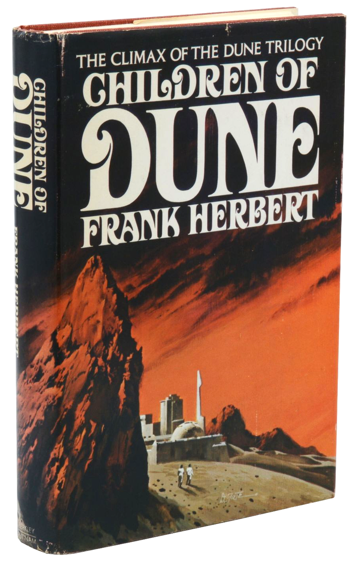
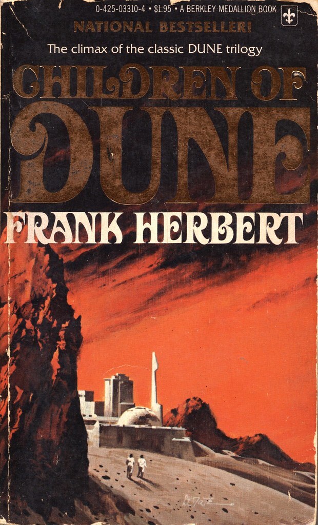
Children of Dune, first edition by Berkley Putnam, 1976. Cover art by Vincent Di Fate. [More info on ISFDB] The secondary typeface here is Columna Solid with its alternate long-legged R.
Source: www.flickr.com Uploaded to Flickr by pulpcrush. License: All Rights Reserved.
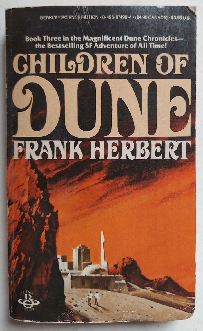
Children of Dune (1976). Berkley Medallion, 1977. Cover art by Vincent Di Fate. [More info on ISFDB]
Source: www.abebooks.com Shoestring Collectibooks. License: All Rights Reserved.
A later printing of Children of Dune by Berkley, 1984. Instead of golden embossed letters, it features plain beige ones.
Source: www.etsy.com Recent Era. License: All Rights Reserved.
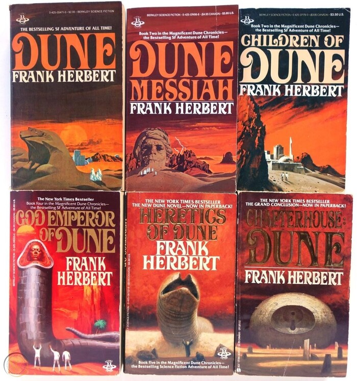
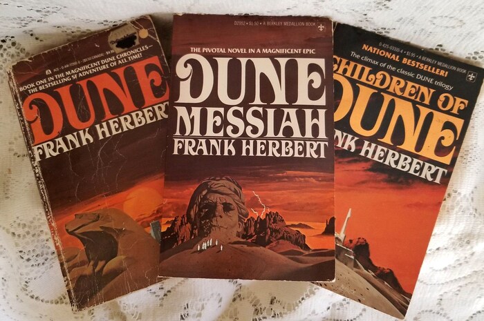
Dune, Dune Messiah, and Children of Dune, in undated paperback editions by Ace and Berkley Medallion
The liaison between Dune and Davison Art Nouveau started in September 1975, when the typeface was used by Berkley Medallion for a paperback edition of the first two novels. At the time, the Berkley imprint was owned by New York-based publisher G.P. Putnam’s Sons. When Berkley Putnam published the first hardcover edition of the third novel, Children of Dune, in 1976, the new typographic identity was applied there, too. Later on, Putnam used the typeface on the jackets for hardback editions of other, unrelated books authored (or coauthored) by Frank Herbert.
After Berkley acquired Ace Books in 1982, Ace took over as Putnam’s publisher for science fiction paperbacks. During this period, some of Herbert’s books also appeared under the Del Rey imprint. Despite the change in imprints, though, the link between Herbert and Art Nouveau lasted – that is, until around 1988. Such “author branding” was rather common, especially with science fiction and fantasy writers. Other examples on Fonts In Use include Roslyn Gothic for Philip K. Dick, Dynamo and Corporate for Arthur C. Clarke, and Pipeline for Robert Heinlein.
The uncredited typographer worked with the Modified variant – at least that’s what the A with curved bar and the E with curling middle bar shown in the limited typeface samples I’ve been able to compare suggest. The letterforms were used with varying degrees of condensation, something that was easily done with phototype. Given that Art Nouveau came with so many alternates, its use for Dune and beyond is impressively consistent. Across the dozens of applications, only a handful of variant glyphs were employed: see for example the two forms for A, one of them with a right stem that curves inward; the R with the curling terminal for “Trilogy” versus the one in “Frank Herbert” on the box set below; or the S with and without ball terminal at the top.
Right from the start, Friz Quadrata was introduced as the supporting typeface, a choice that was maintained for most of the following books.
This post showcases a considerable number of book covers and jackets featuring Art Nouveau, more or less in chronological order, without aiming for completeness. The credit for selecting Art Nouveau probably goes to an unknown art director working at the Berkley Publishing Corporation. My research didn’t turn up any names. If you have any additional insight, please leave a comment.
Source: i.ebayimg.com License: All Rights Reserved.
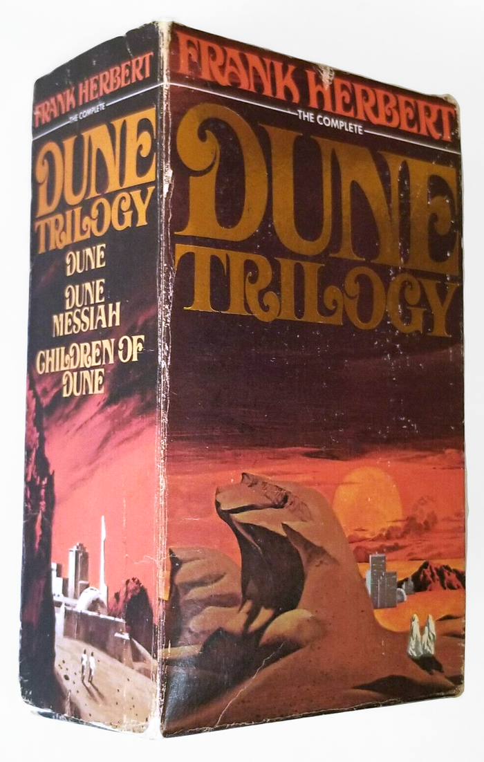
Dune Trilogy: The first three books were also issued in a boxed set by Berkley Medallion, 1977. [More info on ISFDB] “The complete” is added in caps from Futura.
Source: sparrowsbookshop.com Sparrow’s Bookshop (edited). License: All Rights Reserved.
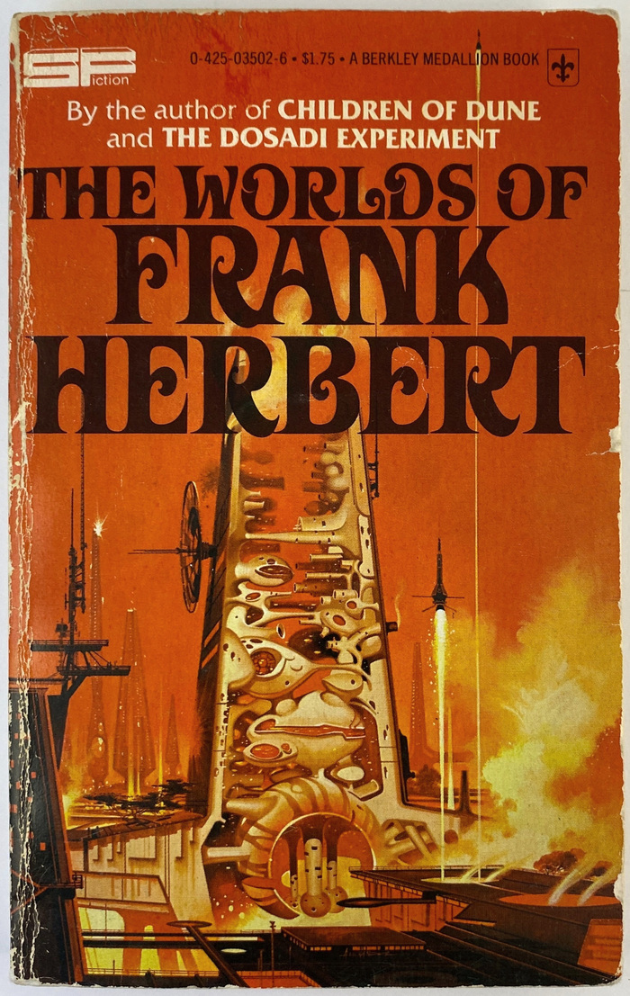
The Worlds of Frank Herbert (1970), Berkley Medallion, 1977. Cover art by Paul Alexander. [More info on ISFDB]

Source: www.flickr.com Uploaded to Flickr by Boy de Haas. License: All Rights Reserved.
Whipping Star (1970), Berkley Medaillon, 1977. Cover art by Paul Alexander. [More info on ISFDB]
Source: biblio.sg Lost Paddle Books. License: All Rights Reserved.
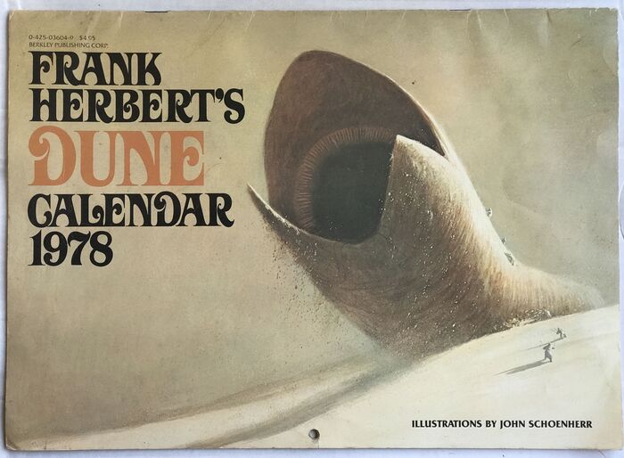
The typographic identity extended to items other than books, too. Frank Herbert’s Dune Calendar 1978 was published by Berkley in 1977, with illustrations by John Schoenherr.
Source: poshmark.com nickycnj. License: All Rights Reserved.
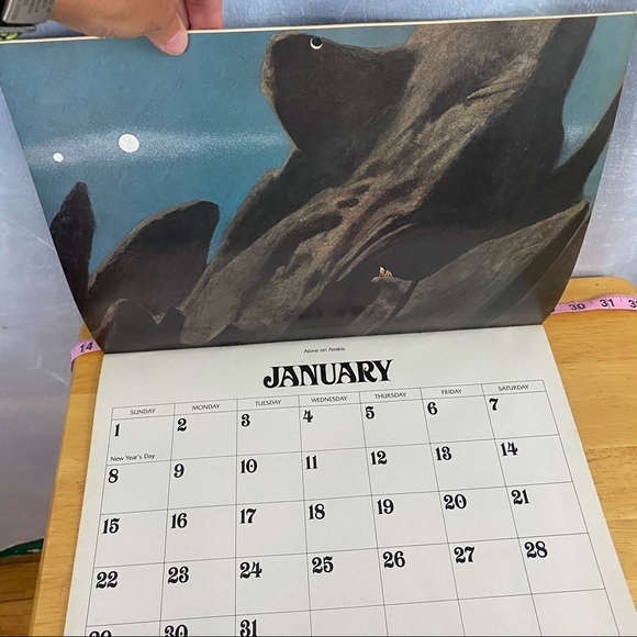
The Dune Calendar 1978 doesn’t only offer stunning art …
Source: poshmark.com nickycnj. License: All Rights Reserved.
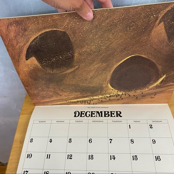
… it’s also a great resource if you’re looking for a complete set of numerals from Davison Art Nouveau.
Source: www.etsy.com JackiesJewelryBooks. License: All Rights Reserved.
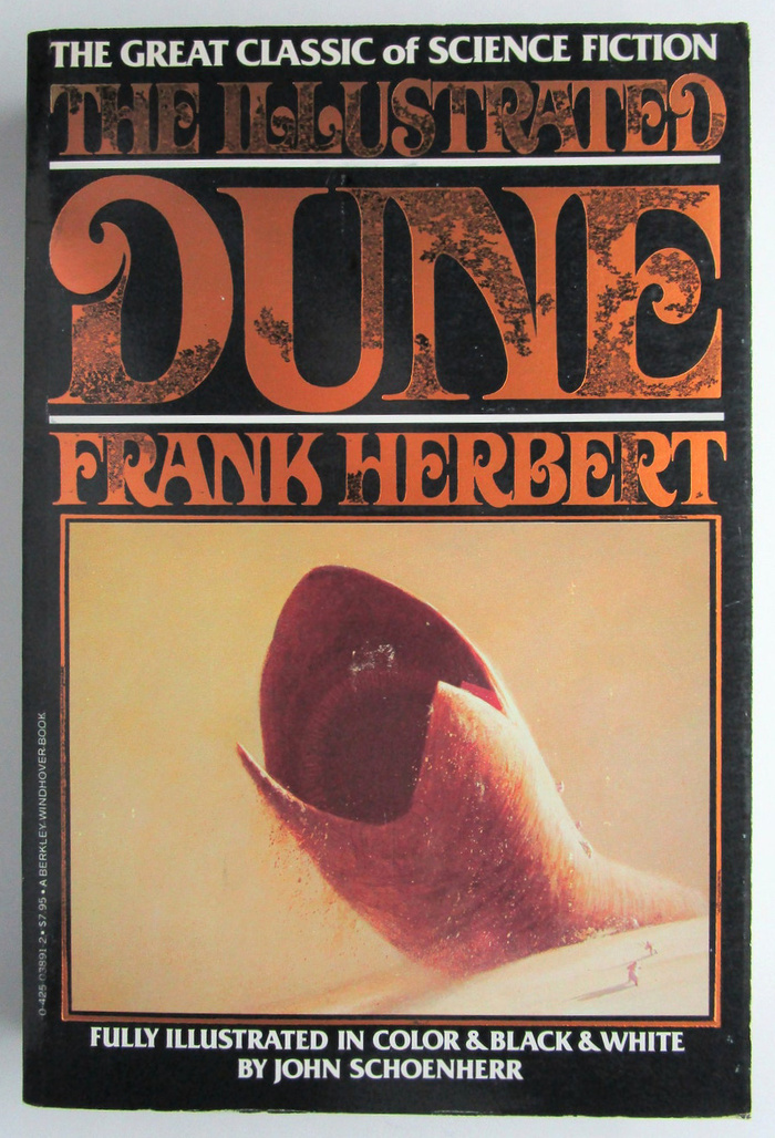
The Illustrated Dune, illustrated by John Schoenherr, Berkley Windover, August 1978
Source: www.flickr.com Uploaded to Flickr by Cadwalader Ringgold. License: All Rights Reserved.
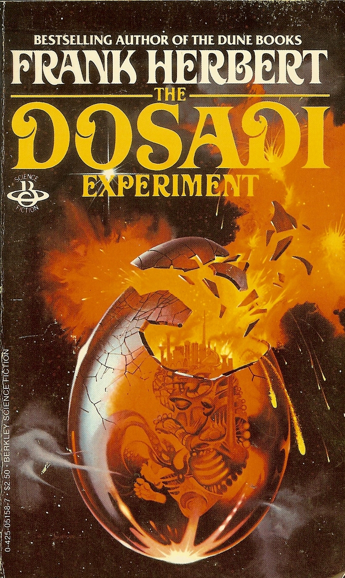
The Dosadi Experiment (1977), Berkley, 1978. Cover art by Paul Alexander. [More info on ISFDB]
Source: www.flickr.com Uploaded to Flickr by admiral.ironbombs. License: CC BY-SA.
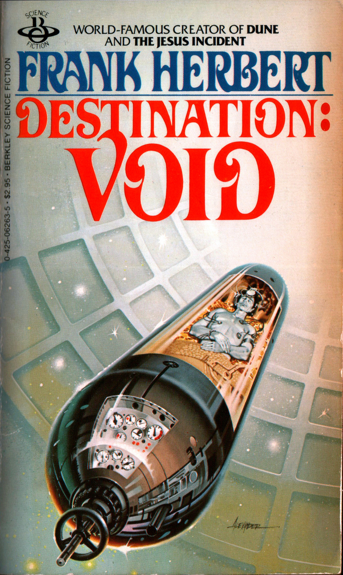
Destination: Void (1966), Berkley, Dec. 1978. Cover art by Paul Alexander. [More info on ISFDB]
Source: www.flickr.com Uploaded to Flickr by Chad. License: All Rights Reserved.
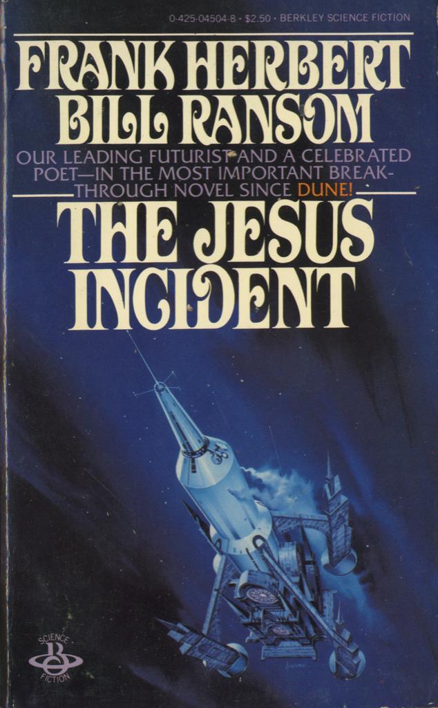
The Jesus Incident (1979) by Frank Herbert & Bill Ransom, Berkley, 1980. Cover art by Paul Alexander. [More info on ISFDB]
Source: www.abebooks.com Comic World. License: All Rights Reserved.
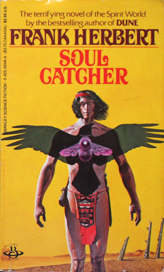
Soul Catcher (1972), Berkley, 1979 (this printing from 1985). Cover art by Wayne Barlowe. [More info on ISFDB]
Source: www.flickr.com Uploaded to Flickr by Boy de Haas. License: All Rights Reserved.
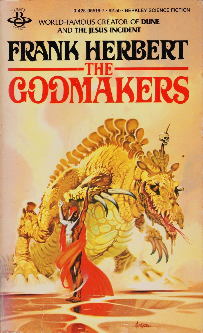
The Godmakers (1972), Berkley, 1981. Cover art by Paul Alexander. [More info on ISFDB]
Source: www.antiqbook.com RareBookCellar.com. License: All Rights Reserved.
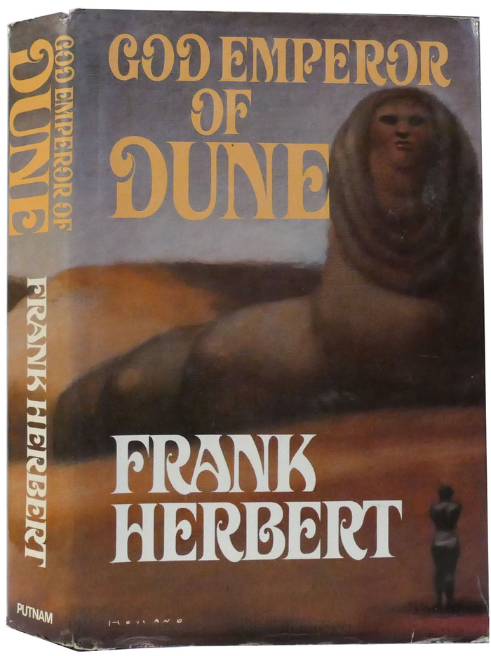
God Emperor of Dune, first US edition by Putnam, 1981. Cover art by Brad Holland. [More info on ISFDB]
Source: www.flickr.com Uploaded to Flickr by Boy de Haas. License: All Rights Reserved.
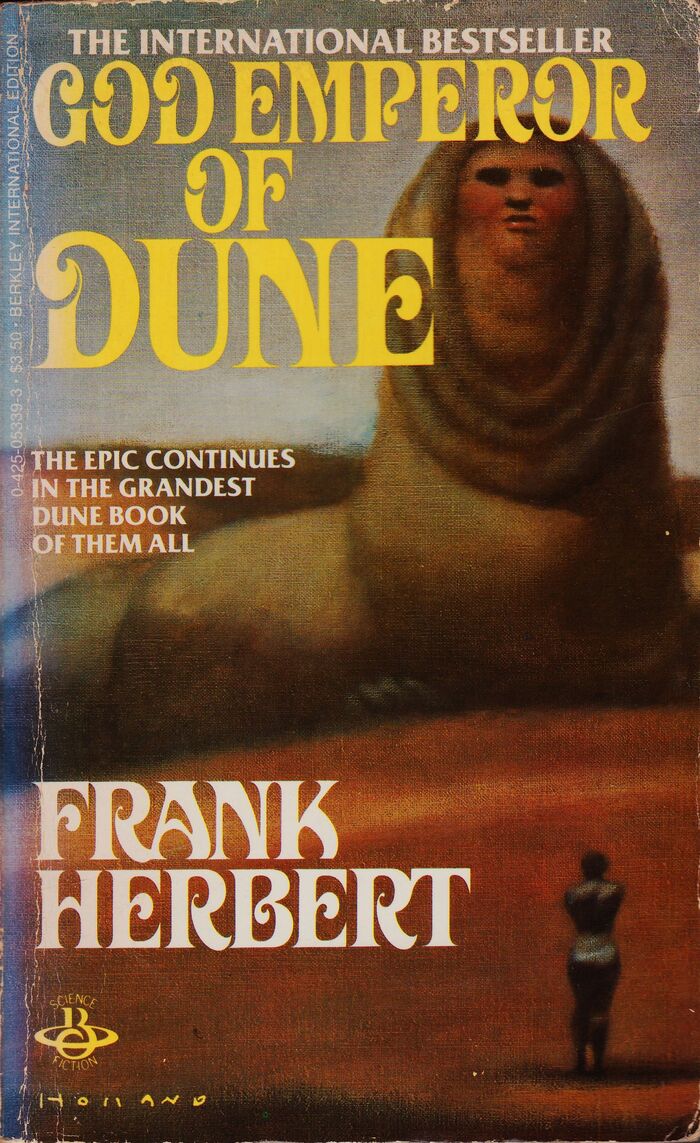
God Emperor of Dune, Berkley, Sep. 1981. [More info on ISFDB]

Source: archive.org License: All Rights Reserved.
The Book of Frank Herbert (1973), Berkley, 1981. Cover art by Vincent Di Fate. [More info on ISFDB]
Source: www.etsy.com MadisonPaperback (edited). License: All Rights Reserved.
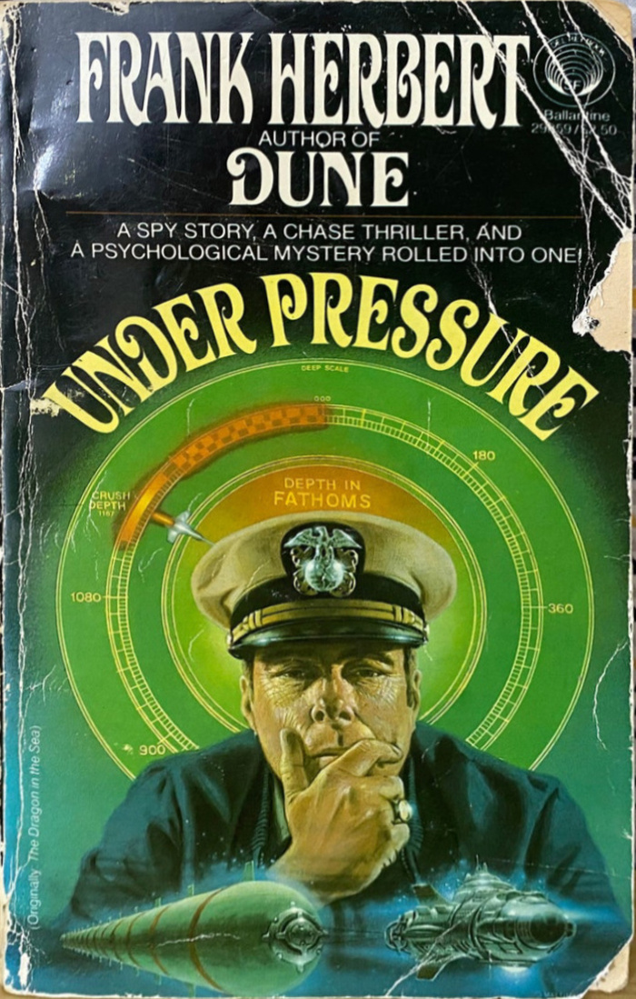
Under Pressure, originally titled The Dragon in the Sea (1956), Del Rey / Ballantine, 1981. Cover art by David B. Mattingly. [More info on ISFDB]
Source: www.etsy.com TheCloudyLion (edited). License: All Rights Reserved.
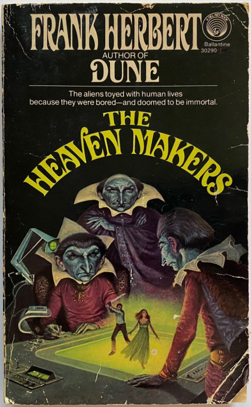
The Heaven Makers (1968), Del Rey / Ballantine, 1982. Cover art by Darrell K. Sweet [More info on ISFDB]

Source: www.abebooks.com Evening Star Books. License: All Rights Reserved.
The White Plague, first edition by Putnam, 1982. Cover art by Abe Echevarria. [More info on ISFDB]

Source: www.abebooks.com Sierra Sales. License: All Rights Reserved.
The Lazarus Effect by Frank Herbert and Bill Ransom, first edition by Putnam, 1983. Cover art by Abe Echevarria. [More info on ISFDB]
Source: www.reddit.com CeeNain (digital recreation of the original cover). License: All Rights Reserved.
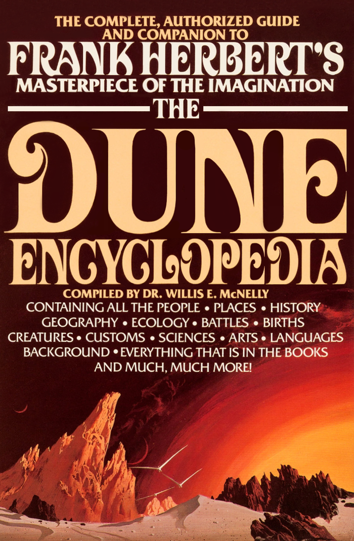
The Dune Encyclopedia by Willis Everett McNelly (ed.), a collection of essays written as a companion to the Dune series, first edition by Berkley, 1984. [More info on ISFDB]

Source: www.flickr.com Uploaded to Flickr by Drümmkopf. License: CC BY.
Chapterhouse: Dune, first edition by Putnam, April 1985. Cover art by John Schoenherr. [More info on ISFDB]
Source: www.flickr.com Uploaded to Flickr by Drümmkopf. License: CC BY.
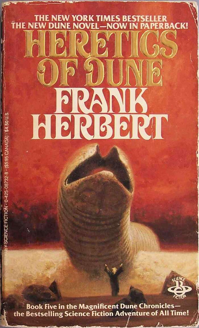
Heretics of Dune (1984), Berkley, April 1986. Cover art by John Schoenherr. A similar edition was published by Ace in 1987. [More info on ISFDB]
Source: www.flickr.com Uploaded to Flickr by livredesombres. License: All Rights Reserved.
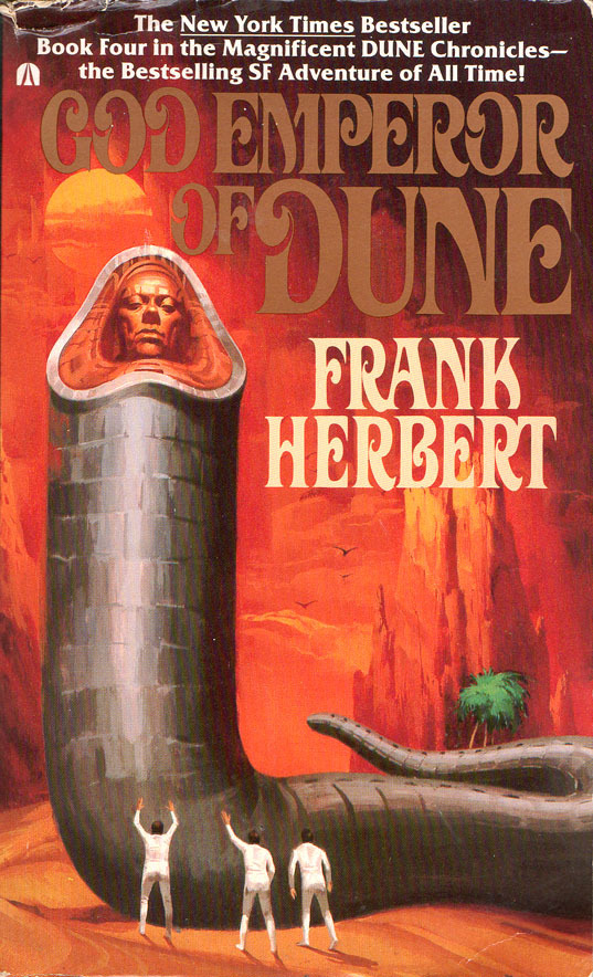
God Emperor of Dune (1981, see above), Ace, June 1987. Cover art by Vincent Di Fate. [More info on ISFDB]
Source: www.flickr.com Uploaded to Flickr byJim Linwood. License: CC BY.
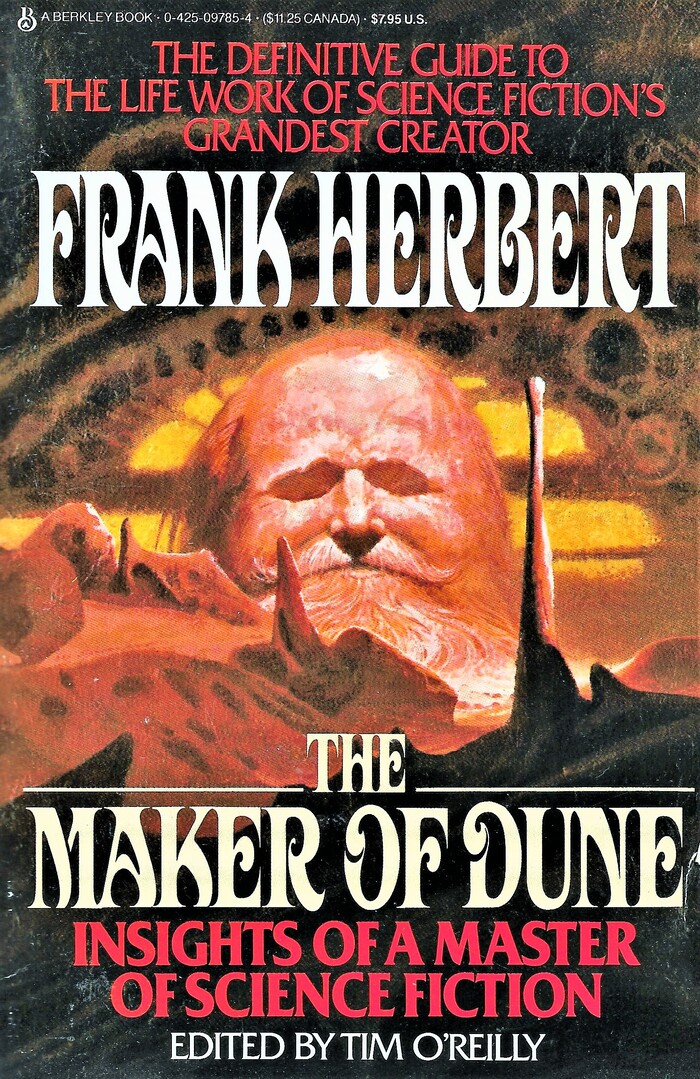
Frank Herbert: The Maker Of Dune, edited by Tim O’Reilly, Berkley, 1987. [More info on ISFDB]
Source: www.abebooks.com Rare Book Cellar. License: All Rights Reserved.
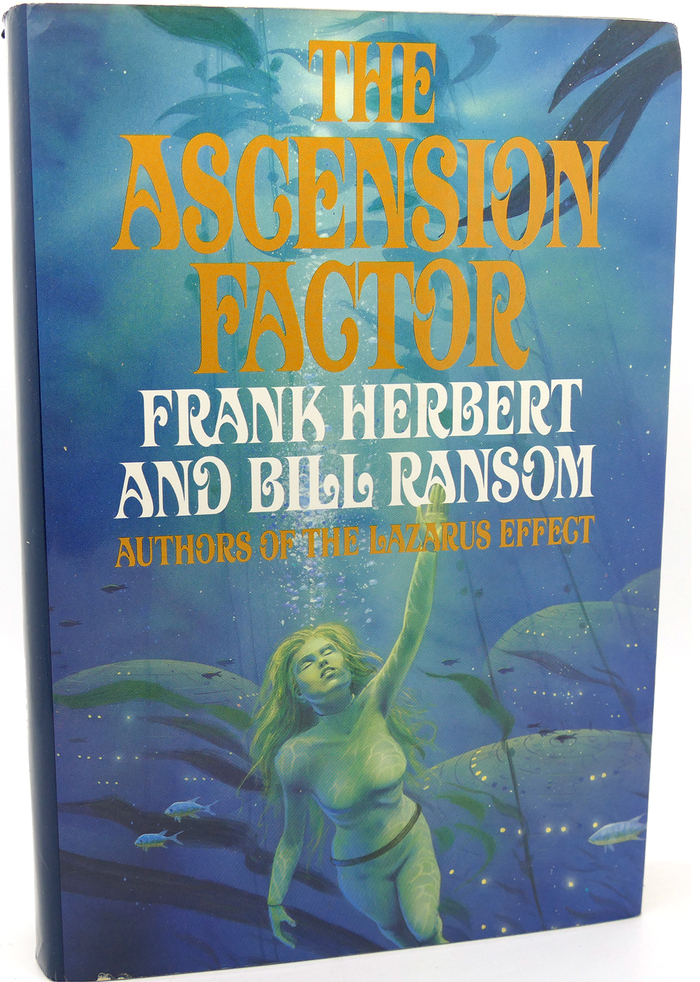
The Ascension Factor by Frank Herbert and Bill Ransom, first edition by Putnam, 1988. Cover art by Ron Miller. [More info on ISFDB]
Davison Art Nouveau in the digital age
Photo-Lettering, Inc. didn’t make the transition to digital typesetting and went out of business in 1997. Davison Art Nouveau disappeared together with the company and thousands of other alphabet designs. In 2003, House Industries purchased the assets. The Delaware design studio partnered with Erik van Blokland and Christian Schwartz and started digitizing a number of film typefaces by PLINC, with the help of friends and colleagues. These were initially made available in 2009 via a special web service that replicated the exclusive PLINC experience for the digital age. House Industries later switched to offering them for conventional licensing. At the time of writing, Davison Art Nouveau is not among the digitized designs.
In 2009, a Dune aficionado who goes by the moniker DuneFish (DFUK) and/or MEP made a digital font called Orthodox Herbertarian, “painstakingly traced from scans of the typeface that was used on the American Ace editions […] of Dune and many other Frank Herbert books”. This amateur digitization is freely available at kullwahad.com. The font is caps only (A–Z), with a basic set of punctuation characters and scaled-down caps in the lowercase. Because it’s based on the book covers (as opposed to the original typeface), it naturally adopts the narrowed proportions. Orthodox Herbertarian is a laudable effort, but it doesn’t include any of the alternates or the numerals. In 2020, Reddit user purgruv added lowercase letters and numerals to this freebie and offered it for download as Extended Herbertarian. The additions aren’t faithful to the original and unfortunately aren’t well drawn, either.
Orthodox Herbertarian arguably covers the needs of most Dune fans. Nevertheless, I hope to see a professional, fully featured digitization of Davison Art Nouveau one day.
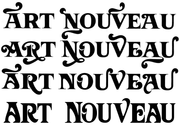
Photo: Florian Hardwig. License: CC BY-NC-SA.
The original Davison Art Nouveau in three variants (line 1–3) with some – but not all – of its alternates, compared to the digital Orthodox Herbertarian (line 4). As a basic caps-plus-small-caps font without any extras, the freebie can do only so much. It is a decent option if you want to quickly emulate Dune’s typographic style, though.
Thanks to B., G., and Justin Hoggard who all suggested to do an article about this use, and to Caren Litherland for the valuable edits. Kudos to the Internet Speculative Fiction Database which helped a lot in identifying and dating the numerous editions and printings.
This post was originally published at Fonts In Use