Dune (1984) titles
Universal Pictures. License: All Rights Reserved.


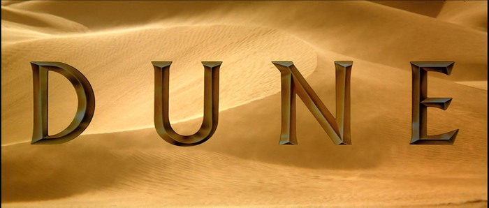
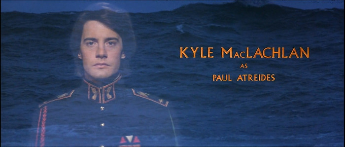
Albertus finds itself in another sci-fi cult classic. The opening credit is done in golden 3D lettering, with some modification to the letterform: U has no bottom-right stem, R tail is longer than usual, ampersand uses the alternate form, and J is a non-descending alternate which was originally a standard variant when the typeface was released. According to the ending credits, Robert Schaefer and the company called Title House are responsible for the work.
Universal Pictures. License: All Rights Reserved.
Universal Pictures. License: All Rights Reserved.
Universal Pictures. License: All Rights Reserved.
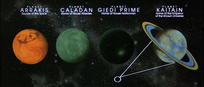
After the opening exposition and credit, the second exposition starts (this film has a lot of background exposition, which is still not enough to fully make sense of itself, and often the main point of its criticism). The planet names are typeset in ITC Avant Garde Gothic.
Universal Pictures. License: All Rights Reserved.
Small caps are simply scaled caps with no weight adjustment.
Universal Pictures. License: All Rights Reserved.
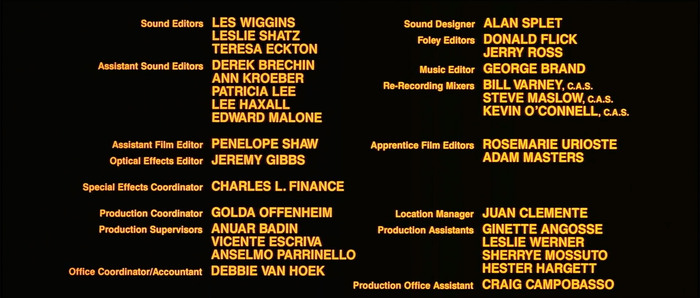
The ending credit is set in Helvetica.
This post was originally published at Fonts In Use