The Mad Book of Magic and Other Dirty Tricks by Al Jaffee
Source: www.amazon.com New American Library; Penguin Random House LLC. License: All Rights Reserved.
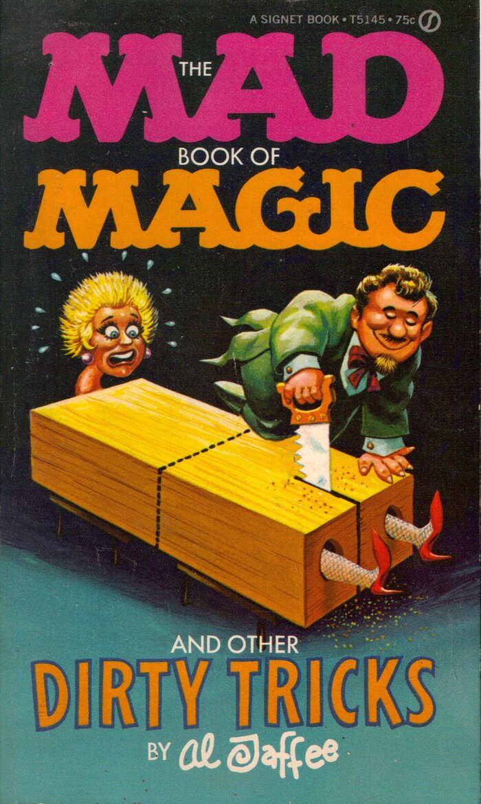
“Magic” is lettering based on Mad’s custom logo. The animated condensed sans-serif caps with contour used for “Dirty Tricks” are probably custom dran as well. The smaller text uses Futura Medium in caps.




Master cartoonist Al Jaffee (1921–2023) of Mad magazine, who is best known for his Mad Fold-Ins and Snappy Answers to Stupid Questions series, created this classic book of wild and psychotic magic tricks. Edited together with Jerry De Fuccio and published by Signet in 1970, it became a hit through North America and Europe, becoming a household item for many growing up in the 1970s.
After I found out about the passing of ole Jaffee I searched my library for works of his that I had found in antique/charity stores on my travels, as to dedicate a well deserved use on Fonts In Use. One of my most relished books of his is this, and what better book to include; it uses a great variety of typefaces alongside his timeless artwork.
Rest in peace Al, your work will never be forgotten (YECCH!).
The original page art for the book will be pictured whenever feasible instead of regular print pages, in order to get a clean view and fair insight. Imaging courtesy of Heritage Auctions.
Source: ebay.com License: All Rights Reserved.
Source: archive.org New American Library; Penguin Random House LLC. License: CC BY.
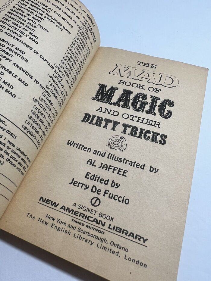
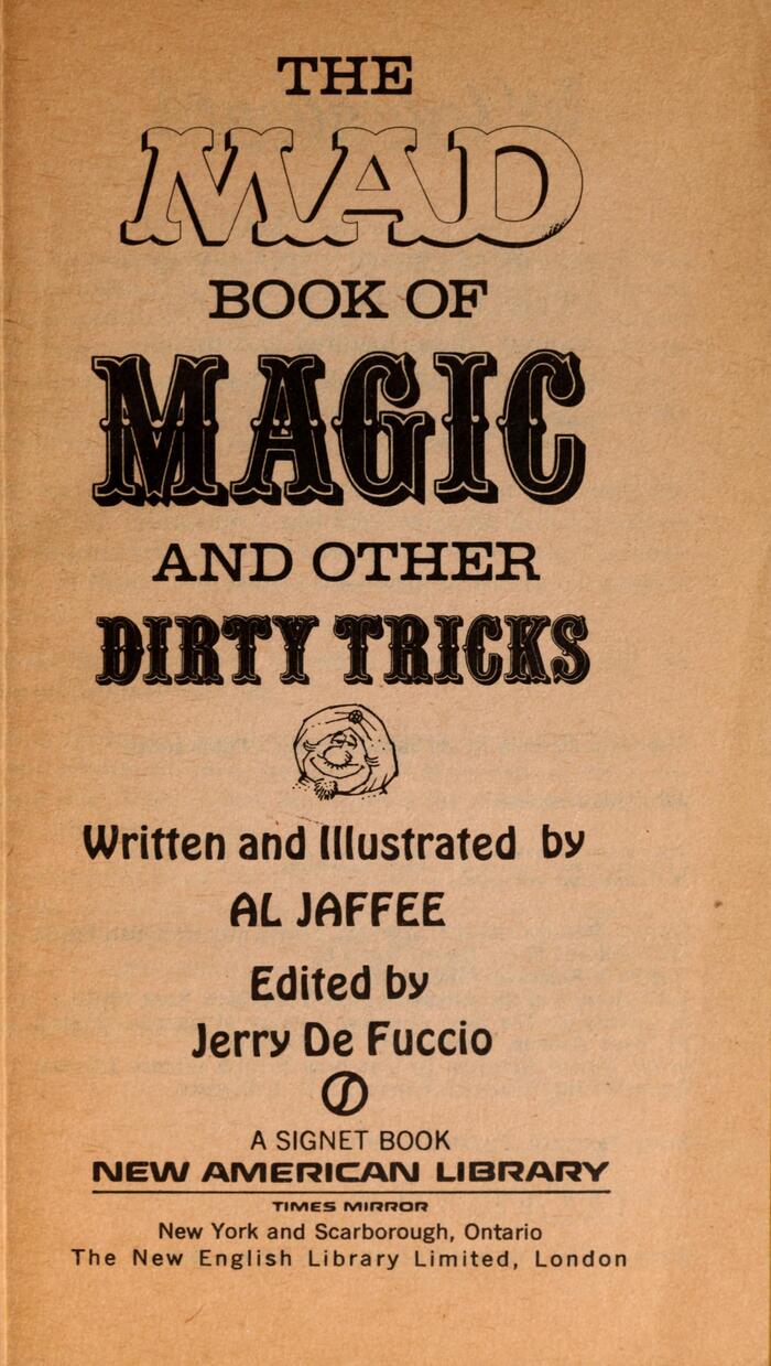
Title page, featuring Clarion Wide (“The”), Mad’s outlined logo, Quentin or the virtually identical Davison Carousel F (“Magic”), Hobo (credits), and News Gothic (“A Signet Book”. locations). The wide futuristic sans for “New American Library” is probably a custom font used by Times Mirror, see Patrick Concannon’s comment. Corporate Image is similar.
Source: comics.ha.com Heritage Auctions (edited). License: All Rights Reserved.
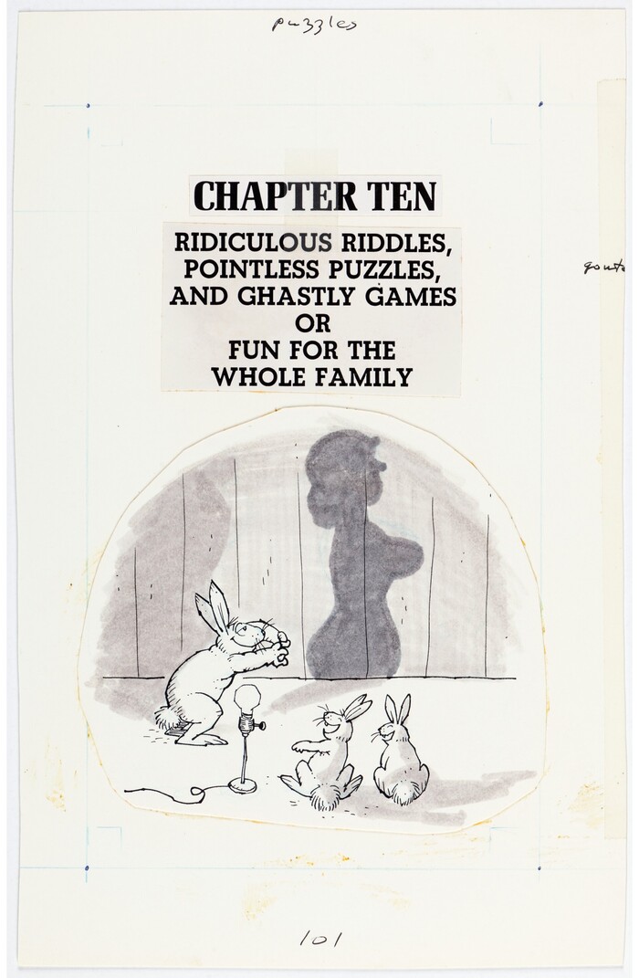
Melior Bold Condensed is used for chapter headings, with a subheading in the original curved leg design of Beton Bold, each of which is written in all caps.
Source: comics.ha.com Heritage Auctions (edited). License: All Rights Reserved.
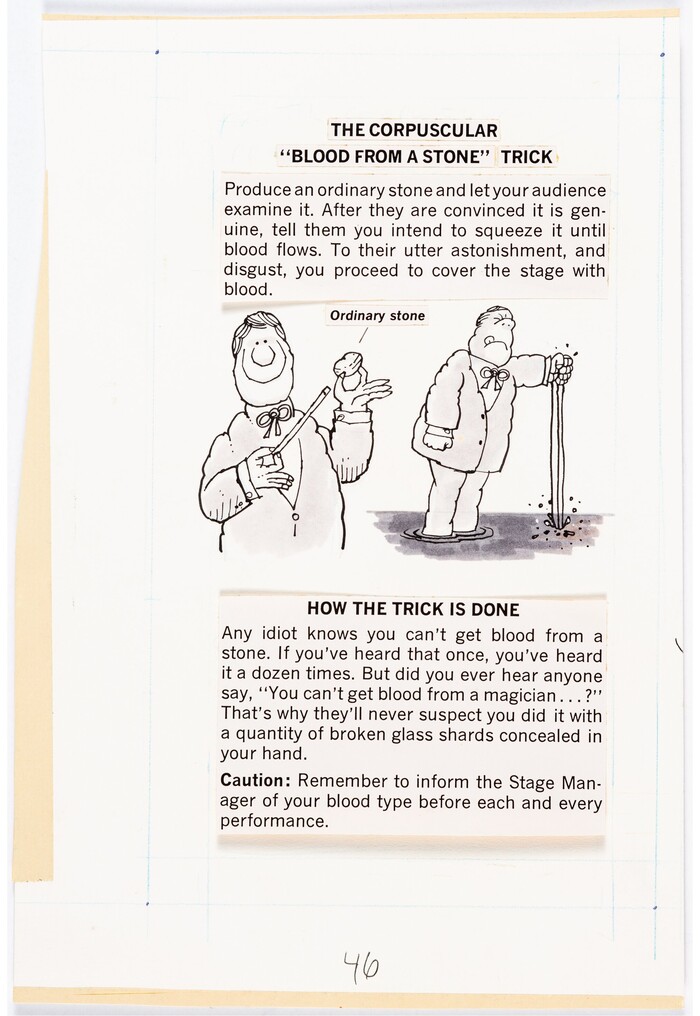
An example of News Gothic. This is the main text face (including the speech bubbles), and in most Mad books and magazines.
Source: comics.ha.com Heritage Auctions (edited). License: All Rights Reserved.
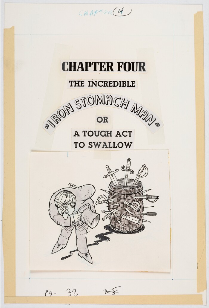
“Iron Stomach Man” is stylized in Orplid on a curve with its round-top form for A.
Source: comics.ha.com Heritage Auctions (edited). License: All Rights Reserved.
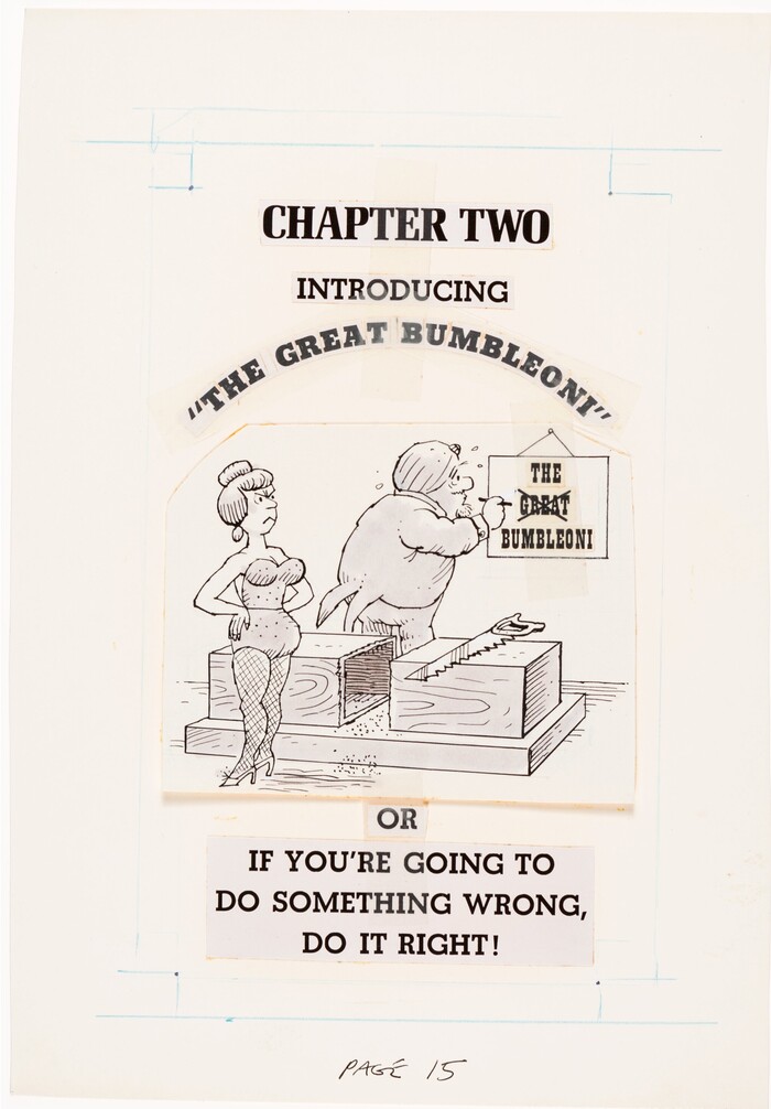
“The Great Bumbleoni” features Beton Extra Bold. Included in the artwork, a crossed-out sign in Playbill.
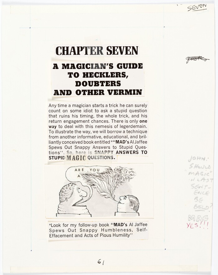
Source: comics.ha.com Heritage Auctions (edited). License: All Rights Reserved.
Within the last sentence of this introductory paragraph “MAGIC” is stylized in Clarendon Bold Condensed.
The “John” person that noted this suggestion in text (seen to the lower right of the page art) is John Putnam, presumably designing for this book.
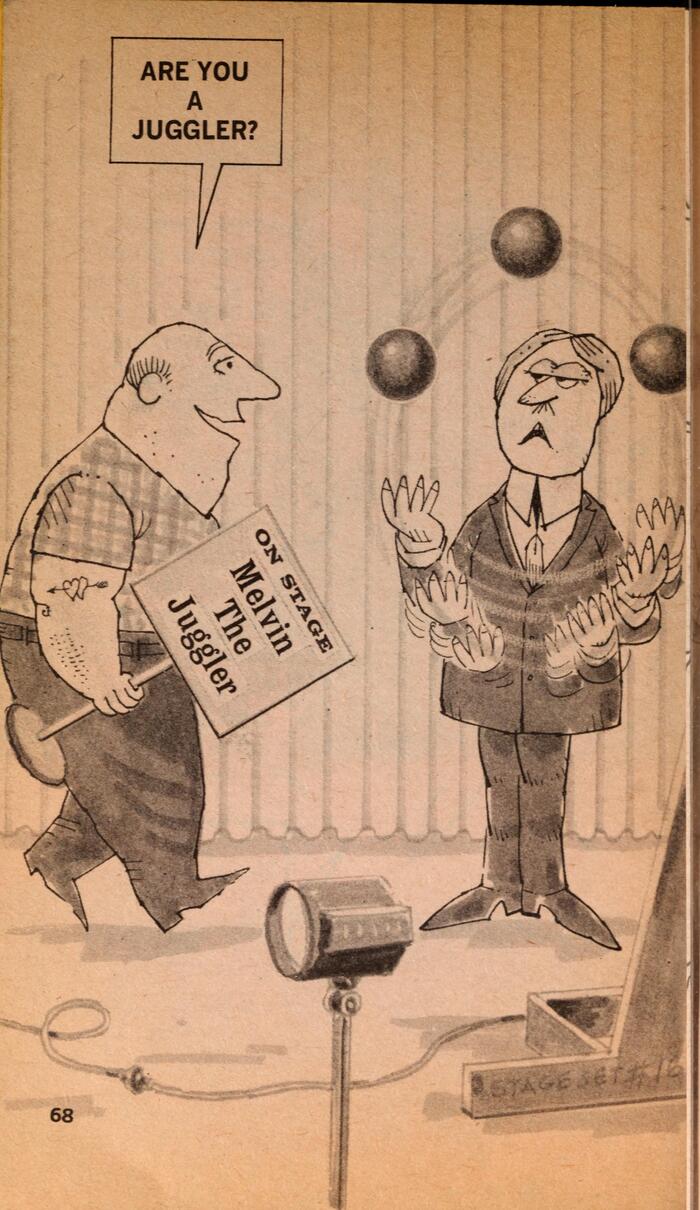
Source: archive.org New American Library; Penguin Random House LLC. License: CC BY.
Volta and Latin Bold Condensed used for a sign

Source: archive.org New American Library; Penguin Random House LLC. License: CC BY.
More Playbill and Volta used for another sign.
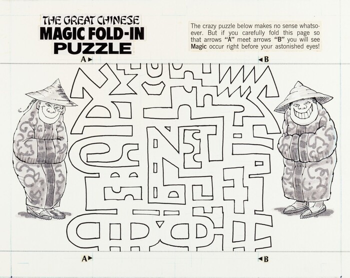
Source: comics.ha.com Heritage Auctions (edited). License: All Rights Reserved.
From the top left, it features the Chop Suey styled Peking (“THE GREAT CHINESE”), Flyer (“MAGIC FOLD-IN”), and an unidentified bold wide grotesque (“PUZZLE”). The “A”/B” labels probably are in Optima Bold.
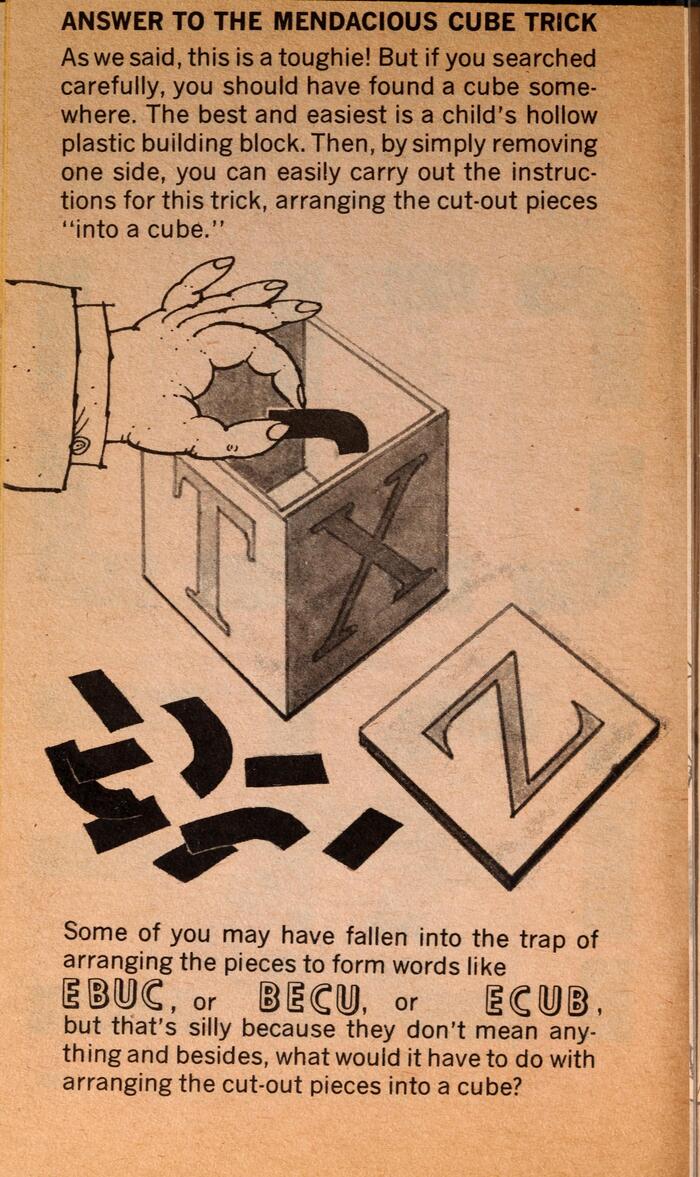
Source: archive.org New American Library; Penguin Random House LLC. License: CC BY.
Orplid makes another appearance ("EBUC").
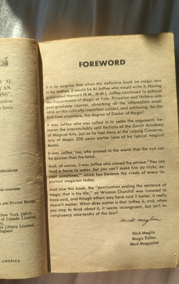
Photo: Sunny Schultz. License: Public Domain.
Futura is used for the foreword, along with a Bold heading. This foreword was only added after the reprints of the book.
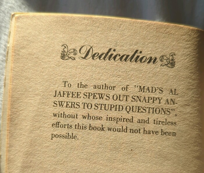
Photo: Sunny Schultz. License: Public Domain.
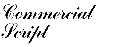
In the dedication page, the heading is set in Commercial Script between ornaments, and the text in Bodoni.
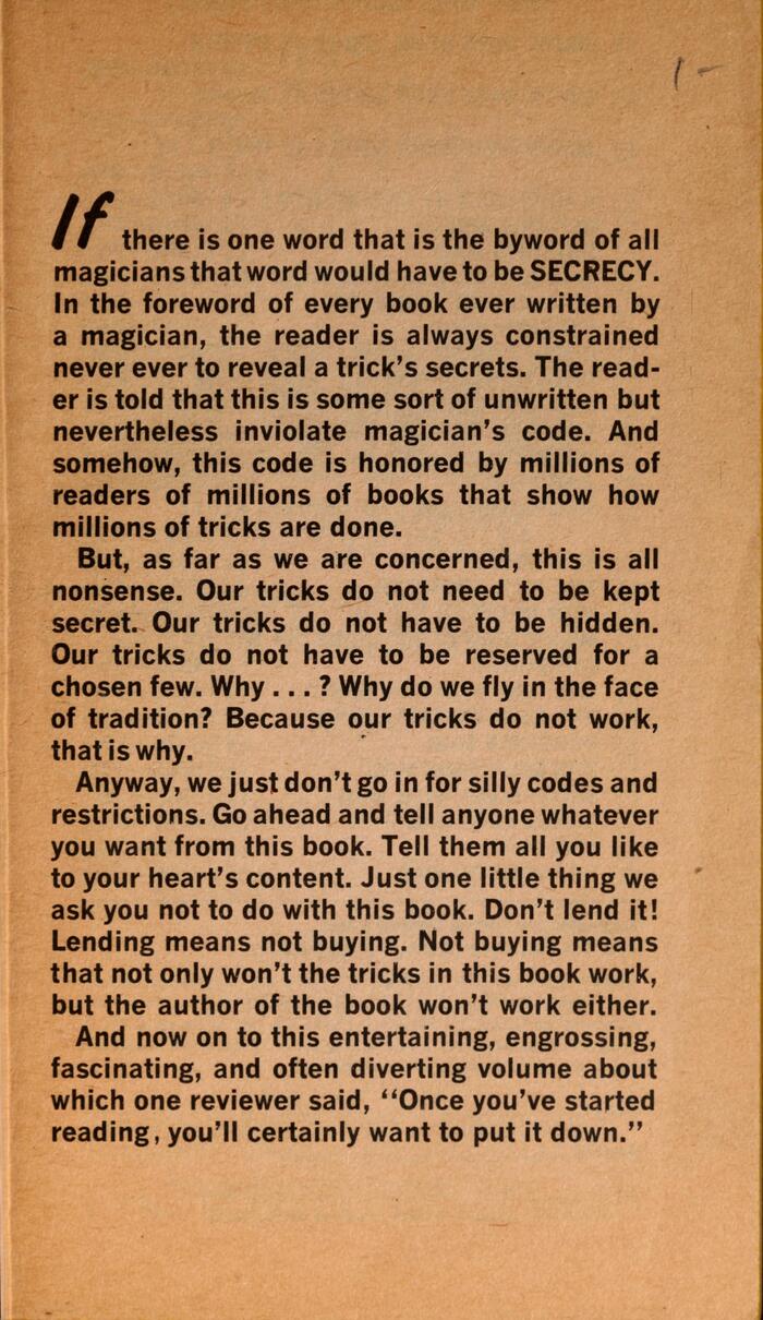
Source: archive.org New American Library; Penguin Random House LLC. License: CC BY.
In the preface, the initial “If” is set in Flash and the rest in News Gothic Bold.

Source: archive.org New American Library; Penguin Random House LLC. License: CC BY.
On the back cover, the book’s tagline (“Amaze friends…”) is written in Alternate Gothic, and the book title is reiterated using Dom Casual in all caps.

Source: ebay.com License: All Rights Reserved.
The book spine features more Alternate Gothic.
This post was originally published at Fonts In Use