Gestaltungsprobleme des Grafikers by Josef Müller-Brockmann

Source: www.theideaofthebook.com License: All Rights Reserved.
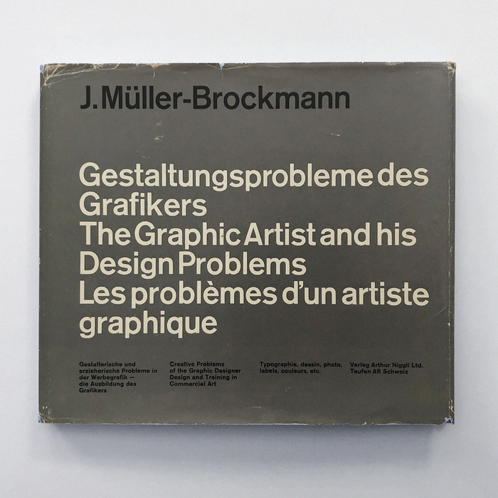
Book jacket (second edition by Niggli, Teufen, 1964)
Dan Reynolds, esteemed friend of the site, writes on Mastodon:
125 years ago today – at exactly 12:05 in the afternoon, Berlin time – H. Berthold AG filed prints of 13 sizes of Akzidenz-Grotesk’s regular weight with the Berlin Muster-Register. That means that it is the typeface’s “birthday” right now.
You can read more on his Typeoff blog and see internal Berthold documents from the Historical Archive at the Deutsches Technikmuseum.
Source: www.ebay.co.uk skylonabooks. License: All Rights Reserved.
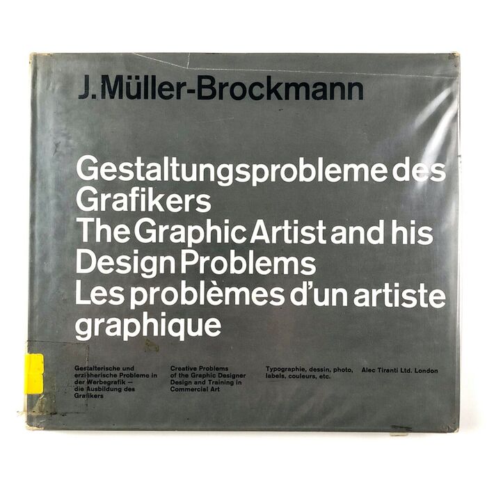
Book jacket (second edition by Alec Tiranti, London, 1964)
We celebrate Akzidenz-Grotesk’s big day by posting one of its most iconic uses, by a die-hard fan of the typeface.
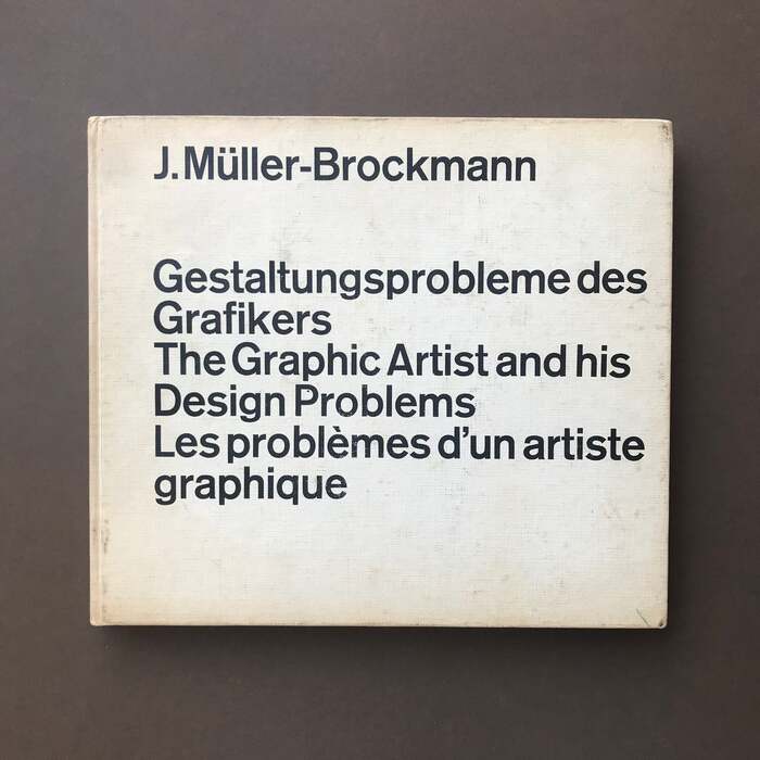
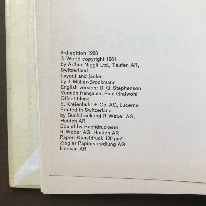
Gestaltungsprobleme des Grafikers (English: The Graphic Artist and his Design Problems, French: Les problèmes d’un artiste graphique) was written, compiled and designed by Josef Müller-Brockmann (1914–1996). He worked on the book while serving as professor of graphic design at the Kunstgewerbeschule Zürich, or School of Applied Arts, a position he held from 1957 to 1960. It was first published in 1961 by Verlag Arthur Niggli, Teufen AR, Switzerland. Alec Tiranti published it in the United Kingdom. A second edition followed in 1964, a third in 1968.
Source: www.theprintarkive.co.uk The Print Arkive. License: All Rights Reserved.
Book cover (first UK edition by Alec Tiranti, London, 1961). According to Felix Wiedler, this is 48pt Akzidenz-Grotesk halbfett. It’s used with very small word spaces.

Source: www.theprintarkive.co.uk The Print Arkive. License: All Rights Reserved.
Title page (third edition, 1968)
On 188 pages organized in eighteen chapters and a grid-based layout with four columns, Müller-Brockmann outlines his approach to solving visual design problems. As the subtitle hints at (“Design and Training in Commercial Art”), the book is directed at beginners and students. At the same time, it serves as a personal monograph: most of the shown works are by Müller-Brockmann himself. He does include works of others, too, for example by Ursula Keller, Nicoletta Baroni, Ruedi Rüegg, and Christof Gassner – who were among his students at the Kunstgewerbeschule.
Akzidenz-Grotesk is not only used throughout the book, from the cover to the captions. It’s also featured in numerous of the depicted examples, some of which were covered in previous posts on Fonts In Use.
In his book (design) story #89, Felix Wiedler points out that Gestaltungsprobleme des Grafikers was issued two years after Gerstner+Kutter’s Die neue Graphik and one year after Hans Neuburg’s Moderne Werbe- und Gebrauchs-Graphik, and that “the cover is very similar, too, with its asymmetric title in large Akzidenz-Grotesk letters. The brownish-grey jacket with black and white type is actually quite ‘Gerstner’)”.
Fun fact: when this book came out sixty-two years ago, Akzidenz-Grotesk was about sixty-two years old.
Source: www.theprintarkive.co.uk The Print Arkive. License: All Rights Reserved.
Colophon (third edition, 1968)
Source: www.theprintarkive.co.uk The Print Arkive. License: All Rights Reserved.
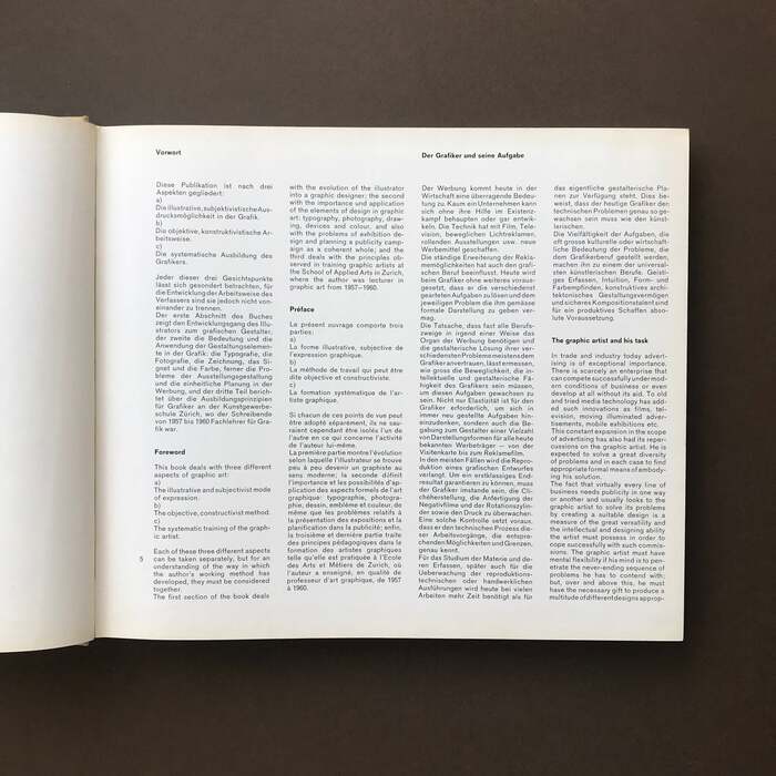
Preface and start of first chapter about “the graphic artist and his task”

Source: www.theprintarkive.co.uk The Print Arkive. License: All Rights Reserved.
Typography in advertising
Source: www.theideaofthebook.com The Idea of the Book. License: All Rights Reserved.
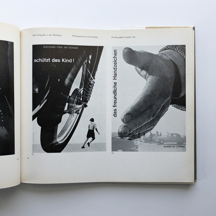
Photography in advertising: two posters from a campaign for more road safety

Source: www.theprintarkive.co.uk The Print Arkive. License: All Rights Reserved.
The drawing in advertising
Source: www.theideaofthebook.com The Idea of the Book. License: All Rights Reserved.
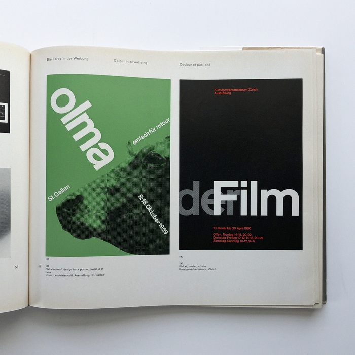
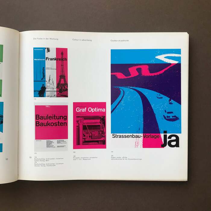
Colour in advertising.
Left: even JMB got his stuff rejected: the poster for OLMA 1959 remained unrealized.
Right: Der Film was an exhibition shown at the Kunstgewerbemuseum Zürich in 1960.
Source: www.theprintarkive.co.uk The Print Arkive. License: All Rights Reserved.
Colour in advertising
Source: www.theideaofthebook.com The Idea of the Book. License: All Rights Reserved.
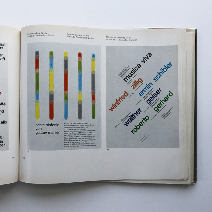
Concert posters for the Tonhalle Gesellschaft Zurich
Source: www.theideaofthebook.com The Idea of the Book. License: All Rights Reserved.
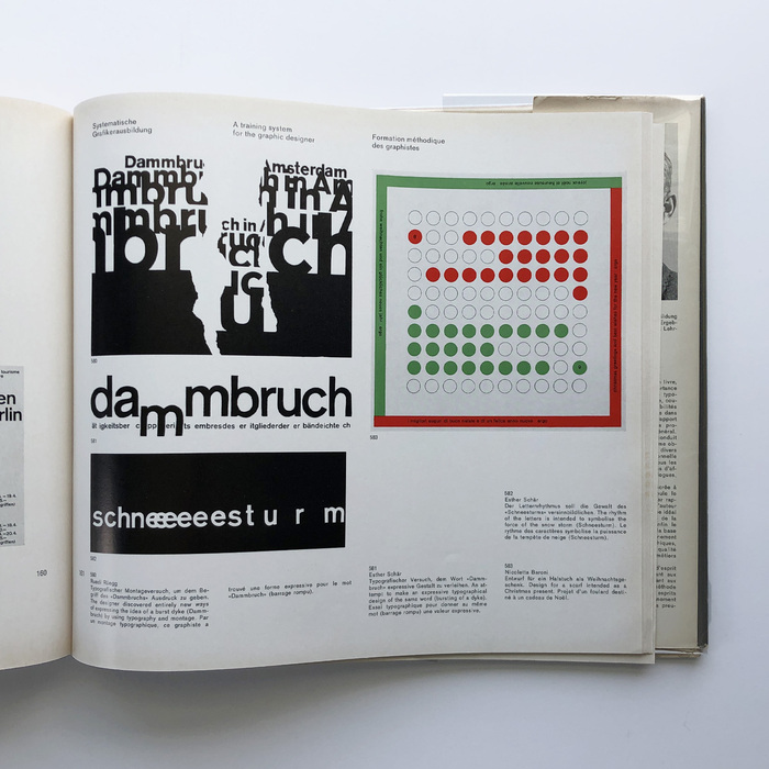
A training system for the graphic designer
This post was originally published at Fonts In Use