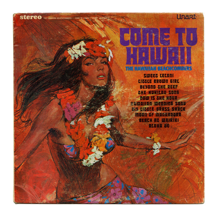
The Hawaiian Beachcombers – Come to Hawaii album art
Published January 22, 2023
By FontsInUse
Photo(s) by Bart Solenthaler on Flickr.

Source: www.flickr.com Uploaded to Flickr by Bart Solenthaler and tagged with “tiptop”. License: All Rights Reserved.


This post was originally published at Fonts In Use

Source: www.flickr.com Uploaded to Flickr by Bart Solenthaler and tagged with “tiptop”. License: All Rights Reserved.


The typeface used on the cover of this album of Pacific music from 1967 is a phototype version of Tip-Top. The top-and-bottom-heavy display face originated at the Klinkhardt foundry in Leipzig in 1902. The original had a T with curling stem and an H that follows the minuscule construction as seen in blackletter typefaces.
The album title uses more conventional forms for these two characters, as well as for W. The latter appears to be an upside-down M. Tip-Top’s standard W with the horizontal end stroke can be seen in the track names, alongside the curling T. The H here has the romanized form, too – it might have been available as an alternate.
This post was originally published at Fonts In Use
Read full story.
WRITTEN BY
FontsInUse
An independent archive of typography.
More from FontsInUse