Tapisserie Pâtisserie

Source: www.instagram.com License: All Rights Reserved.


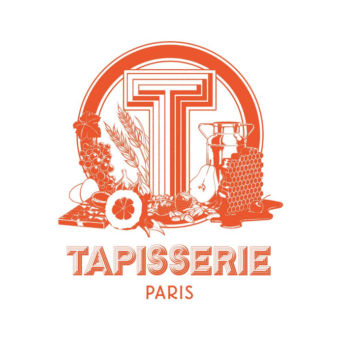
Tapisserie is a bakery with two shops in Paris, France. The shop name, which translates to “tapestry”, is a Verlan wordplay on pâtisserie (cake shop/bakery). Their visual identity was designed by Thomas Jumin.
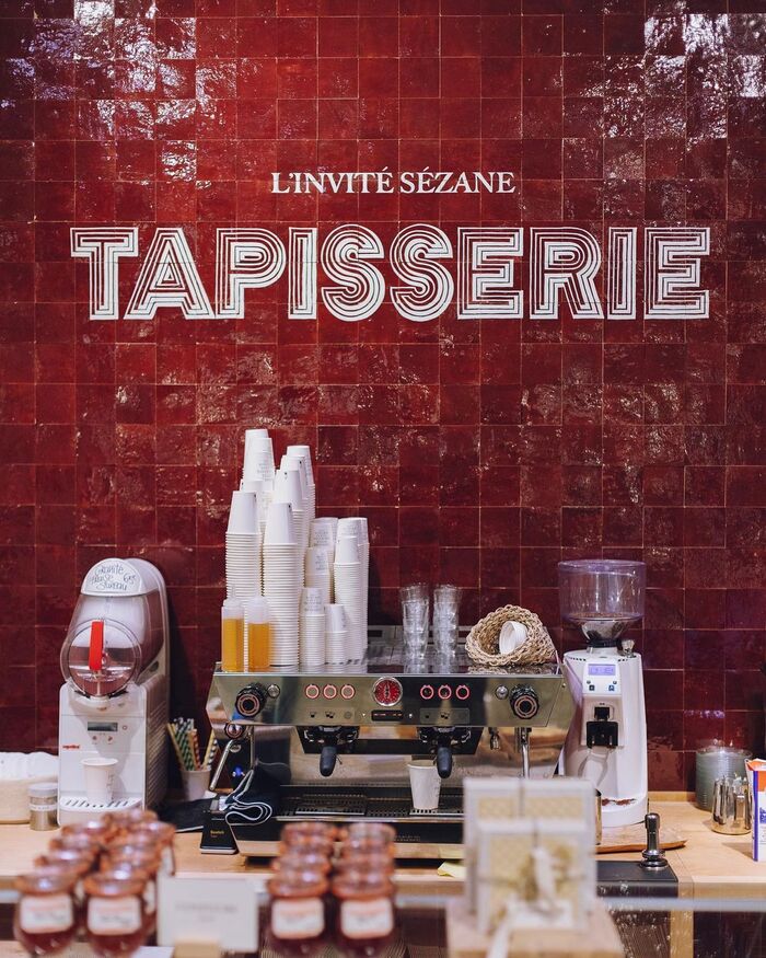
In their in-store shop in Le Bon Marché Rive Gauche sports a wall lettering which is equally layered. It is based on Stack and patiently handpainted on the shop’s handbaked wall tiles by sign painters Louis Lepais and Etienne Renard, who together form paint studio Ensignes Brillo. The stacked letters of Tapisserie are paired with “L’invité Sézane”, referring to clothing brand Sézane, rendered in some form of Caslon.
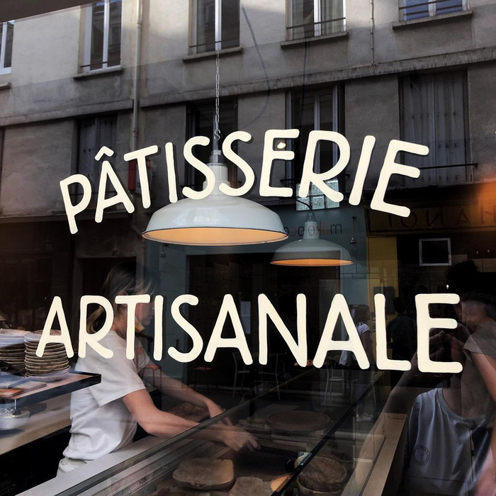
On the bakery website, Stack is paired with the the Light style of Berliner Grotesk in the logo. The same typeface is is also used on the windows of the bakery at the Rue de Charonne. In contrast with Stack, which looks like it was designed using a compass and ruler, Berliner Grotesk is an easier choice to render in paint: its outlines are bubbly by design.
It's probably too far-fetched but in a way the letters seem to participate in same meaning-shuffling of the bakery’s name, particularly Berliner Grotesk: a typeface trying to look like lettering becomes lettering based on a typeface.

Source: www.instagram.com License: All Rights Reserved.
Source: www.tapisserie-patisserie.fr License: All Rights Reserved.

Source: www.instagram.com License: All Rights Reserved.
Source: www.instagram.com License: All Rights Reserved.

Source: www.instagram.com License: All Rights Reserved.
Source: www.instagram.com License: All Rights Reserved.
This post was originally published at Fonts In Use