Great British Railways
Source: gbrtt.co.uk Copyright 2024 Great British Railways Transition Team. License: All Rights Reserved.
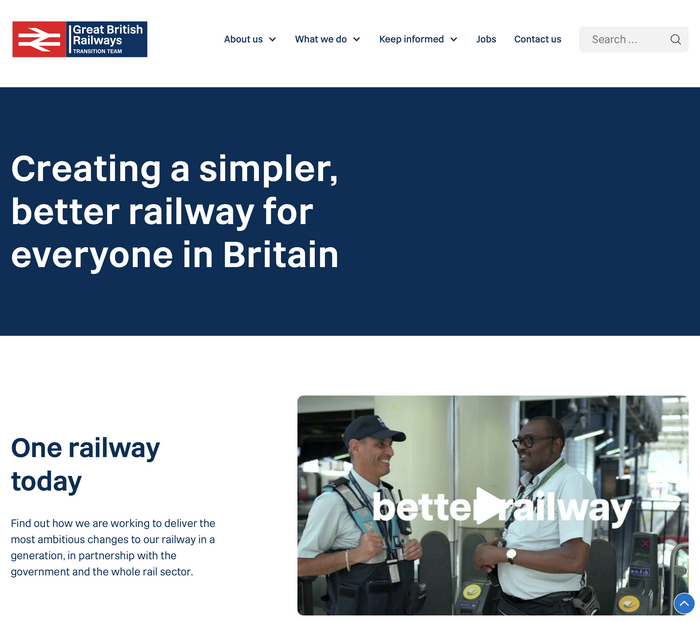
The Great British Railways site as of July 2024

In July 2024, the newly-elected UK Government announced its proposals for re-nationalizing the country’s railways. The website for the new organization, Great British Railways, features the typeface called Rail Alphabet 2. This is intended to be the new face of the UK rail network.
Rail Alphabet 2 is an updated and enhanced version of the original Rail Alphabet designed by Margaret Calvert of Kinneir Calvert Associates in the early sixties. It’s being designed by Calvert in collaboration with Henrik Kubel of A2-TYPE. From an article by Dezeen:
“It is sharper in appearance,” Calvert said. “This is particularly noticeable in how the curves join the vertical stem of the letterform, at an angle; and also lighter and more compact than the original Rail Alphabet.”
The Williams-Shapps Plan for Rail (PDF) proposal document of 2021, adopted by Great British Railways, states that the Great British Railways project will use Rail Alphabet 2 across the rail network.
This publication is the first to use the new typeface, Rail Alphabet 2. This is a continuation and evolution of Margaret Calvert and Jock Kinneir’s original Rail Alphabet typeface, which was employed across the rail network from the mid-1960s.
Margaret Calvert has collaborated with designer Henrik Kubel to develop Rail Alphabet 2. It retains the overall proportions of the original but the letters are sharper and slightly more compact for maximum legibility.
Great British Railways will introduce Rail Alphabet 2 across the rail network, replacing the many different fonts used on railway signage.
Source: web.archive.org License: All Rights Reserved.
The Great British Railways site at the time of its launch in October 2021
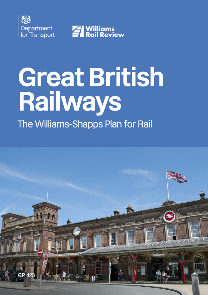
Source: assets.publishing.service.gov.uk License: All Rights Reserved.
The Williams-Shapps Plan for Rail from June 2021 presents the first use of Rail Alphabet 2. The cover depicts Chester station.
This post was originally published at Fonts In Use