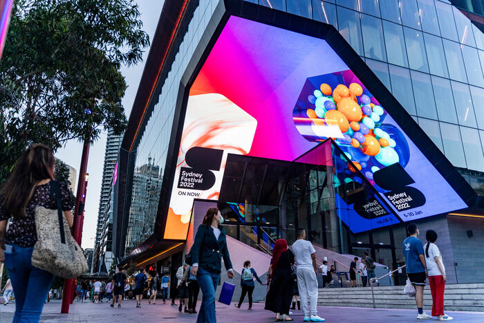
Sydney Festival 2022–24
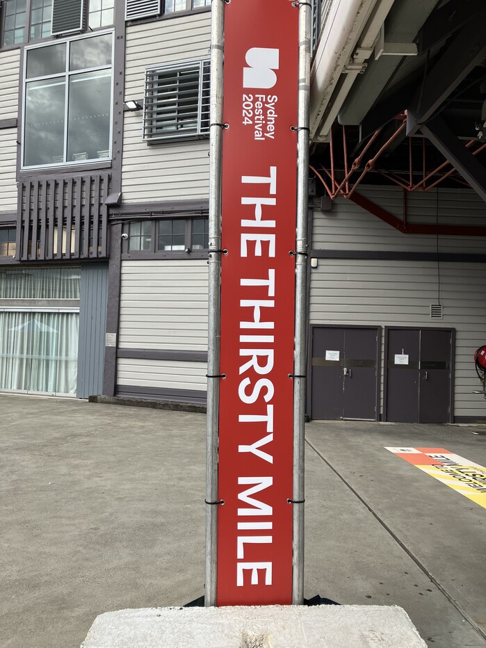
Photo: Karin Wagner. License: All Rights Reserved.

I came across Area at the Sydney Festival, where its Inktrap styles are used as a display typeface in all types of communication. It appears on signs about town, in printed material, and on the website. It is a good example of what I am writing about in my book From ASCII Art to Comic Sans: Typography and Popular Culture in the Digital Age, how typefaces that begin as special technical solutions are being used creatively for other purposes than originally intended.
ink traps were originally introduced to prevent clogging of letterfoms when printed on poor quality paper at high speed and in a small size. Tobias Frere-Jones, designer of Retina – a typeface with inktrap styles as an aid for legibility of small type in print and on screen, said in an interview that he could imagine his micro sizes being used for “very, very large sizes seen at a great distance”.
In Sydney, Area Inktrap is neither used for very small print in The Wall Street Journal nor for road signs on motorways, but instead for something in between.
The design by Re agency won the Best Awards New Zealand in 2022 in the category Large Brand Identity.
Source: www.instagram.com License: All Rights Reserved.
Source: www.re.design License: All Rights Reserved.
Source: www.sydneyfestival.org.au License: All Rights Reserved.
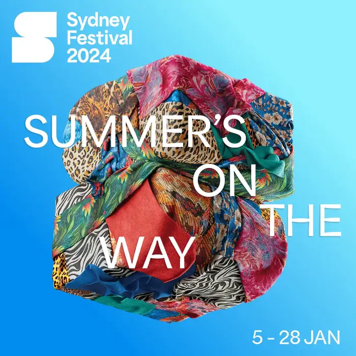
Sydney Festival website, 2024
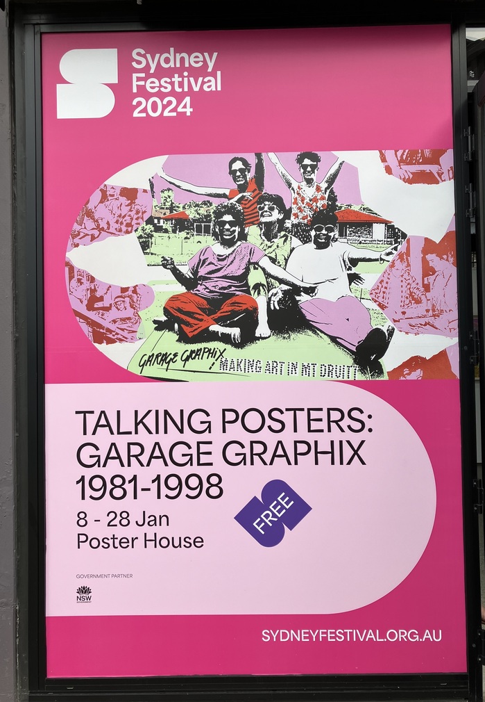
Photo: Karin Wagner. License: All Rights Reserved.
Source: issuu.com License: All Rights Reserved.
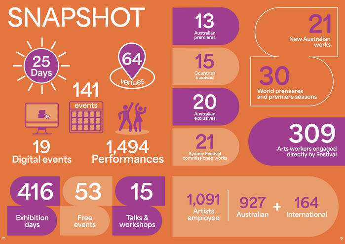
Screenshot from the 2023 festival report
Source: bestawards.co.nz License: All Rights Reserved.
This post was originally published at Fonts In Use