Swehl
Source: swehl.com License: All Rights Reserved.


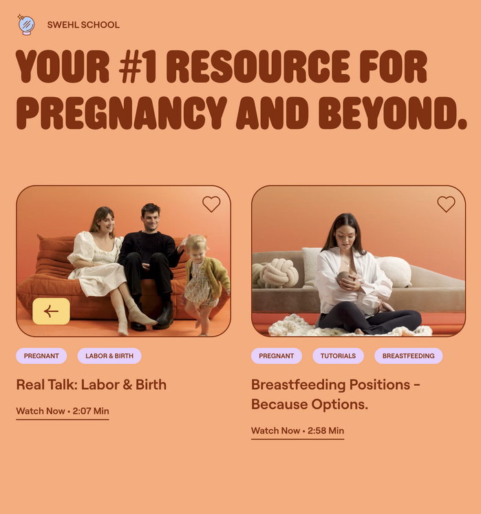
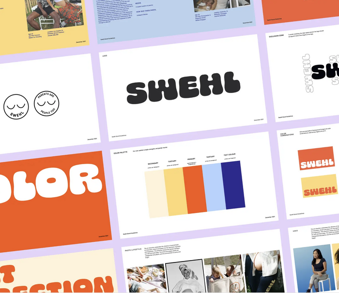
Swehl (pronounced like “Swell”) is a LA-based startup hoping to transform breastfeeding from a cluttered and confusing experience to a bright and cheerful one for new parents.
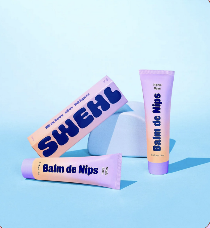
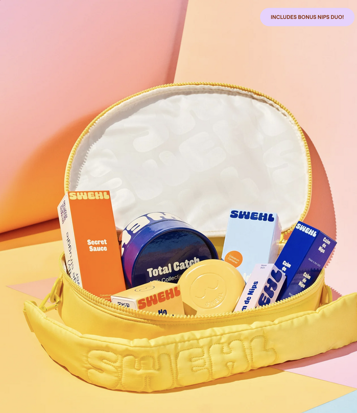
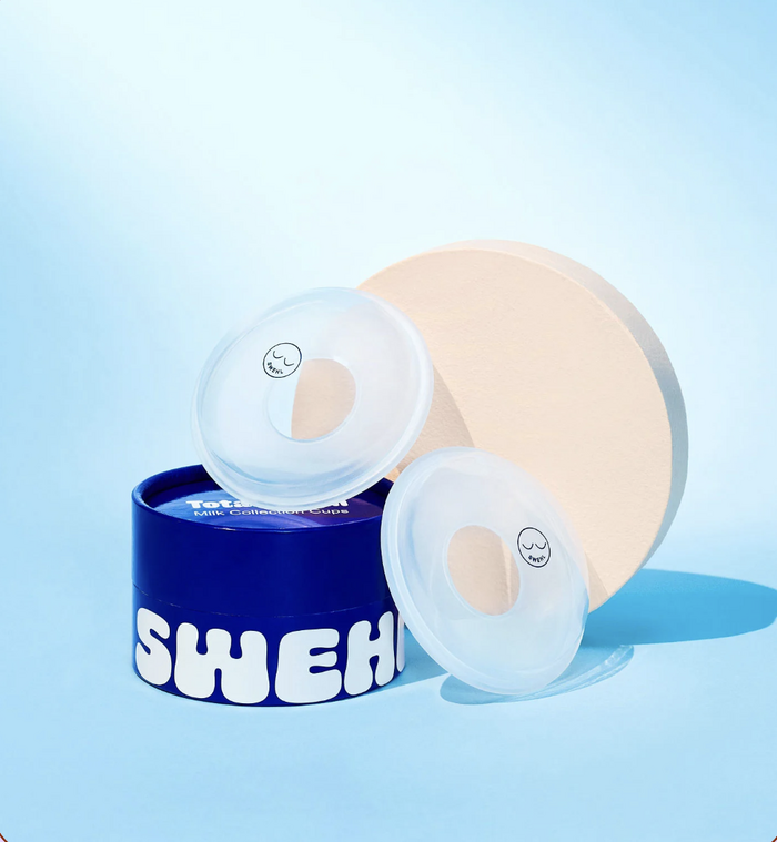
Human NYC (with art director Katherine Phil) put together a brand “inspired by LA sunshine”, pairing pastel colors with super soft type to set Millennial and Gen Z moms at ease. A particular highlight of the brand is the cosmetics-inspired packaging designed by Dilan Walpola.
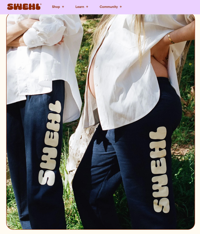
The star typefaces – Cheee (OH no Type Co.) in the logo and Caslon Rounded (Commercial Type) in headlines – really get along well. The relationship between the two hyper-rounded typefaces feels like that of two old friends of different sizes and shapes. The quirky geometric sans Roobert (Displaay) joins the group for support at text sizes.
Source: swehl.com License: All Rights Reserved.
Source: katherinepihl.com License: All Rights Reserved.
Source: swehl.com License: All Rights Reserved.
Source: www.human-nyc.com License: All Rights Reserved.
Source: swehl.com License: All Rights Reserved.
This post was originally published at Fonts In Use