Hodslavice
Source: www.panfolk.com Photography: Jan Andreáš. License: All Rights Reserved.
Welcome to Hodslavice, a Moravian community of 1,700.


How do you bring a design perspective to a community most would overlook?
At Panfolk, we’ve explored this question in our first case study, crafting an identity for the birthplace of František Palacký, one of Czech history’s towering figures. The answer? It’s complicated.
For Hodslavice, we wanted to rethink how a village could engage with its own past. Editorial New became a key part of that exploration—not as a flourish, but as a functional way to reflect the community’s character. Supported by Formula Condensed, it feels right at home on the village noticeboard while still connecting back to Palacký’s intellectual legacy.
The visual language needed a voice that didn’t feel out of place—a type that could speak to the everyday, but also carry a bit of weight when it came to local history. The written content throughout the village—whether it’s wayfinding markers, informational panels, or community newsletters—aims to balance the informative with the engaging. It’s about telling stories that are grounded in place, without turning them into a spectacle.
In reimagining Hodslavice’s look, we wanted to blend old and new in a way that felt natural. The stag from the 18th-century seal still features, reinterpreted for today, but it’s the tonality throughout that keeps it feeling coherent. It allows the history to feel like something you encounter as you move through the village, woven seamlessly into the present rather than kept at arm’s length.
For more information, background and images, visit the extensive case study on the Panfolk website.
Source: www.panfolk.com Photography: Jan Andreáš. License: All Rights Reserved.
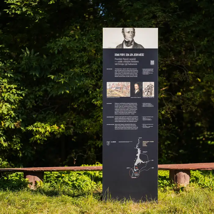
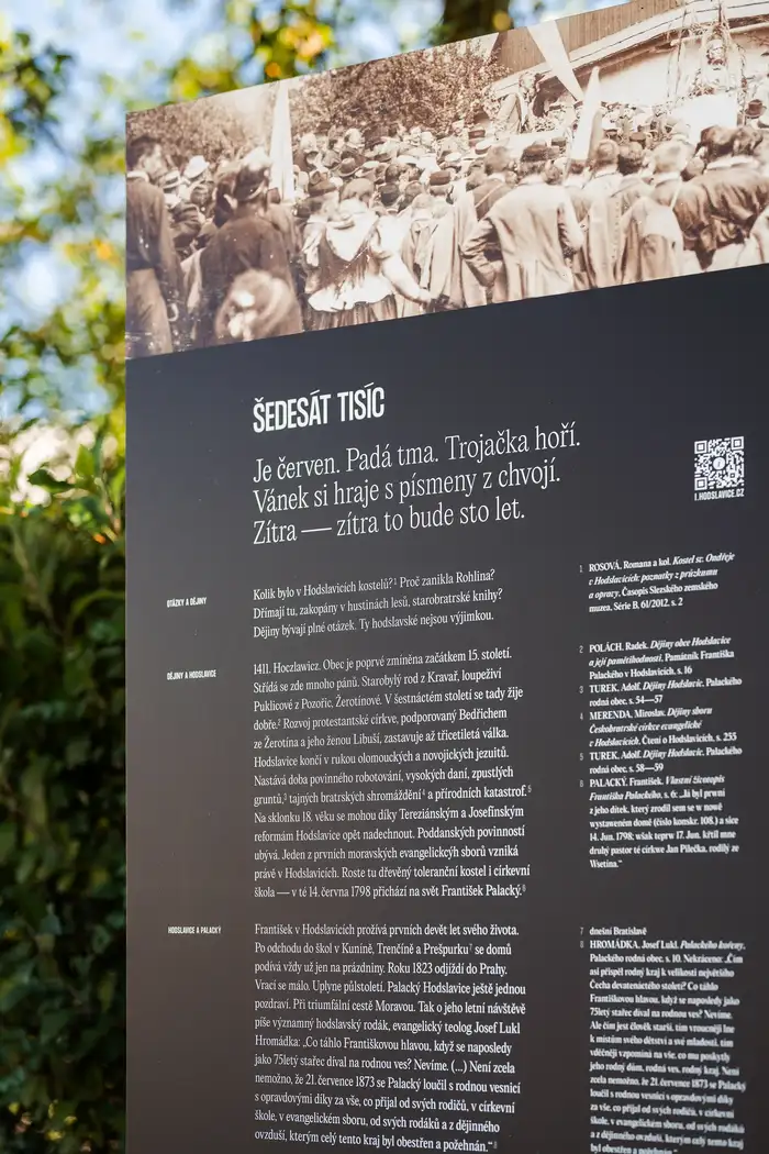
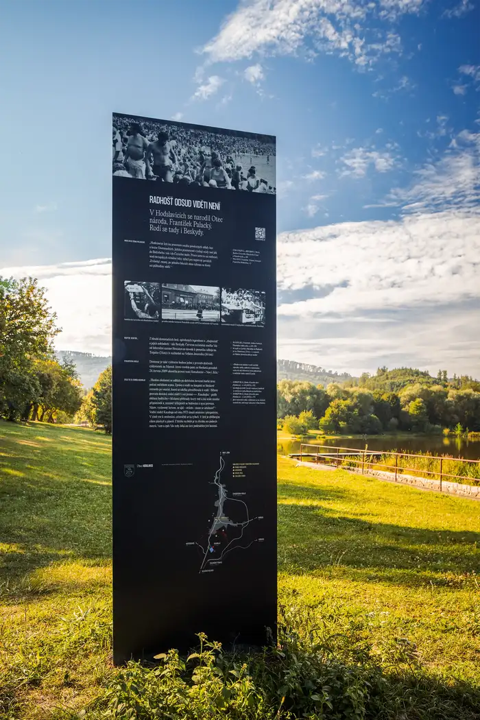
Spread around the village, five narrative panels invite deep divers and glancers alike
Source: www.panfolk.com Photography: Jan Andreáš. License: All Rights Reserved.
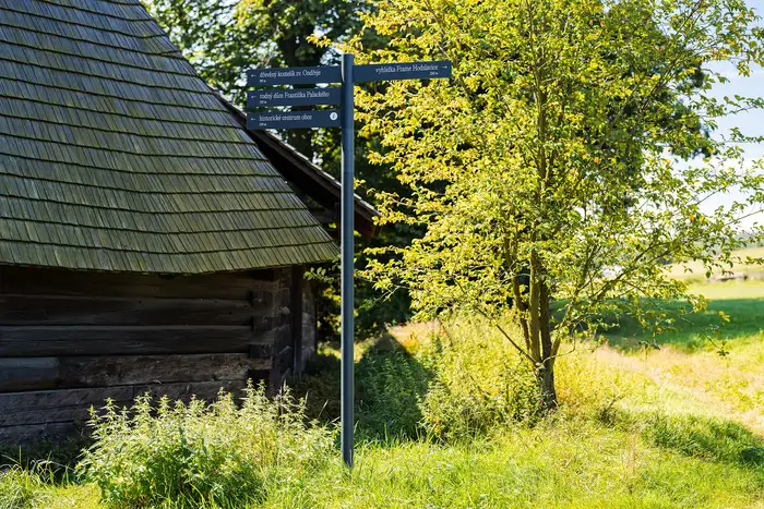
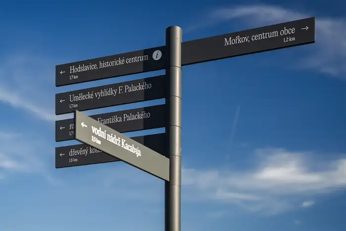
We wanted wayfinding to do its job without pomp, in any context
Source: www.panfolk.com Photography: Jan Andreáš. License: All Rights Reserved.
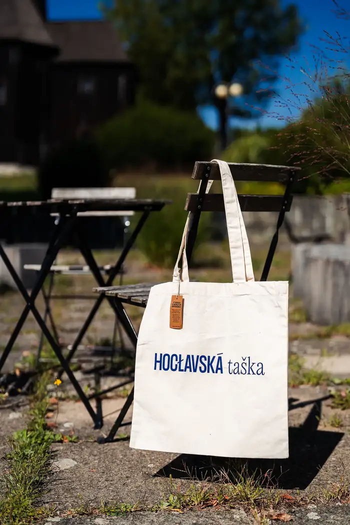
In Hodslavice, typography — and phonetics, for that matter — reigns supreme; even on a tote
Source: www.panfolk.com Photography: Jan Andreáš. License: All Rights Reserved.
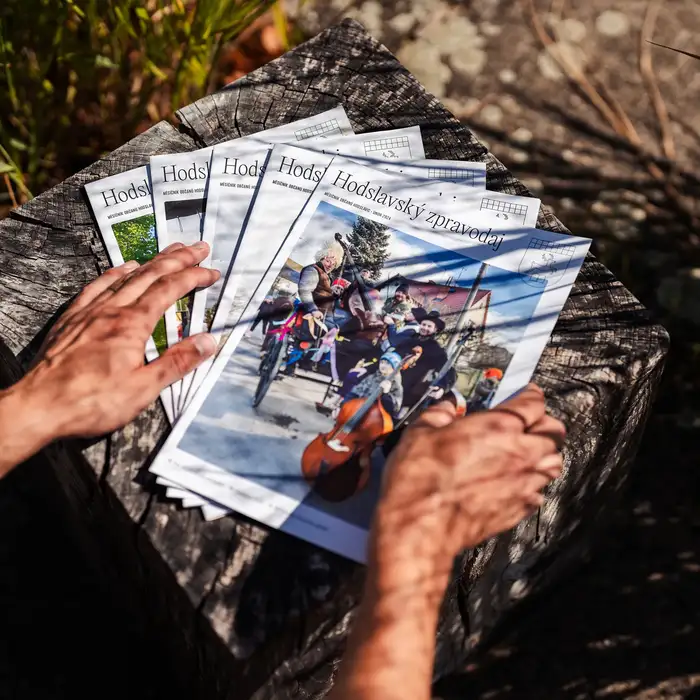
Municipal newsletter, sporting Editorial New
Source: www.panfolk.com Photography: Jan Andreáš. License: All Rights Reserved.
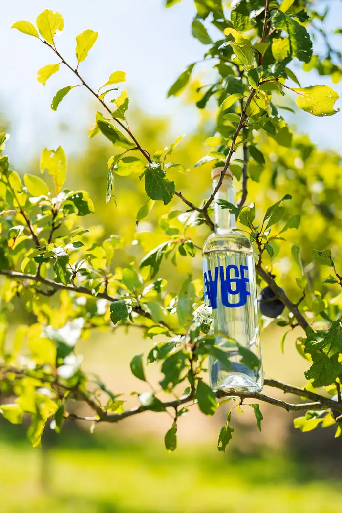
Ready to share the spirit of this place
Source: www.panfolk.com Photography: Jan Andreáš. License: All Rights Reserved.
There’s history here, tiny and large — we set out to make both approachable.
Source: www.panfolk.com Photography: Jan Andreáš. License: All Rights Reserved.
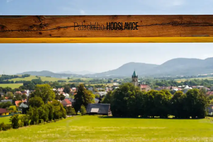
Editorial New leads the way.
Source: www.panfolk.com Photography: Jan Andreáš. License: All Rights Reserved.
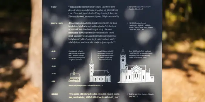
A trio of local churches, in context
Source: www.panfolk.com Photography: Jan Andreáš. License: All Rights Reserved.
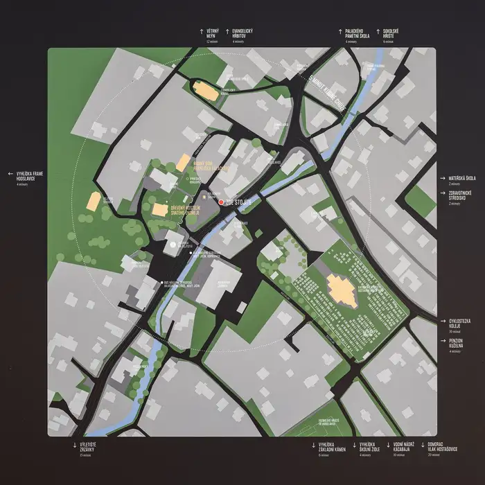
In situ, no history is insignificant
Source: www.panfolk.com Photography: Jan Andreáš. License: All Rights Reserved.
An integrated map unites key landmarks, while all-caps Formula Condensed highlights points beyond the village core.
This post was originally published at Fonts In Use