LAPO branding
Source: www.extrawowrdinary.com WOW. License: All Rights Reserved.
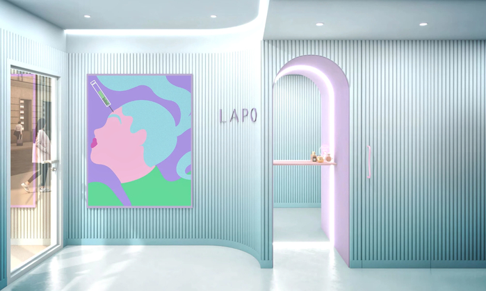
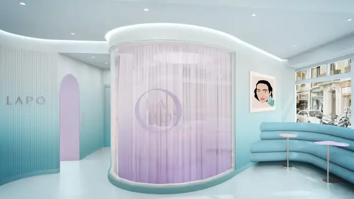
Lobby of the LAPO venue in Geneva

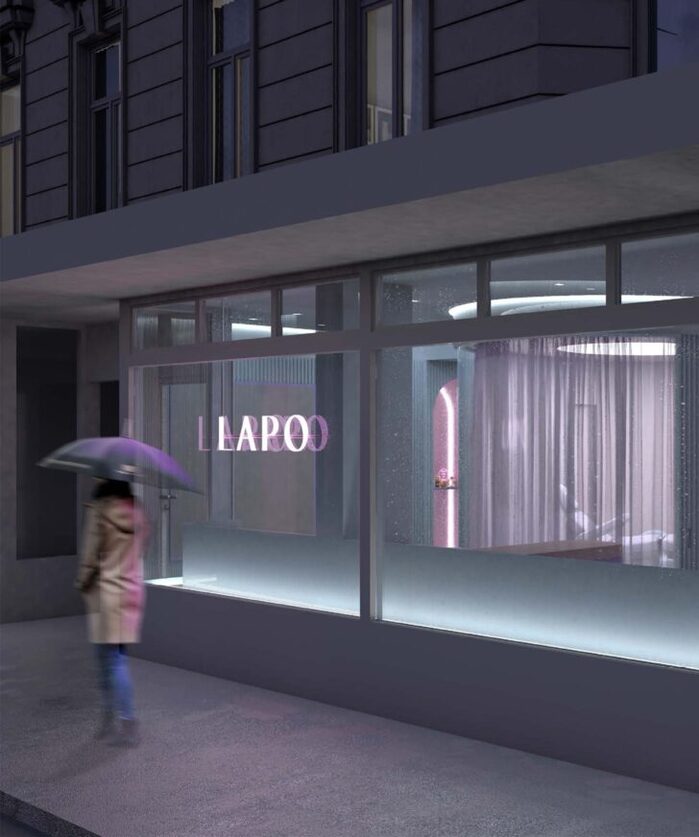
LAPO is a new business in Geneva offering a wide range of aesthetic medical treatments in an unconventional atmosphere.
Design and advertising agency Wow created a specific graphic language in collaboration with artist Asa Ariyoshi-Pope, visually supporting an overt, accessible and playful attitude towards aesthetic treatments.
The interior design of the first location in Geneva was designed in collaboration with Coral Studio, who also designed Lapo’s logo. The resulting interior is highly compliant with the corporate design style guide, featuring strong color accents and an obvious reference to flowing, clear lines and rounded shapes.
This reference is also visible in the choice of the corporate font. Relais Display, designed by Alexander Rütten and Olivia Wood from Ligature Type, is used in the logo, and also for headlines and text in all media (web, print, social media) in various styles.
Relais Display supports clarity and adds elegance, accentuating a ‘French touch’ in the general appearance of the corporate design.

Source: www.extrawowrdinary.com WOW. License: All Rights Reserved.
Mobile optimized web experience

Source: www.extrawowrdinary.com WOW. License: All Rights Reserved.
Brochure and business cards
Source: www.extrawowrdinary.com WOW. License: All Rights Reserved.
Treatment and waiting area

Source: www.extrawowrdinary.com WOW. License: All Rights Reserved.
Website
Source: www.extrawowrdinary.com WOW. License: All Rights Reserved.
Illuminated Logo on the storefront window
This post was originally published at Fonts In Use