Super Mario’s 40th birthday article in DIE ZEIT

Source: www.zeit.de License: All Rights Reserved.
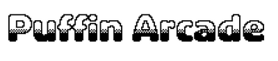
The main headline is a layered combination of Puffin Arcade Liquid, Nerf, Wipe, and Loadout.
Dutch type designer Pieter van Rosmalen has shown a long-time fascination with pixels and modular display fonts. His BlahBlah (2000–2021) is a brick-by-brick interpretation of the American Gothic. Quokka (2019–2021) “took shape by duplicating and layering the same bitmap letters in Adobe Photoshop”. Both are available from CakeType, a boutique label for distributing some of his early typefaces. Alterego, started in 2001 and released in 2018 with Bold Monday, is another design that evolved from layering bitmap letters on top of each other and subsequently playing with transparency and layer sequence.
Van Rosmalen’s most extensive series of bitmap fonts to date is Puffin Arcade (2012–2021). Its twelve members are based on the heaviest weight of Puffin Display Soft, which in turn is a spinoff of Puffin (a revision and extension of the earlier Pinup). With the exception of Foozle, all individual styles can be combined in layers for chromatic effect.
That’s exactly what Julika Altmann, designer at DIE ZEIT, did for an article by Florian Eichel that celebrates forty years of (Super) Mario. Each of the multicolor headlines is rendered in four of eight styles from Puffin Arcade: Regular, Chrome, Dither, Liquid, Loadout, Nerf, Warp, and Wipe. This was done by including the text four times, positioning the elements on top of each other via CSS, and hiding the decorative duplicates via the aria-hidden attribute from the accessibility API (think screenreaders and other assistive technology).
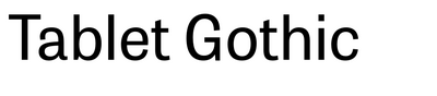
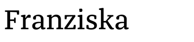
Puffin Arcade Regular also serves for secondary single-color headings and for the scores of the interactive mini games included in the article. The text typefaces are Jakob Runge’s Franziska and TypeTogether’s Tablet Gothic, used for the online edition of the newspaper since 2014.

Source: www.boldmonday.com Bold Monday. License: All Rights Reserved.
An overview of Puffin Arcade’s style range from the printed specimen booklet by Bold Monday

Source: www.zeit.de License: All Rights Reserved.
Jump menu to the three sections, or levels, of the article

Source: www.zeit.de License: All Rights Reserved.
Puffin Arcade Regular, Nerf, Chrome, and Loadout for “Der Retter”

Source: www.zeit.de License: All Rights Reserved.
“How many coins can you collect in 5 seconds?”

Source: www.zeit.de License: All Rights Reserved.
“Der Held” combines Puffin Arcade Regular, Nerf, Warp, and Loadout.

Source: www.zeit.de License: All Rights Reserved.
“Der Wandelbare” combines Puffin Arcade Regular, Nerf, Dither, and Loadout.

Source: www.zeit.de License: All Rights Reserved.
“Test your reaction time ”

Source: fontstand.com License: All Rights Reserved.
The style range of Puffin Arcade as presented on the Fontstand website
This post was originally published at Fonts In Use