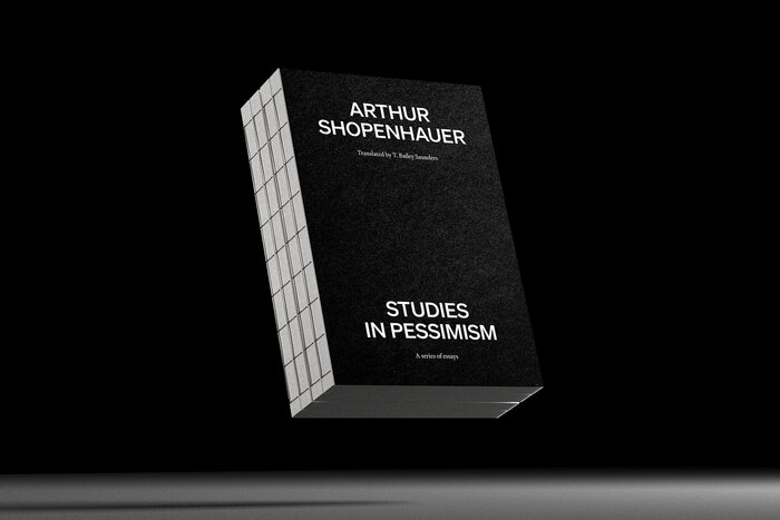
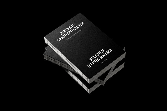
Studies in Pessimism by Arthur Schopenhauer (Sholotch student project)
Source: www.behance.net License: All Rights Reserved.


Studies in Pessimism is a series of philosophical essays where Arthur Schopenhauer offers his thoughts on "the sufferings of the world," why evil is positive, on "the vanity of existence", on suicide as a will to live, on women, and more. These esssays were the content for my student project as part of the Typography Book Layout course by Sholotch.
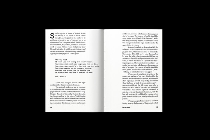
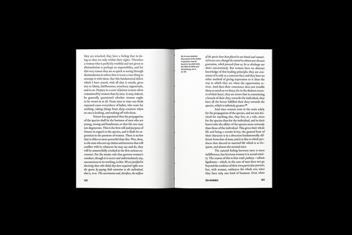
Throughout the book, all typography uses typefaces from Klim Type Foundry.
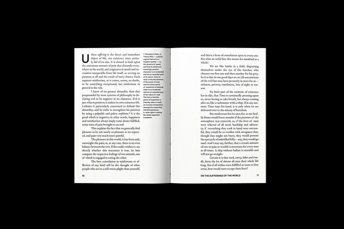
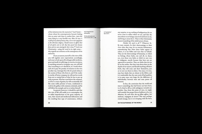
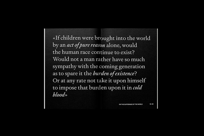
The body font is Signifier, a modern rethinking of the 17th century that looks perfect in either small body text or big sizes. Its beautiful italic text is used to emphasize quotations or terms. Söhne is used for chapter headings, page numbers, and footnotes. It’s described by thedesigner as “the memory of Akzidenz-Grotesk framed through the reality of Helvetica.” I also used its monospaced counterpart Söhne Mono for some quotations.
Signifier and Söhne work well together creating a beautiful typographic pair with brutalist shapes.

Source: www.behance.net License: All Rights Reserved.
Source: www.behance.net License: All Rights Reserved.
Source: www.behance.net License: All Rights Reserved.
Source: www.behance.net License: All Rights Reserved.

Source: www.behance.net License: All Rights Reserved.
Source: www.behance.net License: All Rights Reserved.
Source: www.behance.net License: All Rights Reserved.

Source: www.behance.net License: All Rights Reserved.
Source: www.behance.net License: All Rights Reserved.
This post was originally published at Fonts In Use