Detroit Opera brand identity
Scorpion Rose Studio. License: All Rights Reserved.
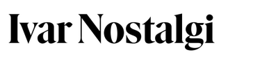


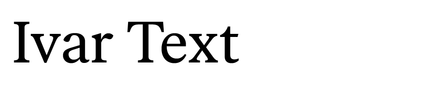
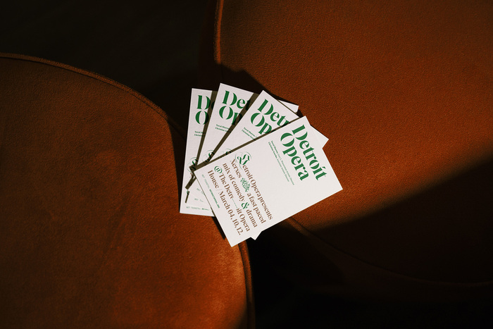
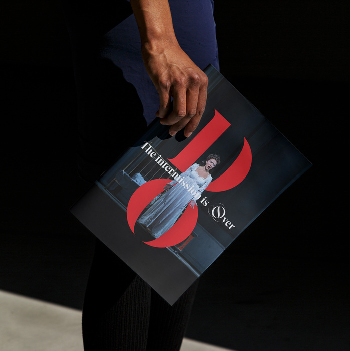
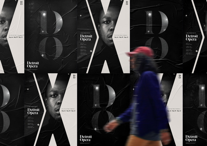
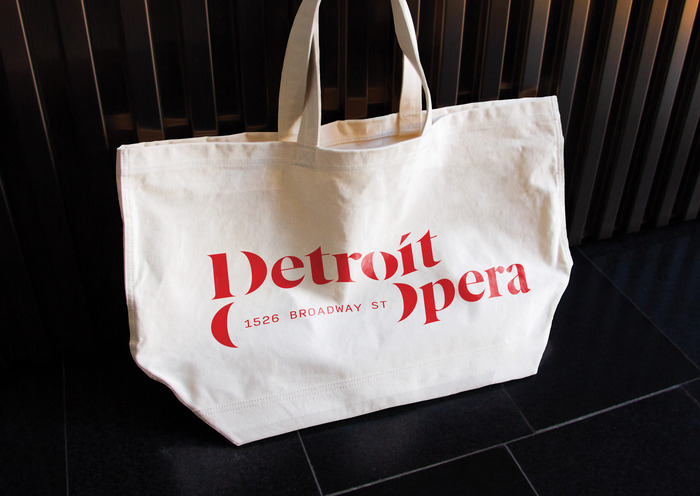
The new visual identity for the Detroit Opera consists of a kinetic typographic system that allows the brand to be flexible across various design applications. The primary typeface of the logo, Ivar Nostalgi Stencil, echoes the grassroots culture and visual artwork found throughout Detroit – primarily graffiti, street art and stenciling. We paired it with Input Mono, a modern monospaced typeface to elevate the tone. We then included a tertiary blackletter typeface, Jabin, for small accents that adds additional personality and movement to the brand identity. The blackletter typeface was chosen both out of respect for opera’s centuries old traditions as well as a subtle nod to the iconic Old English Detroit D, most familiar to people as the logo of the Detroit Tigers.
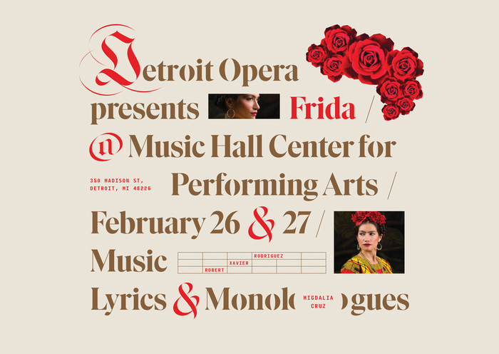
We created a full graphic brand system consisting of logo, color, typography, stationery and social media art direction. Additionally, we also created unique show art for the season, marrying the brand identity to unique visuals capturing each show’s essence.
View the full case study at he Scorpion Rose portfolio website
Scorpion Rose Studio. License: All Rights Reserved.

Scorpion Rose Studio. License: All Rights Reserved.
Scorpion Rose Studio. License: All Rights Reserved.
Scorpion Rose Studio. License: All Rights Reserved.

Scorpion Rose Studio. License: All Rights Reserved.
Scorpion Rose Studio. License: All Rights Reserved.

Scorpion Rose Studio. License: All Rights Reserved.
Scorpion Rose Studio. License: All Rights Reserved.
This post was originally published at Fonts In Use