Stay Connected: Navigating the Cloud at Tai Kwun Contemporary
Source: www.infoandupdates.com Studio Pianpian He and Max Harvey. License: All Rights Reserved.

From Tai Kwun Contemporary:
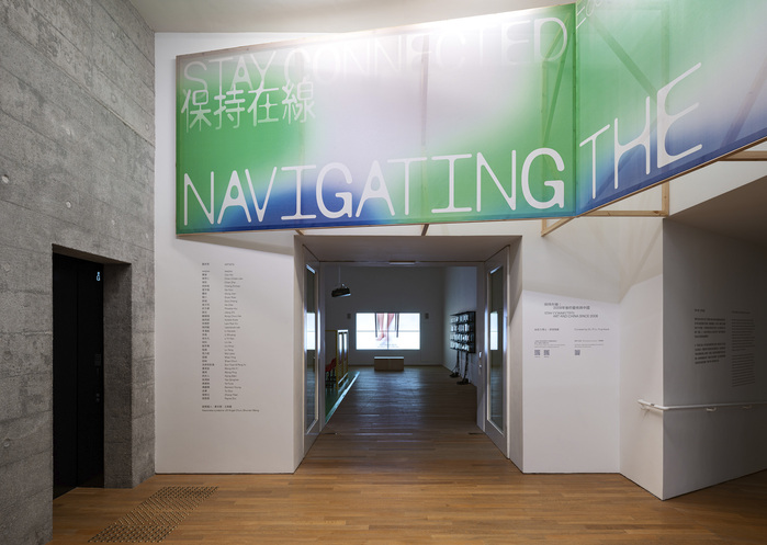
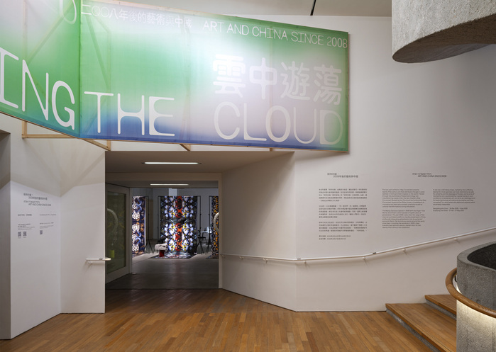
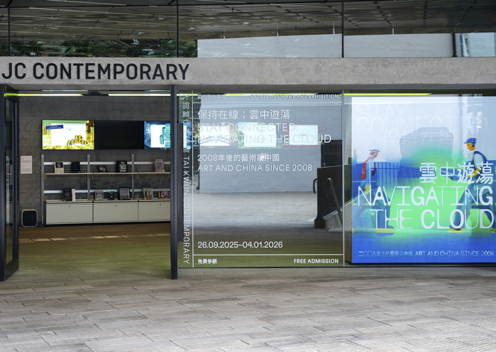
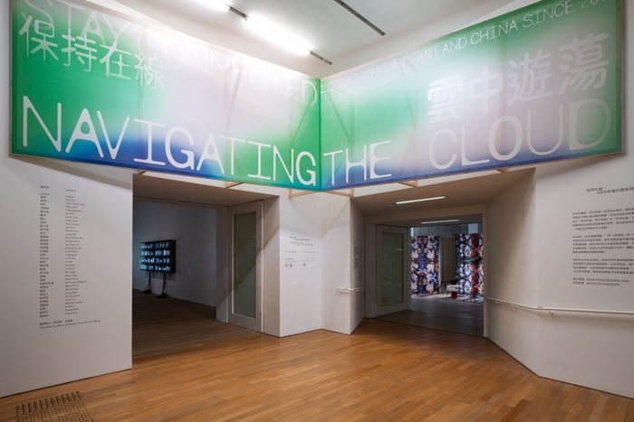
The panoramic exhibition Stay Connected: Art and China Since 2008 presents twenty-first century art that addresses changes in social realities in China and their impacts on the world. Framed through the dual lenses of digital technology and the manufacturing supply chain, the two chapters, titled Stay Connected: Navigating the Cloud (26 Sep 2025 to 4 Jan 2026) and the forthcoming Stay Connected: Supplying the Globe (27 Feb to 31 May 2026), trace a constellation of innovative and alternative artistic practices as well as cultural transformations during this period.
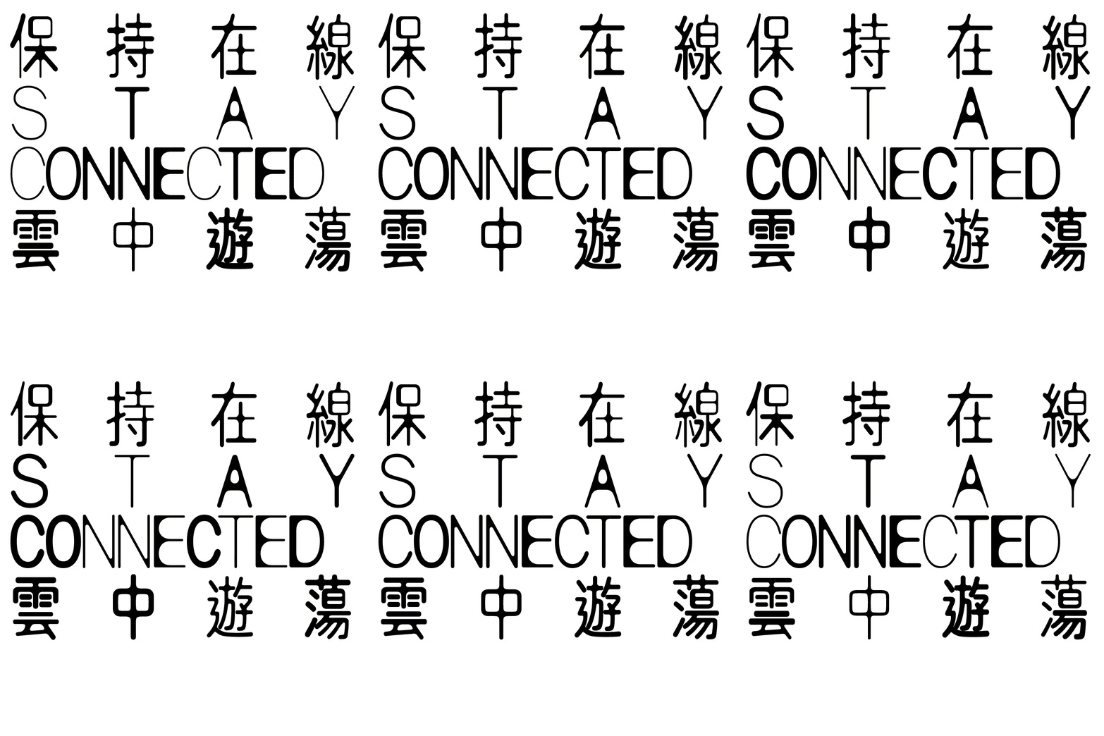
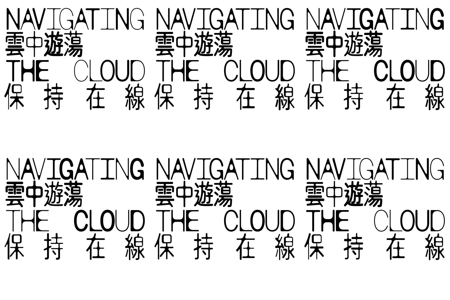
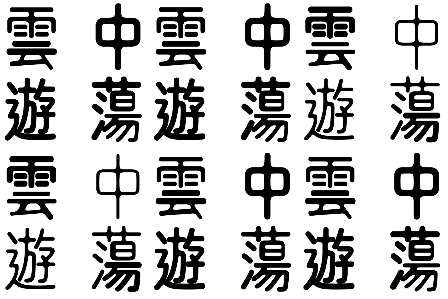
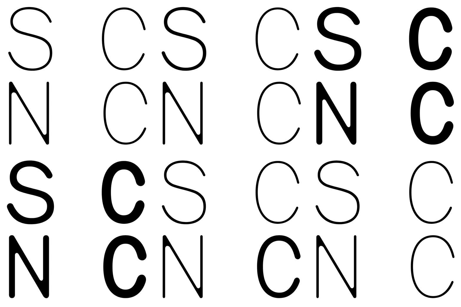
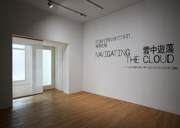
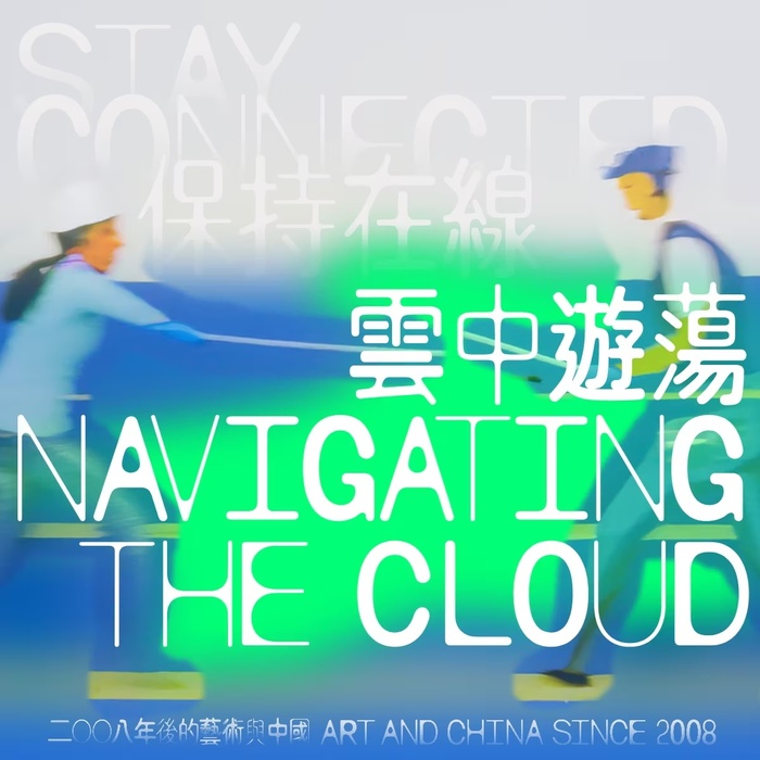
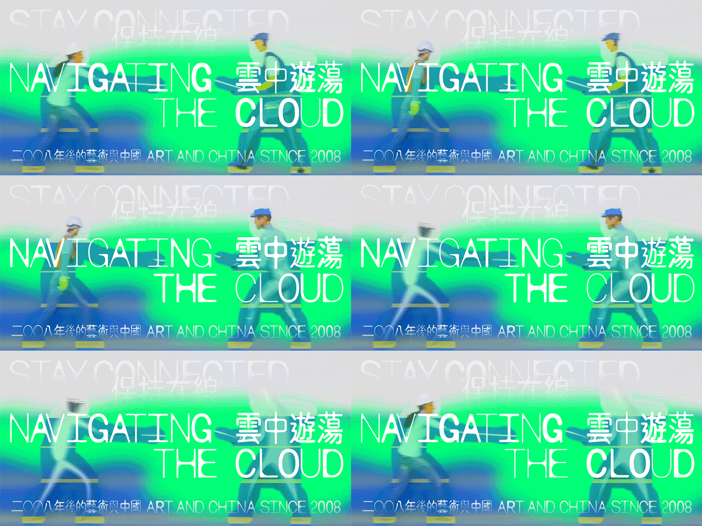
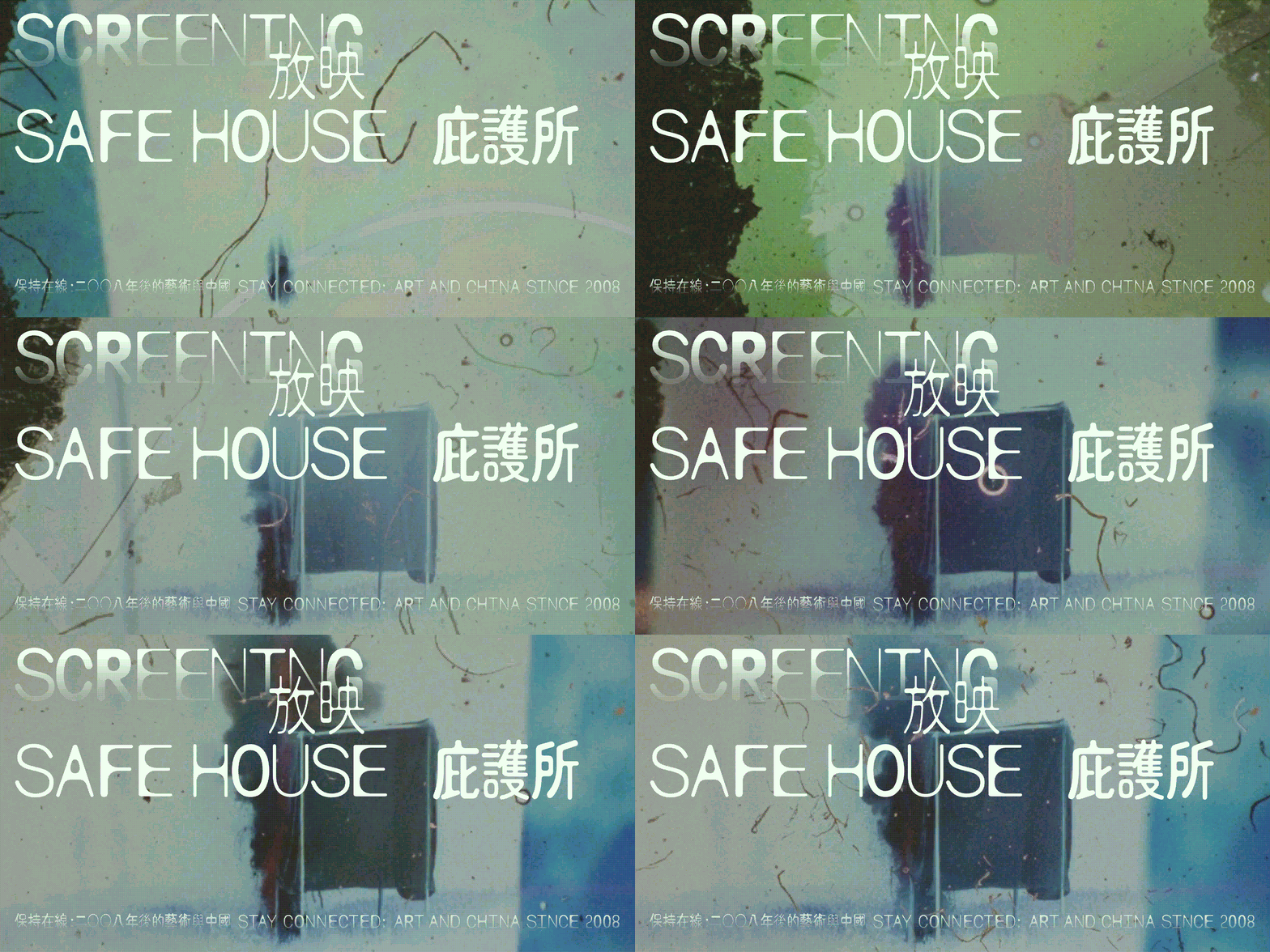
The project uses commonSans Condensed SWAP, a nonlinear variable font by notyourtypefoundry. Chinese characters are custom drawn based on the curves and non-linear animation nature of CommonSans Condensed SWAP.
The designers of Studio Pianpian He and Max Harvey comment:
In Pianpian’s hometown, Changsha, six subway lines were built in just eight years. By the time we returned in 2018, paper money had sort of disappeared. The textures of daily life, and how one perceives the country has shifted entirely when comparing it with the previous century. The early 21st century is marked by plastic surfaces, hyper-cloud networks, and mass consumption. As the curatorial foreword suggests, China itself becomes not just a subject but a concept, one that continues to shape artists’ practice and thinking.
With this in mind, we focused our reasoning on how the visual identity could reflect an environment that fosters this new generation of artists and the dramatic social transformations they navigate. The elusive cloud first led our choice of a typeface: CommonSans, designed by Gao Xiaoyuan. You might think of it as a “bubbly” or “clouded” Heiti, or a Yuanti, the ubiquitous sans serif font and rounded sans of our era, akin to Helvetica, its rounded counterpart or VAG rounded. If Heiti represents the clarity, reliability, modernity, and an emblem of mass production of this time, then CommonSans in its variable form is what remains after, post production: a worn, shaky and hazy face, yet carrying a distinct trace of its moment. Together with Wang Xuechun, we extended this idea by developing a matching Chinese variable font for a fixed amount of characters (not all the thousands), thus completing the visual identity for the exhibition.
Source: www.infoandupdates.com Studio Pianpian He and Max Harvey. License: All Rights Reserved.
Source: www.infoandupdates.com Studio Pianpian He and Max Harvey. License: All Rights Reserved.
Source: www.infoandupdates.com Studio Pianpian He and Max Harvey. License: All Rights Reserved.
Source: www.infoandupdates.com Studio Pianpian He and Max Harvey. License: All Rights Reserved.
Source: www.infoandupdates.com Studio Pianpian He and Max Harvey. License: All Rights Reserved.
Source: www.infoandupdates.com Studio Pianpian He and Max Harvey. License: All Rights Reserved.
Source: www.infoandupdates.com Studio Pianpian He and Max Harvey. License: All Rights Reserved.
Source: www.infoandupdates.com Studio Pianpian He and Max Harvey. License: All Rights Reserved.
Source: www.infoandupdates.com Studio Pianpian He and Max Harvey. License: All Rights Reserved.
Source: www.infoandupdates.com Studio Pianpian He and Max Harvey. License: All Rights Reserved.
Source: www.infoandupdates.com Studio Pianpian He and Max Harvey. License: All Rights Reserved.
This post was originally published at Fonts In Use