Standby: An Approach to Theatrical Design by Joshua Langman

Copyright © 2022 by Joshua Langman. License: All Rights Reserved.


Standby, published in 2022 by Southern Illinois University Press, presents a unique practical philosophy of design for the stage. Breaking with the habitual separation between the domains of writing and design, I lobbied to design and typeset the book myself. The result was honored as a selection in the international AUPresses Book, Jacket, and Journal Show.
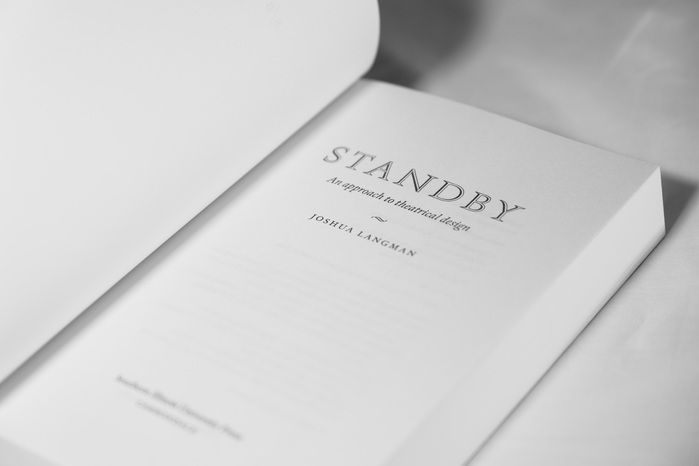
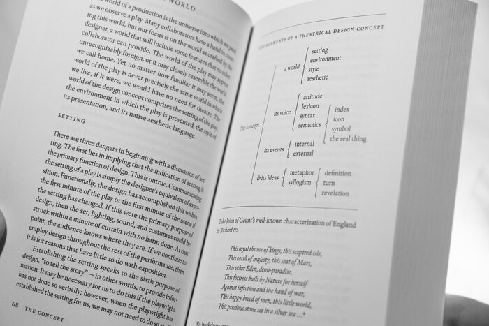
The design of Standby represents a contemporary interpretation of Renaissance book typography. One of the guiding principles of the design was not to introduce any element or manipulate the type in any fashion that would not be achievable in lead. Almost every piece of text, including extracts, headings, and chapter titles, is set in a single face and a single size. The typographic palette consists exclusively of roman, italic, small caps, and full caps. Pilcrows and midpoints are employed judiciously throughout. Captions and numerals for lists often hang in the margins, bringing some life to the space surrounding the textblock. In a deconstruction of a traditional Aldine chapter opening, chapter titles appear on the recto before the text begins. The opening text shows faintly through the paper, uniting the title and text in an implied single-page layout. The “S/B” device on the half-titles, built from the text face and a custom slash character, represents the traditional stage manager’s abbreviation for “standby.”
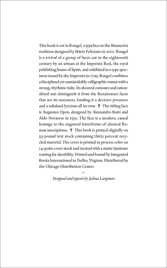
The text is set in Mário Feliciano’s Rongel. Rongel marries a certain kind of upright, almost staid formality with an unusual sharpness and tension in the letterforms. It has stage presence, conviction, a sense of theatricality which lends itself to this book about theatre. Rongel also feels not quite of this time, and indeed it is not — its roots lie in eighteenth-century Spain. The titling face, a classical homage with a sense of humor, made a pleasing contrast and alluded to mid-twentieth-century title page design.
A few characters in the text were borrowed from other faces as needed. For instance, the superior note numbers are set in Fontwerk’s Romaine, because I required proportionally spaced superior figures. All delimiters are set in roman, even in an italic context. All ampersands are set in italic, even in a roman context. I made a three-quarter-em dash and set it with spaces on either side. I likewise built my own ellipsis with my preferred spacing. All acronyms and roman numerals are in small caps. Subheads are capitalized sentence-style throughout. Extracts are italicized rather than set down in size.
A companion website and a suite of marketing materials employ the same typefaces and design aesthetic. More information about Standby can be found on the dedicated website. Additional images may be viewed on my portfolio website.
Copyright © 2022 by Joshua Langman. License: All Rights Reserved.
Copyright © 2022 by Joshua Langman. License: All Rights Reserved.
Copyright © 2022 by Joshua Langman. License: All Rights Reserved.
Copyright © 2022 by Joshua Langman. License: All Rights Reserved.
Copyright © 2022 by Joshua Langman. License: All Rights Reserved.
This post was originally published at Fonts In Use