Sonnentraum tea

Source: www.instagram.com Samuel Lewek. License: All Rights Reserved.


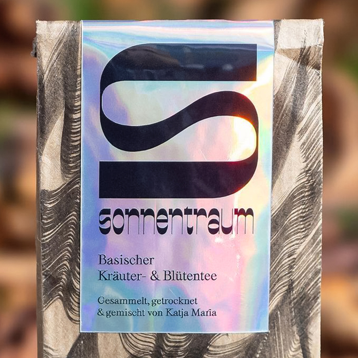
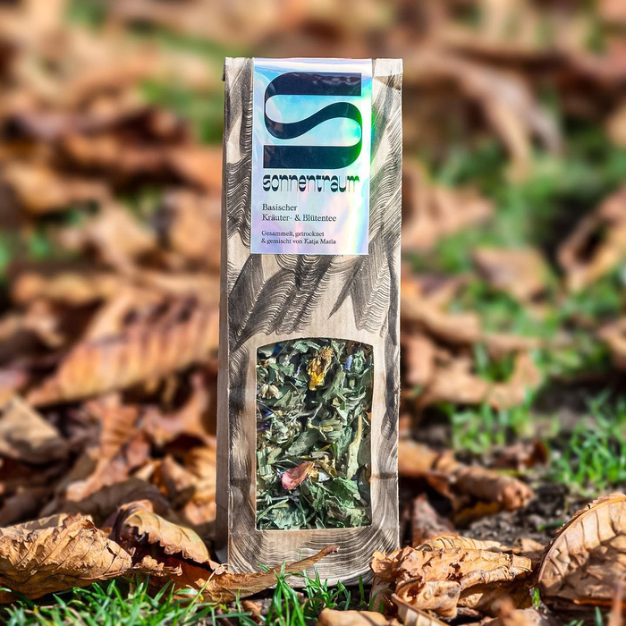
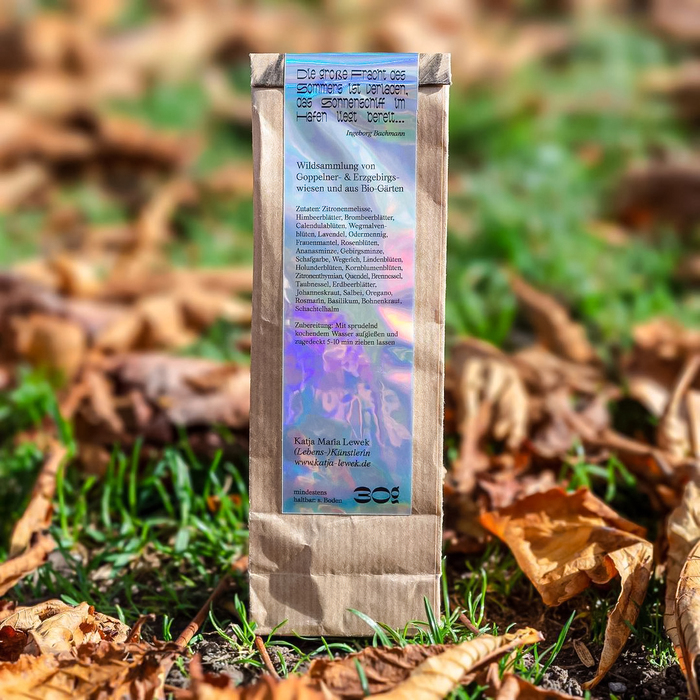
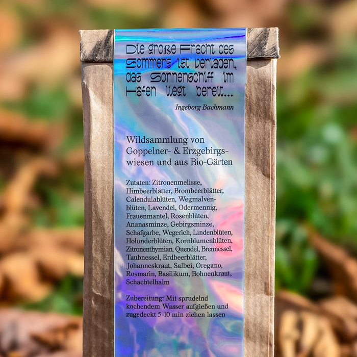
Visual identity and clean iridescent product packaging designed by Samuel Lewek for his mother’s professional activity. In an Instagram post, Samuel Lewek describes the project:
Whenever I visit my old hometown, I get some fresh tea from my mum. She collects it on the meadows and fields in our neighborhood, dries it and fills it by hand. Whenever I drink this tea – no matter where I am – it tastes and smells like home.
As an artist, her work has become more graphic in recent years. The packaging combines her skills (each package is hand painted with ink) and my love for typography. Nice mother and son collaboration I would say.
This cool creation is based on illustrations and two typefaces: Plage from Lift Type and Kéroïne from Studio Charlotte Rohde.

Source: www.instagram.com Samuel Lewek. License: All Rights Reserved.

Source: www.instagram.com Samuel Lewek. License: All Rights Reserved.

Source: www.instagram.com Samuel Lewek. License: All Rights Reserved.
This post was originally published at Fonts In Use