Sonder
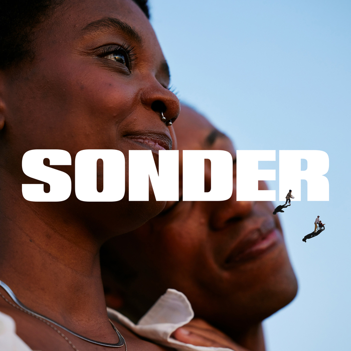
Photo: OHMY Studio. License: All Rights Reserved.
The logo uses Aro Narrow.


Sonder, formerly Consumer Insight, transforms complex data into meaningful insights through human-centered research. Their old brand and name no longer reflected their forward-thinking approach. They needed a fresh identity, tone of voice, and name to match their progressive vision.
We crafted a dynamic brand identity based on ‘sonder’—the idea that every person has a unique story. Through a collage of photos, moments, and memories, we captured the richness of human experience. This included a new website, presentation decks, credentials, and social assets that clearly communicate their people-focused approach.
The new brand elevates Sonder’s status and conveys that research is as fascinating as the people behind it, preparing them to grow into new markets.
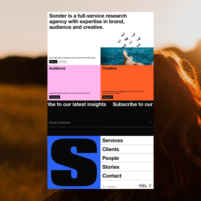
Photo: OHMY Studio. License: All Rights Reserved.
The primary brand typeface is Neue Helvetica.
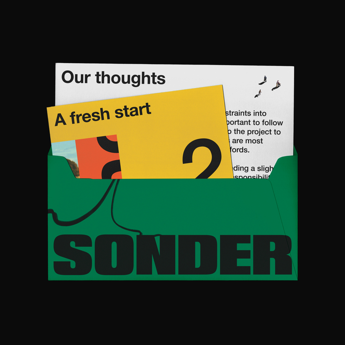
Photo: OHMY Studio. License: All Rights Reserved.
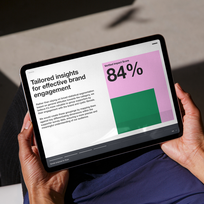
Photo: OHMY Studio. License: All Rights Reserved.
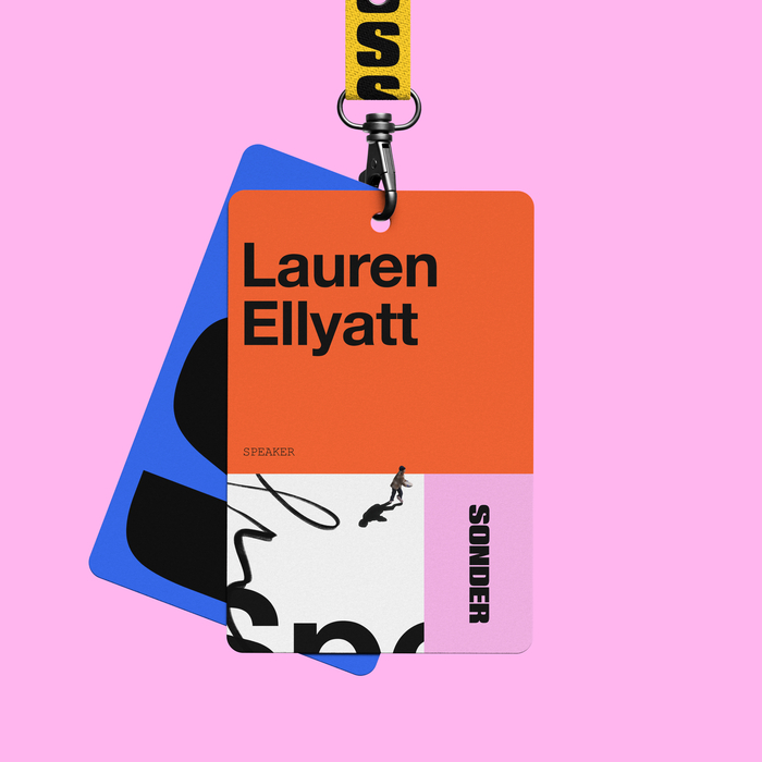
Photo: OHMY Studio. License: All Rights Reserved.
Neue Helvetica is sometimes supported by Courier New.
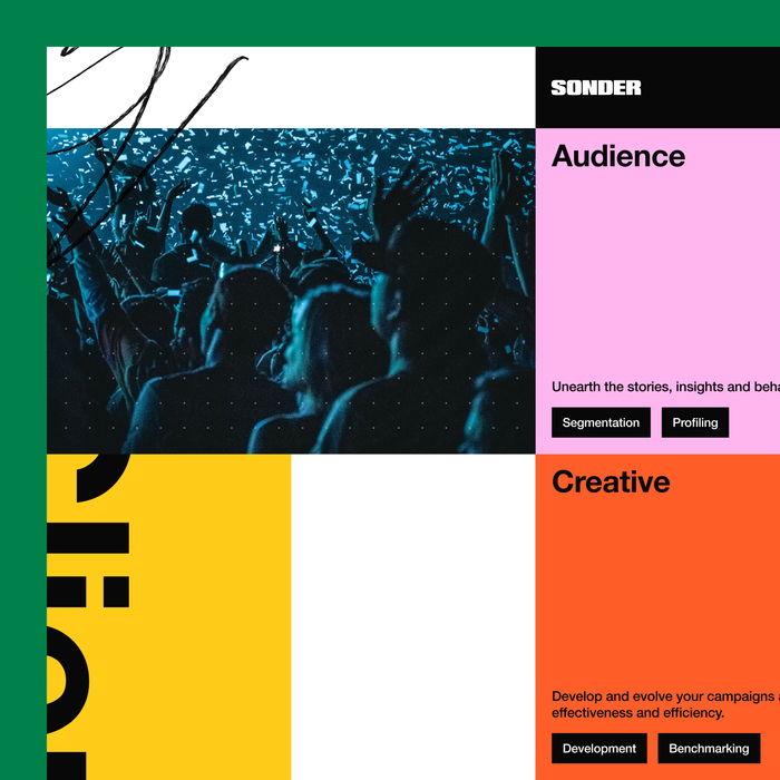
Photo: OHMY Studio. License: All Rights Reserved.
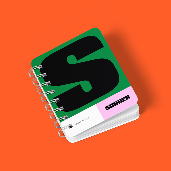
Photo: OHMY Studio. License: All Rights Reserved.
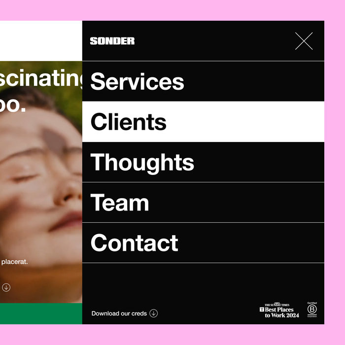
Photo: OHMY Studio. License: All Rights Reserved.
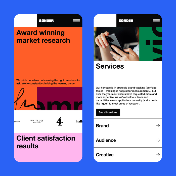
Photo: OHMY Studio. License: All Rights Reserved.
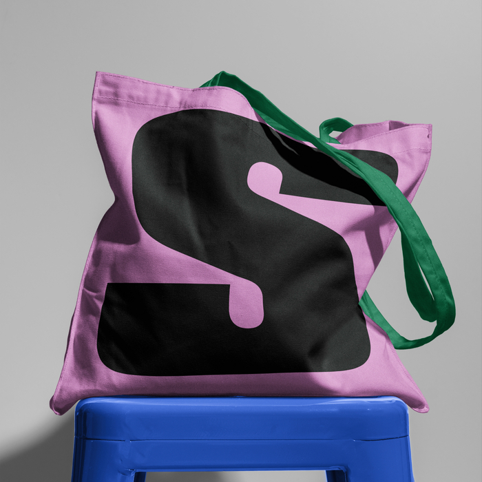
Photo: OHMY Studio. License: All Rights Reserved.
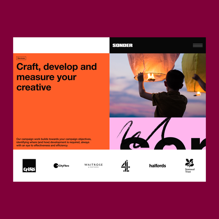
Photo: OHMY Studio. License: All Rights Reserved.
Photo: OHMY Studio. License: All Rights Reserved.
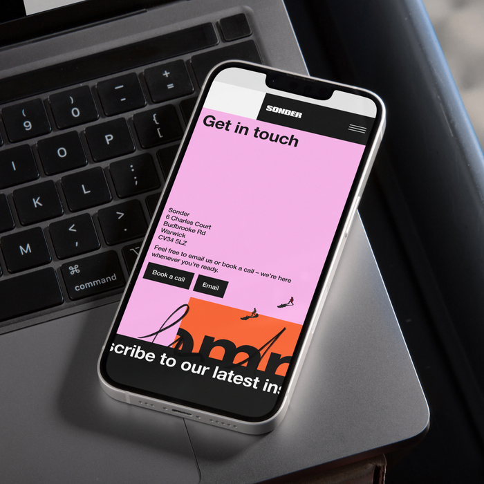
Photo: OHMY Studio. License: All Rights Reserved.
This post was originally published at Fonts In Use