The Shed
Published February 6, 2024
By FontsInUse
Contributed by Maxime Gau
Source: adamstudios.xyz Adam Studios. License: All Rights Reserved.

Source: adamstudios.xyz Adam Studios. License: All Rights Reserved.
Source: adamstudios.xyz Adam Studios. License: All Rights Reserved.
Source: adamstudios.xyz Adam Studios. License: All Rights Reserved.
Source: adamstudios.xyz Adam Studios. License: All Rights Reserved.
Source: adamstudios.xyz Adam Studios. License: All Rights Reserved.
Source: adamstudios.xyz Adam Studios. License: All Rights Reserved.
Source: adamstudios.xyz Adam Studios. License: All Rights Reserved.
This post was originally published at Fonts In Use
Source: adamstudios.xyz Adam Studios. License: All Rights Reserved.
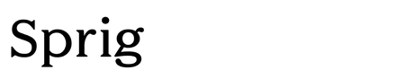
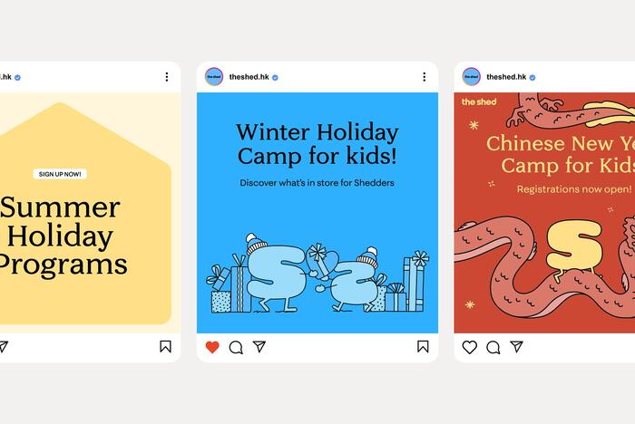
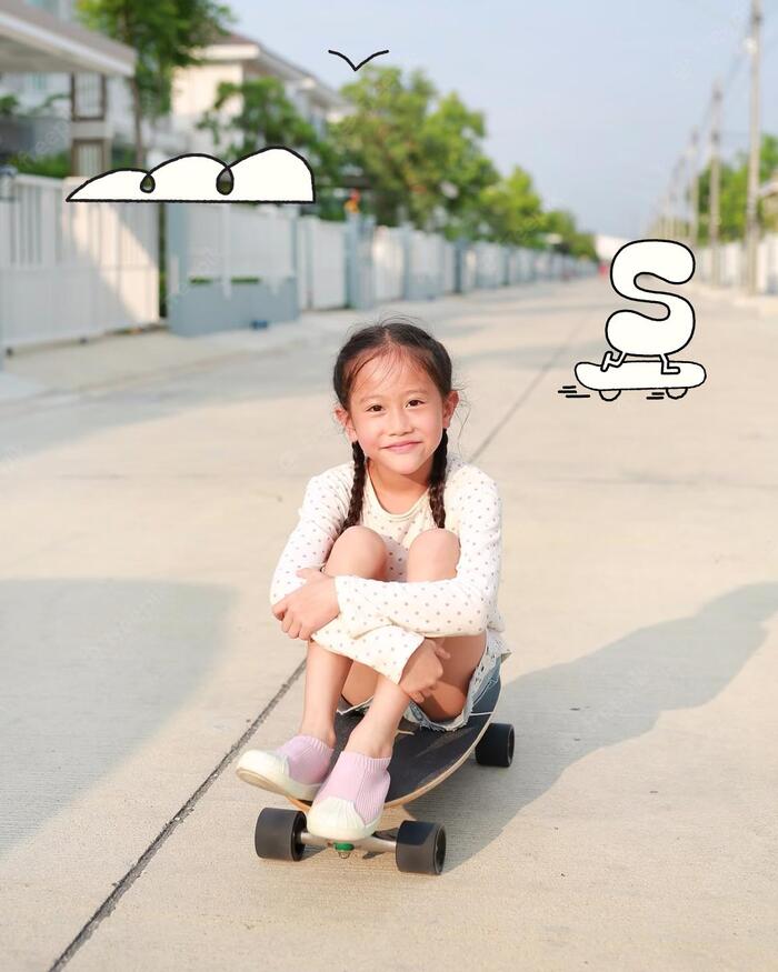
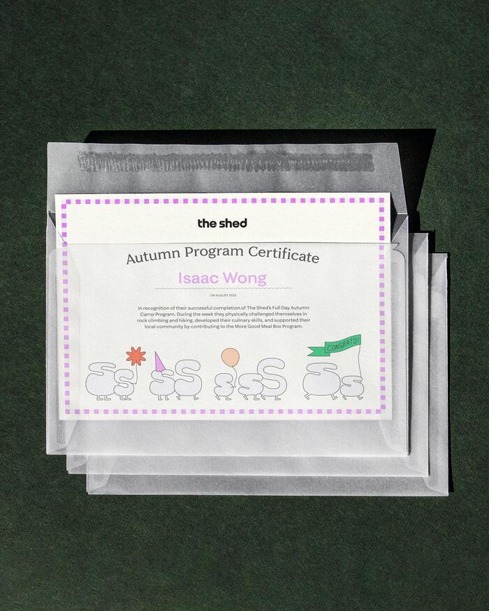
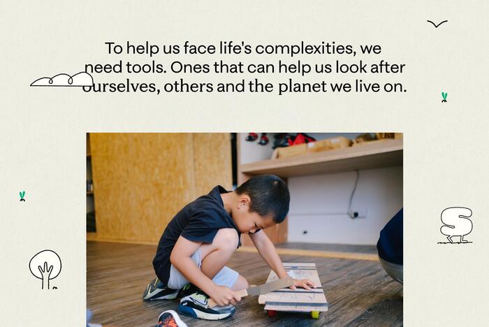
Faire Type’s Sprig and Sprig Sans in use for the new visual identity of The Shed.
Adam Studios writes:
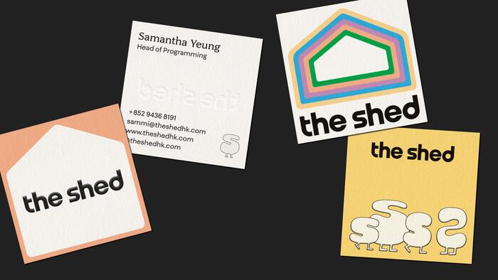
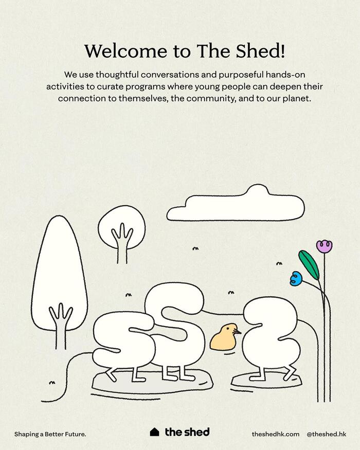
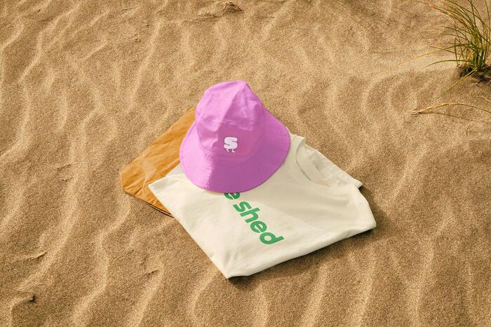
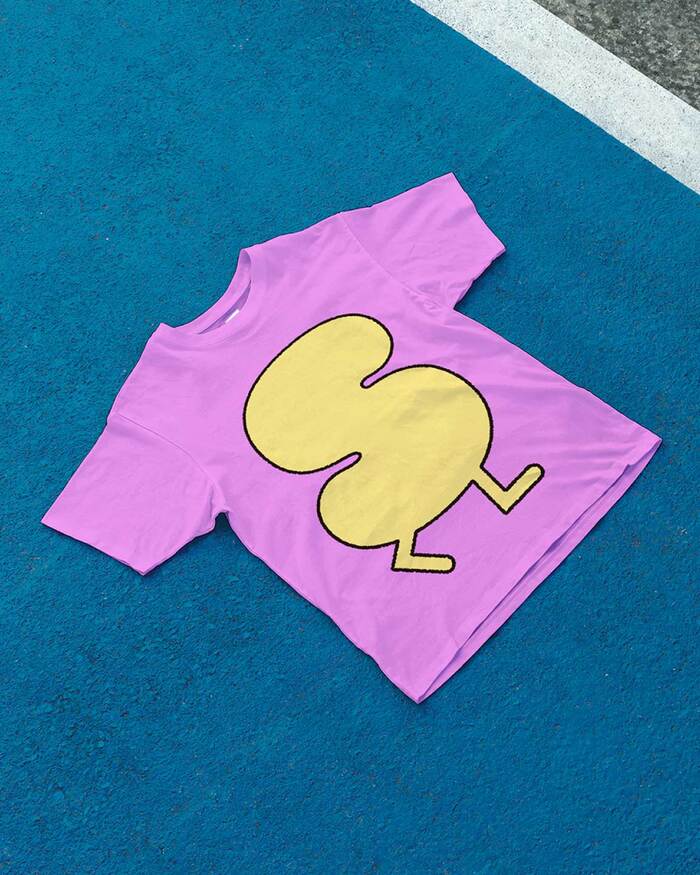
We updated the visual identity of The Shed, a hands-on afterschool programme based in Hong Kong. In addition to establishing fonts, palette and guidelines, we also did the illustrations that represent the brand’s core tenet “Me, We, Us” that encourages children to attend to their needs, those of others and those of the planet. This branding process culminated in an update to The Shed’s website, the creation of new social and press templates, and the beginnings of The Shed’s product development phase.
Source: adamstudios.xyz Adam Studios. License: All Rights Reserved.
Source: adamstudios.xyz Adam Studios. License: All Rights Reserved.
Source: adamstudios.xyz Adam Studios. License: All Rights Reserved.
Source: adamstudios.xyz Adam Studios. License: All Rights Reserved.
Source: adamstudios.xyz Adam Studios. License: All Rights Reserved.
Source: adamstudios.xyz Adam Studios. License: All Rights Reserved.
Source: adamstudios.xyz Adam Studios. License: All Rights Reserved.
This post was originally published at Fonts In Use
Read full story.
WRITTEN BY
FontsInUse
An independent archive of typography.