The CW

Source: www.dixonbaxi.com DixonBaxi. License: All Rights Reserved.

The CW is an American broadcast television network. From DixonBaxi’s case study:
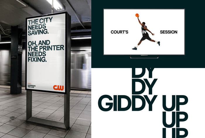
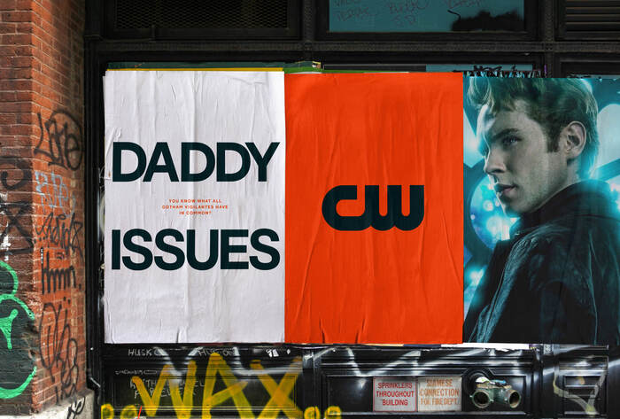
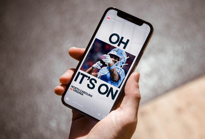
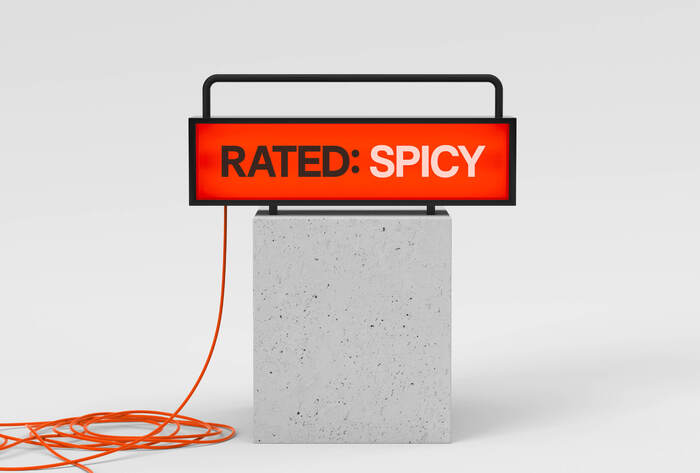
Voice first and full of attitude.
Leading with its voice, the brand speaks in a way the biggest networks can’t, bringing with it a light-hearted irreverence that feels like a breath of fresh air. A premium and deadpan type system delivered atop pure white backdrops allows the messaging to flourish with boldness and confidence. Speaking with wit and relatability, the brand adds a vital dose of personality to the world of entertainment.
The brand’s signature typeface is F37 Bolton by UK-based type studio F37, used as a bold, attention grabbing display font.
Overall the branding has been sharpened and made more consistent, and, accompanied by sharp copy, has been given a cheeky and irreverent tone.
Source: www.dixonbaxi.com DixonBaxi. License: All Rights Reserved.
Source: www.dixonbaxi.com DixonBaxi. License: All Rights Reserved.

Source: www.dixonbaxi.com DixonBaxi. License: All Rights Reserved.
Source: www.dixonbaxi.com DixonBaxi. License: All Rights Reserved.
Source: www.dixonbaxi.com DixonBaxi. License: All Rights Reserved.
This post was originally published at Fonts In Use