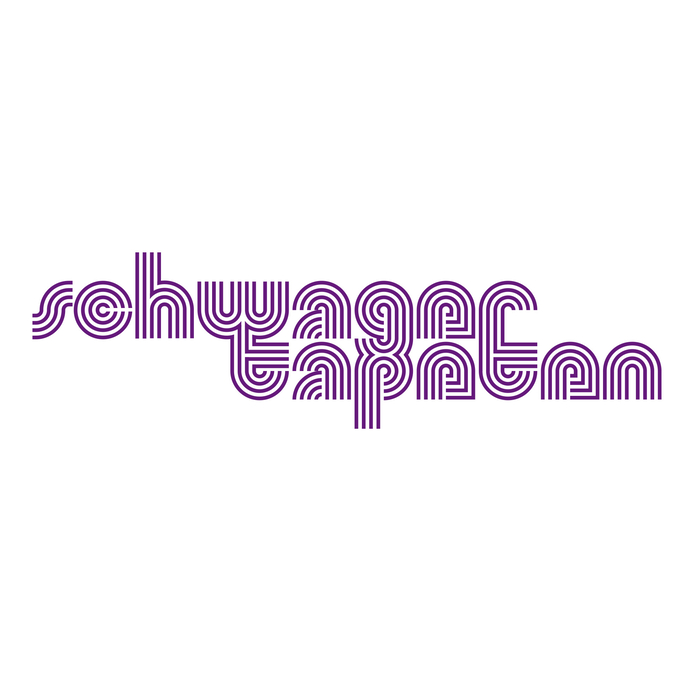
Schwager Tapeten logo
Roland Hirter. License: All Rights Reserved.

In 1971, Swiss graphic designer Roland Hirter created the logo for Schwager Tapeten, a store selling wallpapers and related products. The wordmark features lowercase letters from a multiline typeface that Hirter was designing at the time.
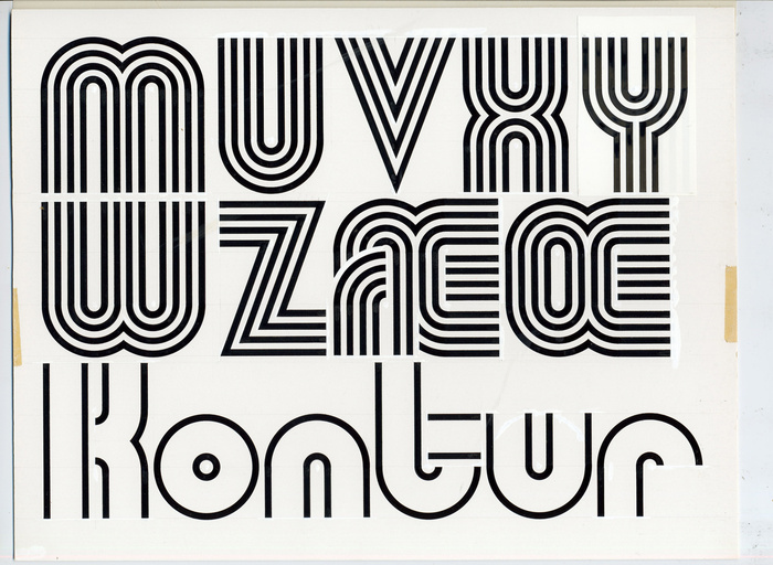
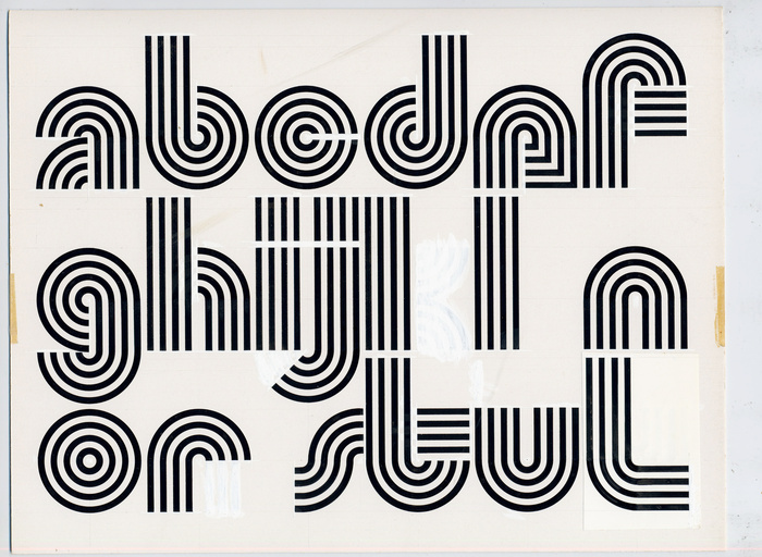
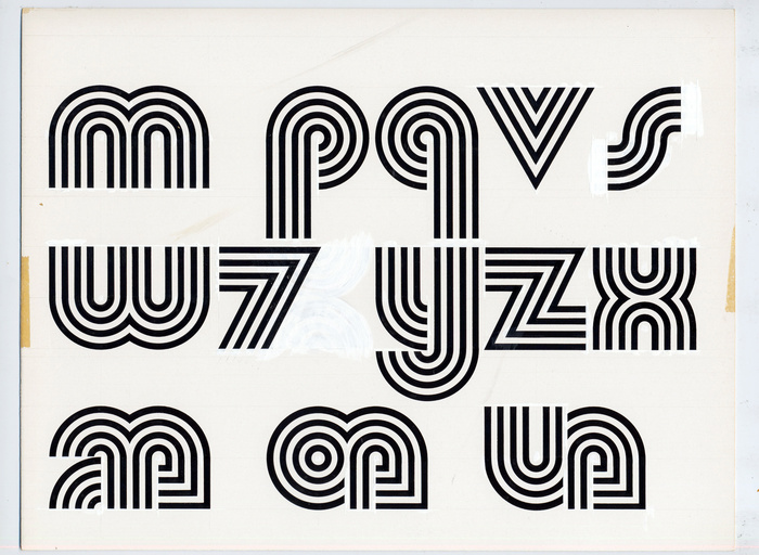
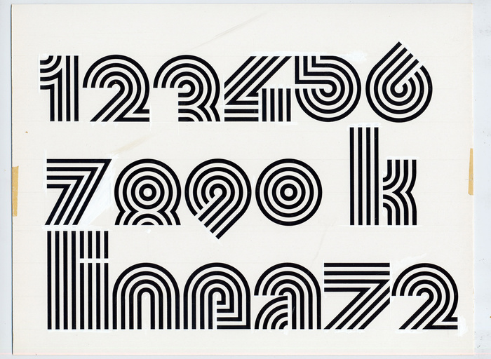
As seen on the original drawings shown below, this typeface started life in the era of phototypesetting and dry transfer lettering. It was meticulously drawn, with compass and technical drawing pen. By around 1972, Hirter had completed all letters of the Latin alphabet, including an uppercase and also numerals. However, he hardly ever used it himself and the typeface remained unreleased.
When Roland Hirter quit working around 2015 and cleared out his studio, he intended to throw away the original artwork. It was me – Roland’s son Thomas – who saved them. For the typeface’s fiftieth anniversary, I digitized all the original glyphs.
Since today's technologies allow for a faster work process compared to the seventies, I expanded the font to cover most of the Latin script. Even more, I added a total of ten stylistic sets to offer alternative glyphs for different letters and figure sets. Attentive observers will notice, however, that Roland Hirter also drew different variations of some glyphs, such as the lowercase letters h and t and the numeral 7.
More than half a century after its first application, the typeface is finally available. It was released in February 2023 under the original name Linea 72, in the two original styles, Regular and Kontur.

Roland Hirter. License: All Rights Reserved.
The original drawings for the uppercase glyphs, part 1
Roland Hirter. License: All Rights Reserved.
The original drawings for the uppercase glyphs, part 2, plus a sample for the Kontur version in which the inner lines have been eliminated
Roland Hirter. License: All Rights Reserved.
The original drawings for the lowercase glyphs, part 1. Note how h and t are different from the glyphs in the Schwager Tapeten logo.
Roland Hirter. License: All Rights Reserved.
The original drawings for the uppercase glyphs, part 2
Roland Hirter. License: All Rights Reserved.
The original drawings for the numerals – and the typeface’s name, Linea 72
Roland Hirter. License: All Rights Reserved.
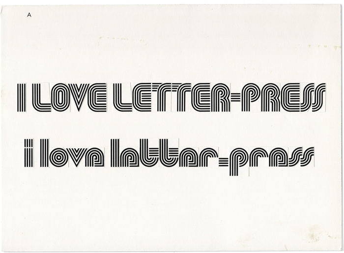
Copy and paste the old way: a proof from the early 1970s. The sample text “I love Letter-Press” suggests that Roland Hirter submitted the design to Mecanorma’s permanent contest, in which the French Letraset competitor sourced new designs for their Letter-Press range of dry transfer typefaces.
This post was originally published at Fonts In Use