Sans Comic by Cory Arcangel
Source: coryarcangel.com License: All Rights Reserved.

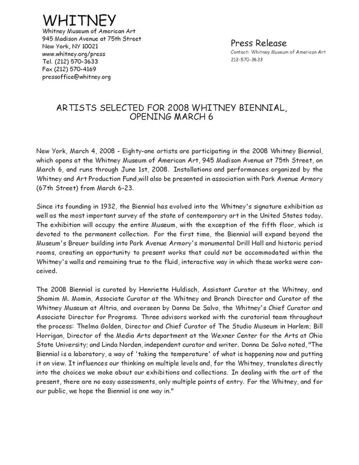
This press release presenting the list of artists selected for the 2008 Whitney Biennial was redesigned by Cory Arcangel using Comic Sans.
Cory Arcangel is a post-internet artist. He uses and confronts many elements from the internet culture, notably through the heavy use of Comic Sans in many of his projects.
Its use is criticized for being characterized as a bad typography. Arcangel comes to use it in a particular context that marks the desire to get this typography out of this general judgment. Not only by taste for this typeface but as a positioning in front of the mass criticism that the internet can create. By context I mean places and elements where we traditionally expect a certain design. For example his logo for Arcangel Surfware where we expect a particular graphic design, or this official press announcement where design has apparently no interest, but if it is different, it can be interesting.
The use of Comic Sans has now become a trademark element of Cory Arcangel in contemporary art. You can find the whole document on the artist’s website.
Title: Sans Comic
Year: 2008
Medium: PDF
Elevator pitch: Whitney Biennial press release in comic sans. Distributed to biennial press list.
ps: Made as part of Dexter Sinister’s True Mirror reflections on the 2008 Whitney Biennial, this was emailed to the Whitney’s press list…. FYI: no one noticed the font. LOL. :)
The original press release by the Whitney Museum uses Cachet.
This post was originally published at Fonts In Use