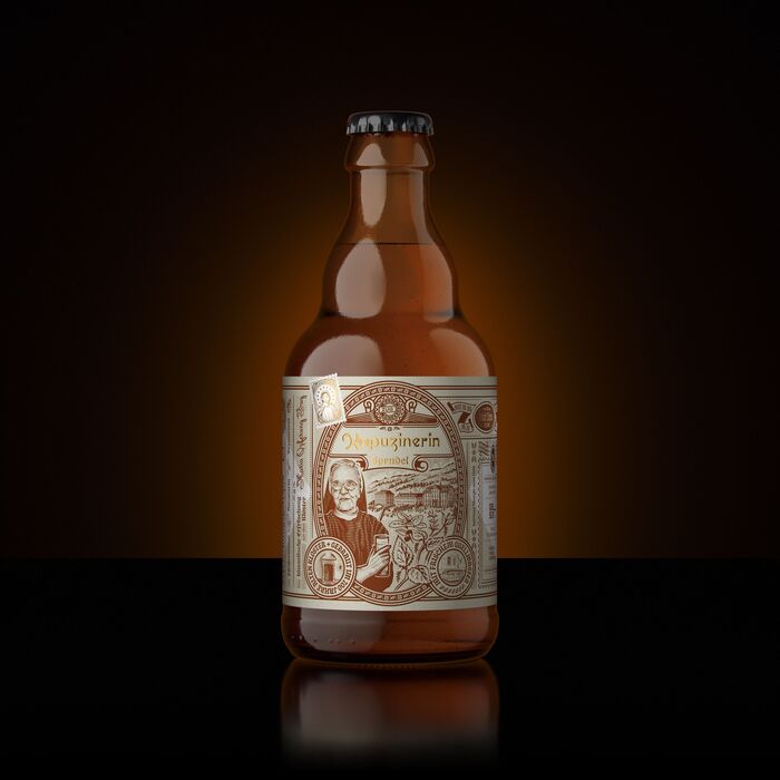
Kapuzinerin Sprudel label
Source: www.instagram.com Peter Voth. License: All Rights Reserved.


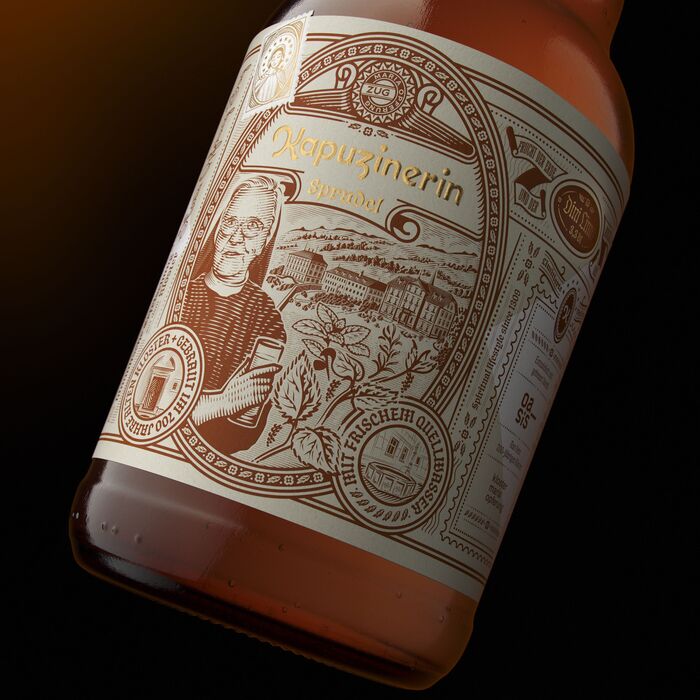
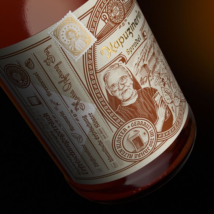
Kapuzinerin Sprudel is a small batch brand for sparkling water from the Kloster Maria Opferung in Zug, Switzerland.
The “Kapuzinerin” logo is custom drawn in-house (or rather, in-cloister) by Martin Iten. For remaining text, the blackletter typeface Schmaltzy is used alongside Tiller, Rijsenburg, and Smillingen, complementing the ornamental illustrations. The labels are designed by Peter Voth, who writes:
The monastery existed for over 700 years, since 1309 to be exact. In the historic monastery building, the heart of the entire property, the Catholic lay organization Anima Una has been operating since the fall of 2018. The organization realizes creative projects that want to preserve the historical place and give it a future. One of these projects is this monastery product.
The label design features a major illustration of Sister Anna (1930–2019) the last Mother of the Capuchin Sisters of Maria Opferung. Also featured on the label is a historic engraving style illustration of the monastery and some herbs like nettles, peppermint leaves and Rosemary.
Source: www.instagram.com Peter Voth. License: All Rights Reserved.
Source: www.instagram.com Peter Voth. License: All Rights Reserved.
Source: www.instagram.com Peter Voth. License: All Rights Reserved.
This post was originally published at Fonts In Use