Stubs cocktails
Source: beststudio.ca © 2021 Best Studio. License: All Rights Reserved.


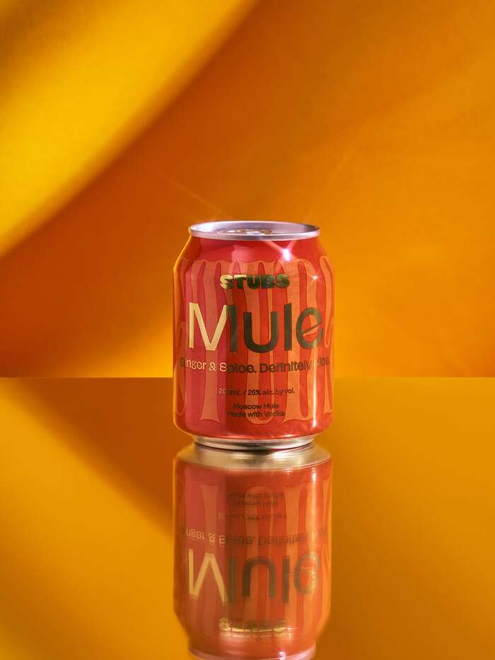
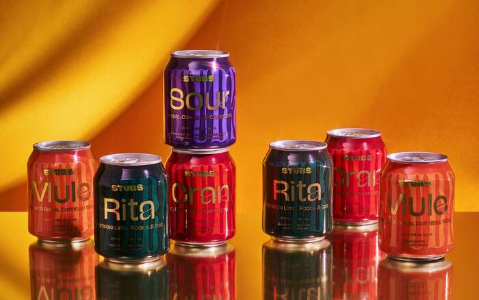
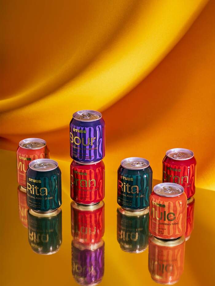
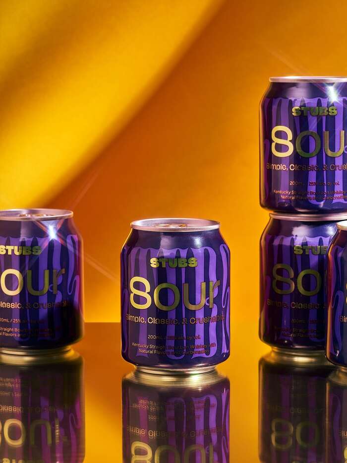
Stubs are pre-made strong cocktails, sold in cans. The brand distinguishes itself by the high amount alcohol per can (25% alc. by vol) and by the small format of its cans.
To convey this idea of a strong drink in a small receptacle, Best Studio created a very strong and colorful design composed of overlapped fonts with strong colors and the information added as a golden overlay. Although the logo is set in NaN Jaune Maxi Black, the name of the brand also appears as a pattern background on every can, this time set in Digestive, both typefaces designed by Jérémy Landes and sold in their earlier stages through Future Fonts where they might have been ordered around the same time. A lighter weight of Jaune Maxi is used to set the cocktail names and their description, while Lucas Sharp’s Sharp Sans serves the body copy.
Source: beststudio.ca © 2021 Best Studio. License: All Rights Reserved.

Source: beststudio.ca © 2021 Best Studio. License: All Rights Reserved.
Source: beststudio.ca © 2021 Best Studio. License: All Rights Reserved.
Source: beststudio.ca © 2021 Best Studio. License: All Rights Reserved.
This post was originally published at Fonts In Use