Sána identity and packaging
Published July 14, 2023
By FontsInUse
Contributed by TYPE01
Source: www.instagram.com anvar. License: All Rights Reserved.


Source: www.instagram.com anvar. License: All Rights Reserved.
Source: www.instagram.com anvar. License: All Rights Reserved.
Source: www.instagram.com anvar. License: All Rights Reserved.
Source: www.instagram.com anvar. License: All Rights Reserved.
This post was originally published at Fonts In Use
Source: www.instagram.com anvar. License: All Rights Reserved.
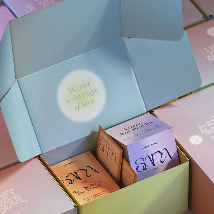
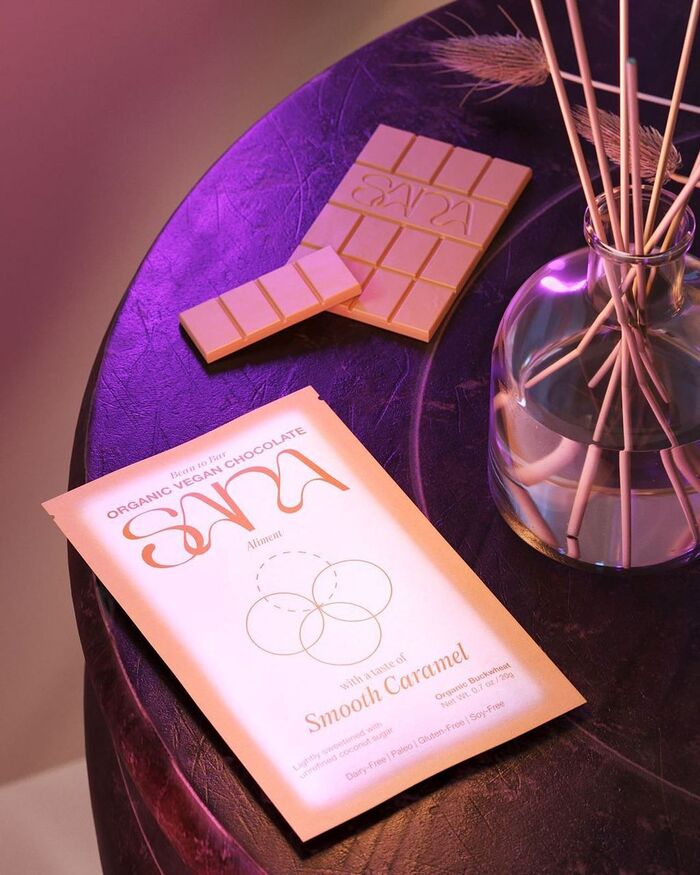
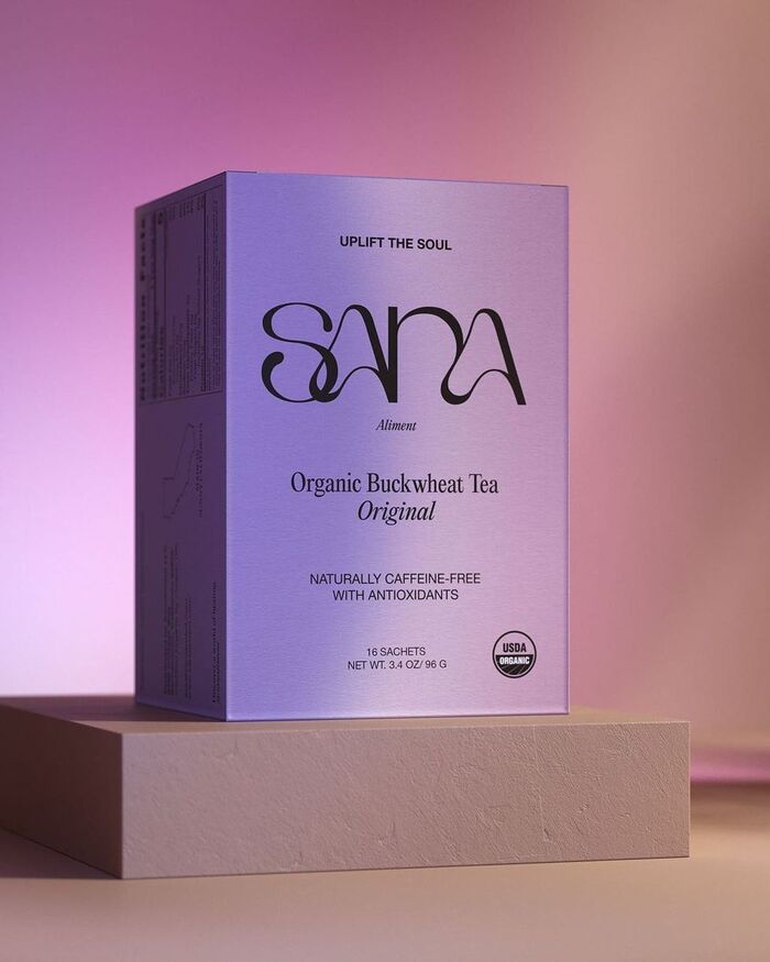
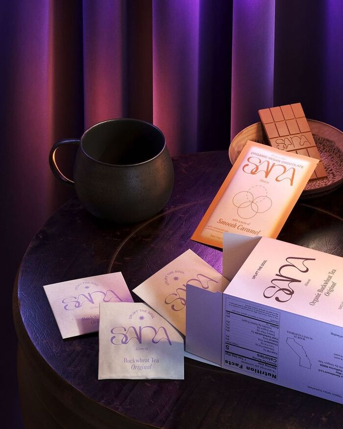
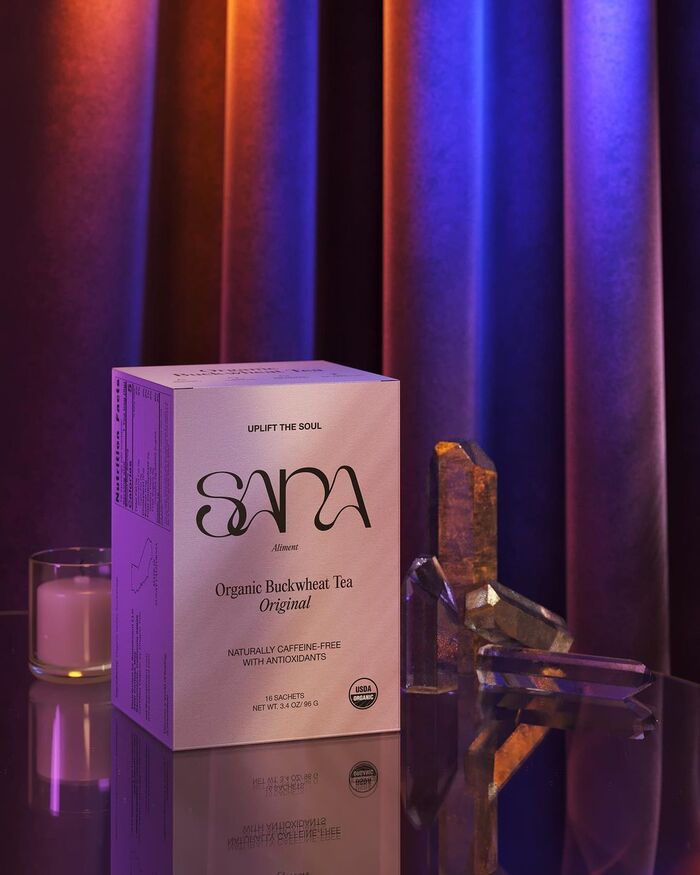
Sána is a woman-owned company that believes in empowerment through well-being. Offering a variety of products using buckwheat (ethically sourced) as their main ingredient, the brand operates from California.
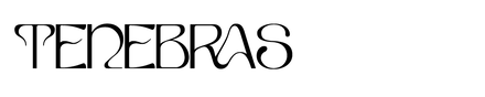
Designed by graphic designer Anvar of Of Nuances, as part of the brand's identity, he opted for Tenebras by Doménico Barretto and it's no surprise, as Tenebras brings a whimsical playfulness to the identity. The accompanying brand typefaces are Editorial New by Francesca Bolognini and Mathieu Desjardins and Neue Helvetica by Linotype.
Source: www.instagram.com anvar. License: All Rights Reserved.
Source: www.instagram.com anvar. License: All Rights Reserved.
Source: www.instagram.com anvar. License: All Rights Reserved.
Source: www.instagram.com anvar. License: All Rights Reserved.
This post was originally published at Fonts In Use
Read full story.
WRITTEN BY
FontsInUse
An independent archive of typography.